FIBI KUNG is a London-based art director and designer from Hong Kong. She specialises in art direction and design for art and cultural exhibitions, brand identity, and digital interactive experiences. Previously she has worked in leading agencies and design practices across Hong Kong, Stockholm, Copenhagen, Rotterdam, and Seoul, collaborated with cultural institutions such as Barbican Centre, Natural History Museum, Somerset House, M+, Tai Kwun, the Royal Botanic Gardens, Kew, and others. With diverse international experiences, her practice is driven by a passion for cultural narratives and experiences through thoughtful and meaningful design. She is also passionate about exploring type design and lettering as a means of cultural expression.
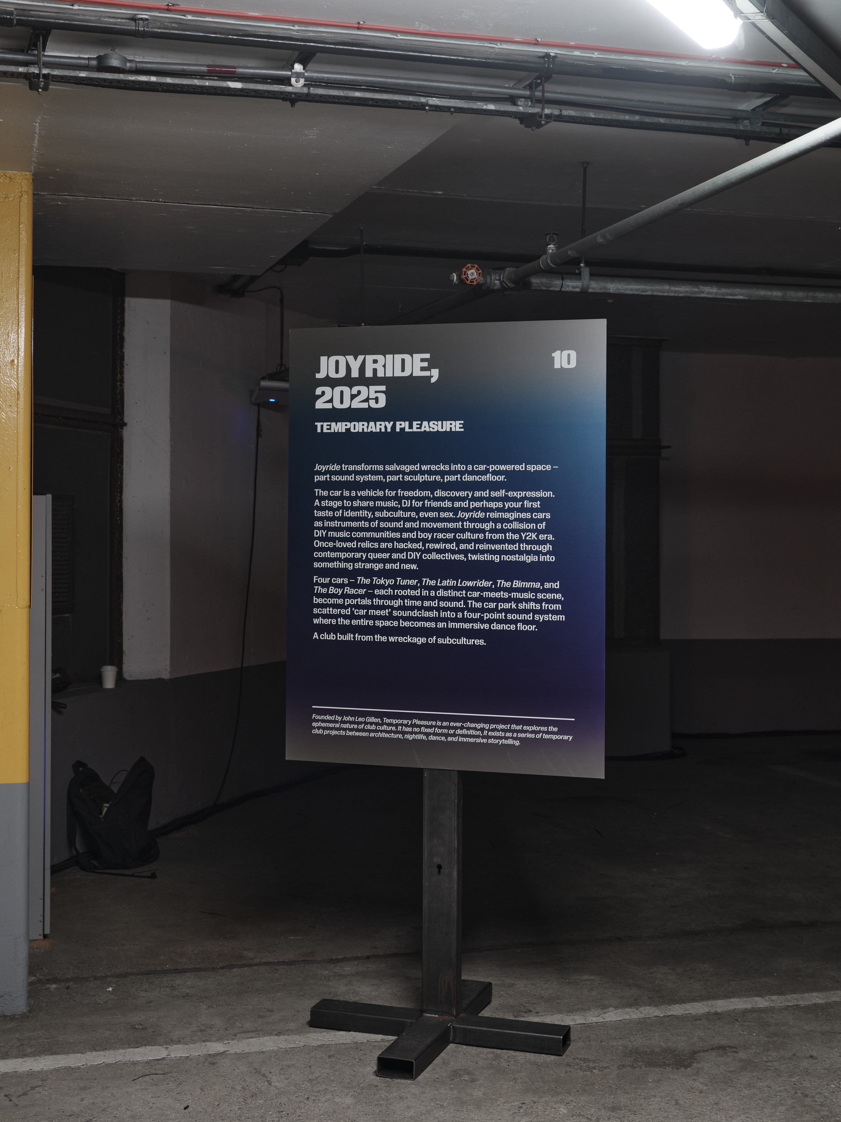


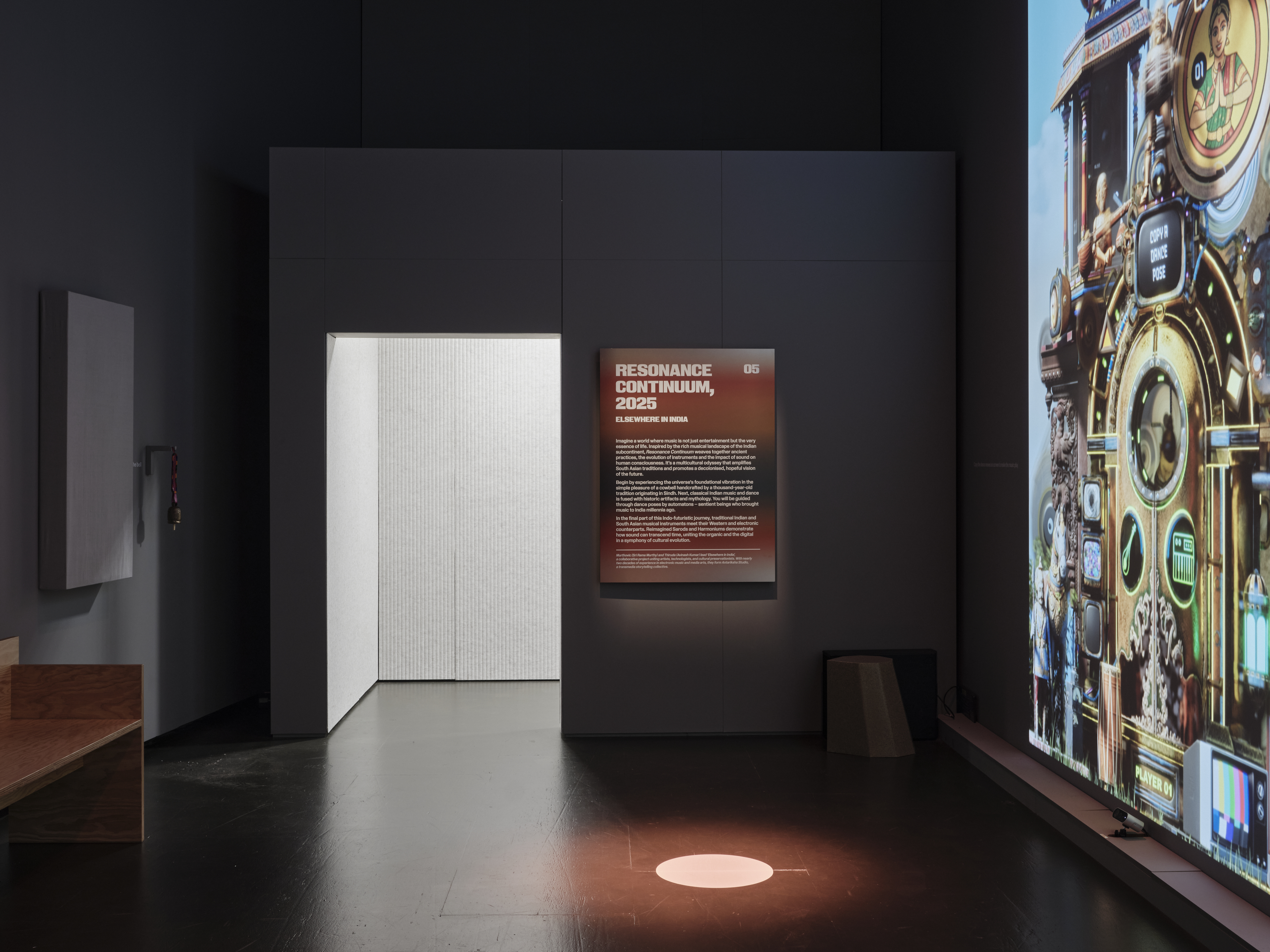
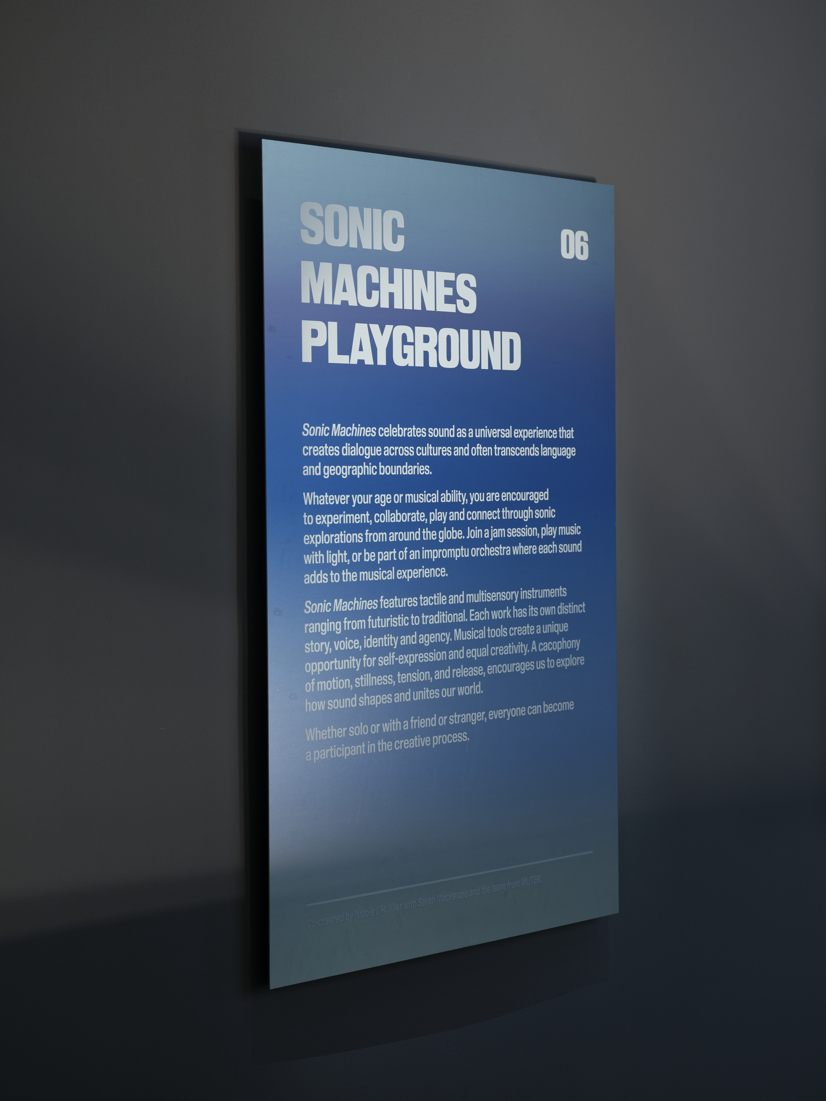
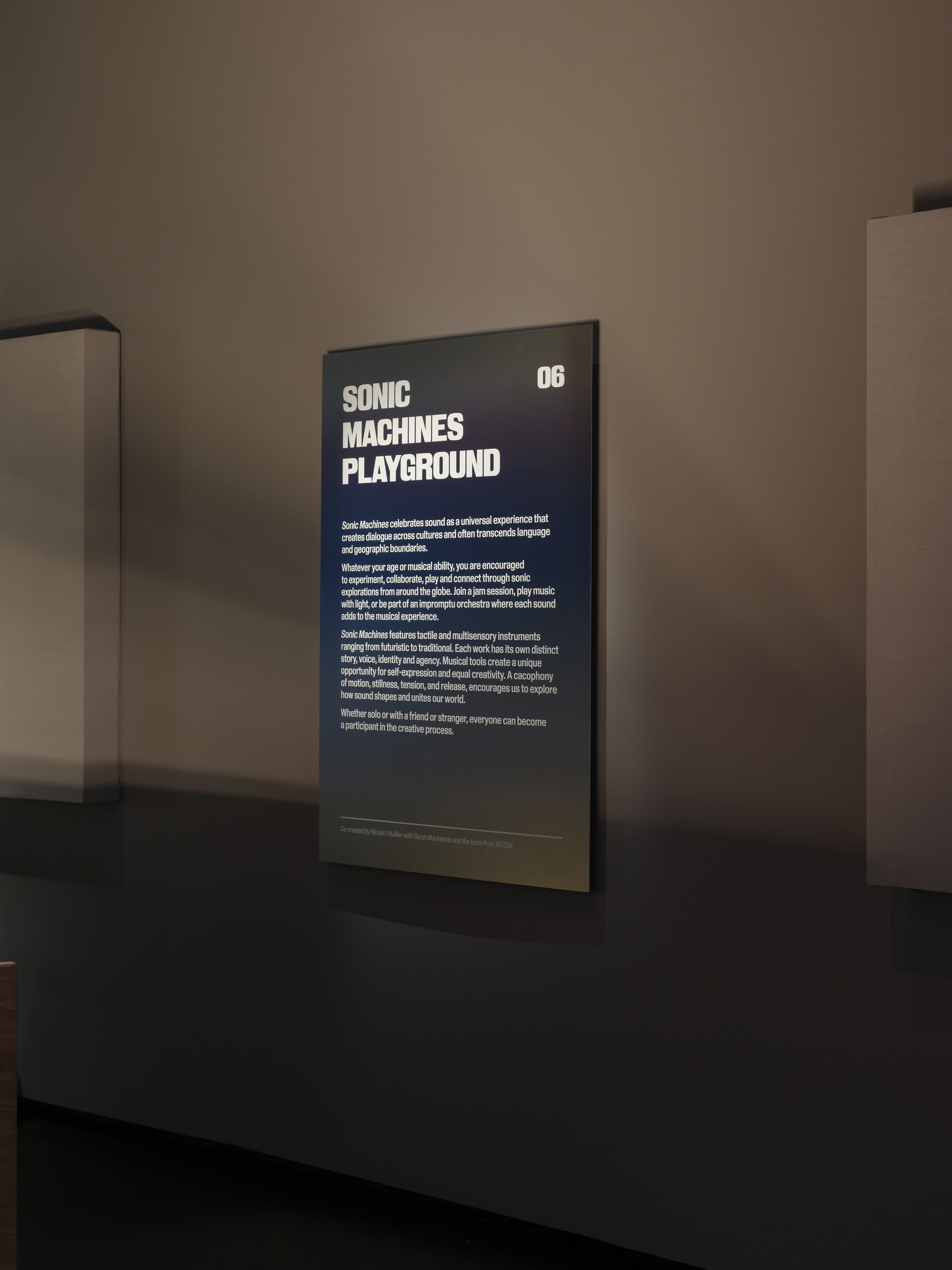
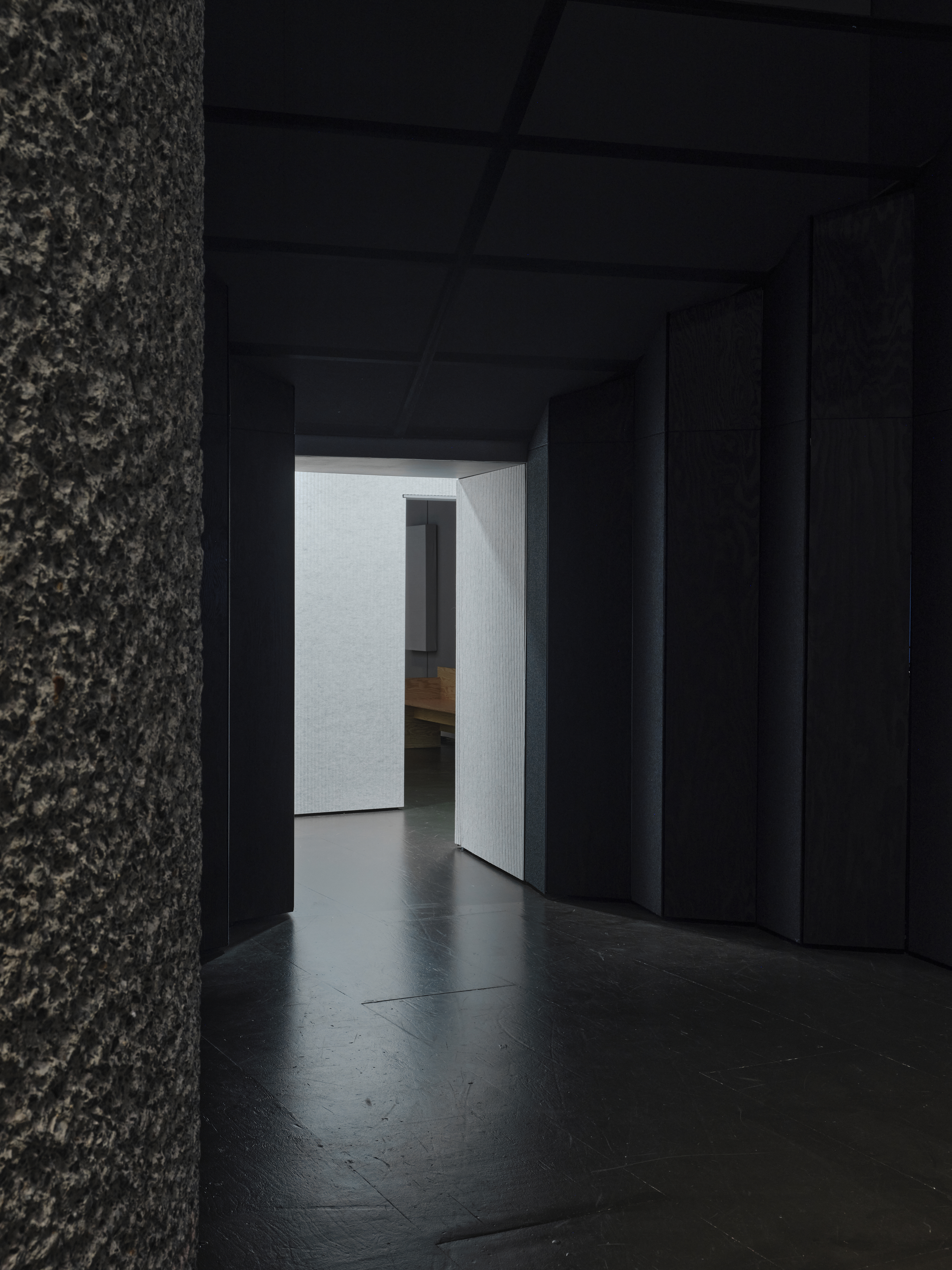
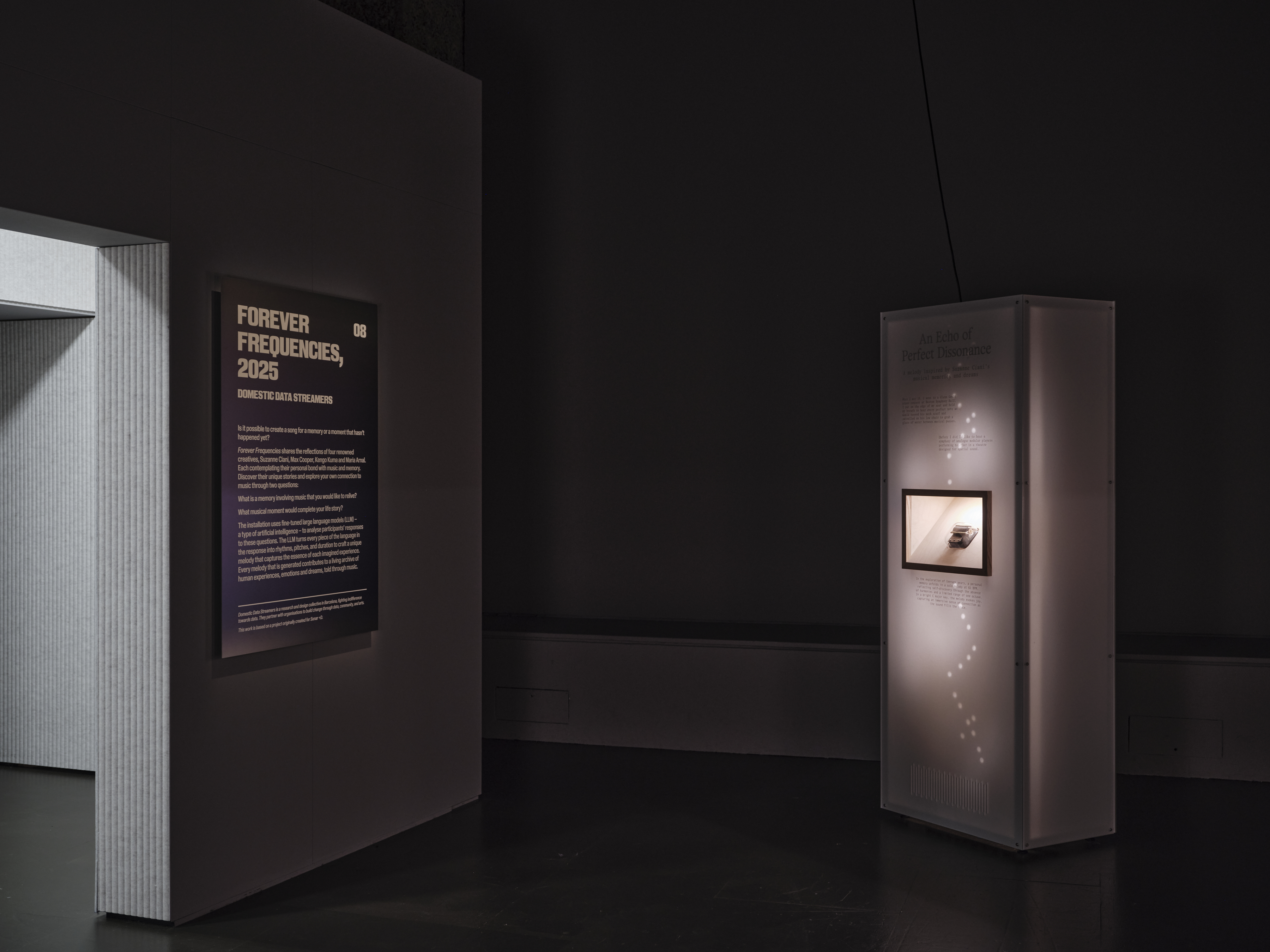
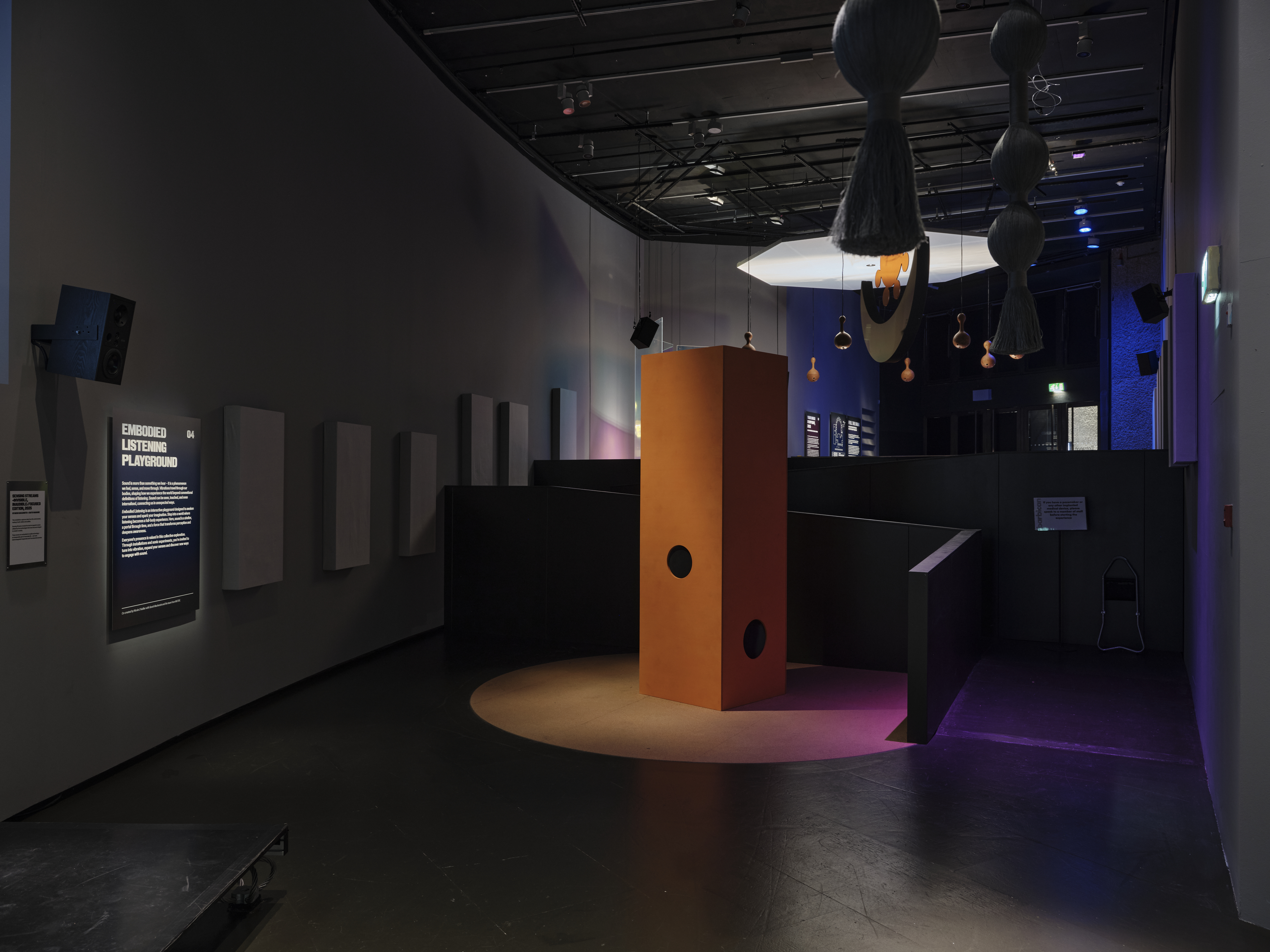

Feel the Sound 22 May—31 Aug, 2025
Barbican Centre, London
Key visual identity and exhibition graphics for Feel the Sound. The exhibition includes multi-sensory installations that take you on a journey across locations in the Barbican, from the curve gallery to the car parks and to the Lakeside Terrace.
Artists Raymond Antrobus, Patty Ayukawa, Alejandra Cárdenas Tatiana Heuman, Cities and Memory, Domestic Data Streamers, ELECTRONICOS FANTASTICOS! / Ei Wada, Dame Evelyn Glennie, Holly Herndon, Miyu Hosoi, Evan Ifekoya, ILĀ, Intelligent Instruments Lab, Giacomo Lepri, Nicole L’Huillier, Daito Manabe, Sarah Mackenzie, MUTEK, Amor Muñoz, MONOM, Elsewhere in India, Nexus Studios, Nicola Privato, Ryuichi Sakamoto, Yuri Suzuki, Jan St. Werner, Temporary Pleasure, TRANS VOICES, Kinda Studios.
Scope Exhibition Key Visual Identity, Exhibition Graphics
Project completed at HATO
Photography courtesy of Thomas Adank
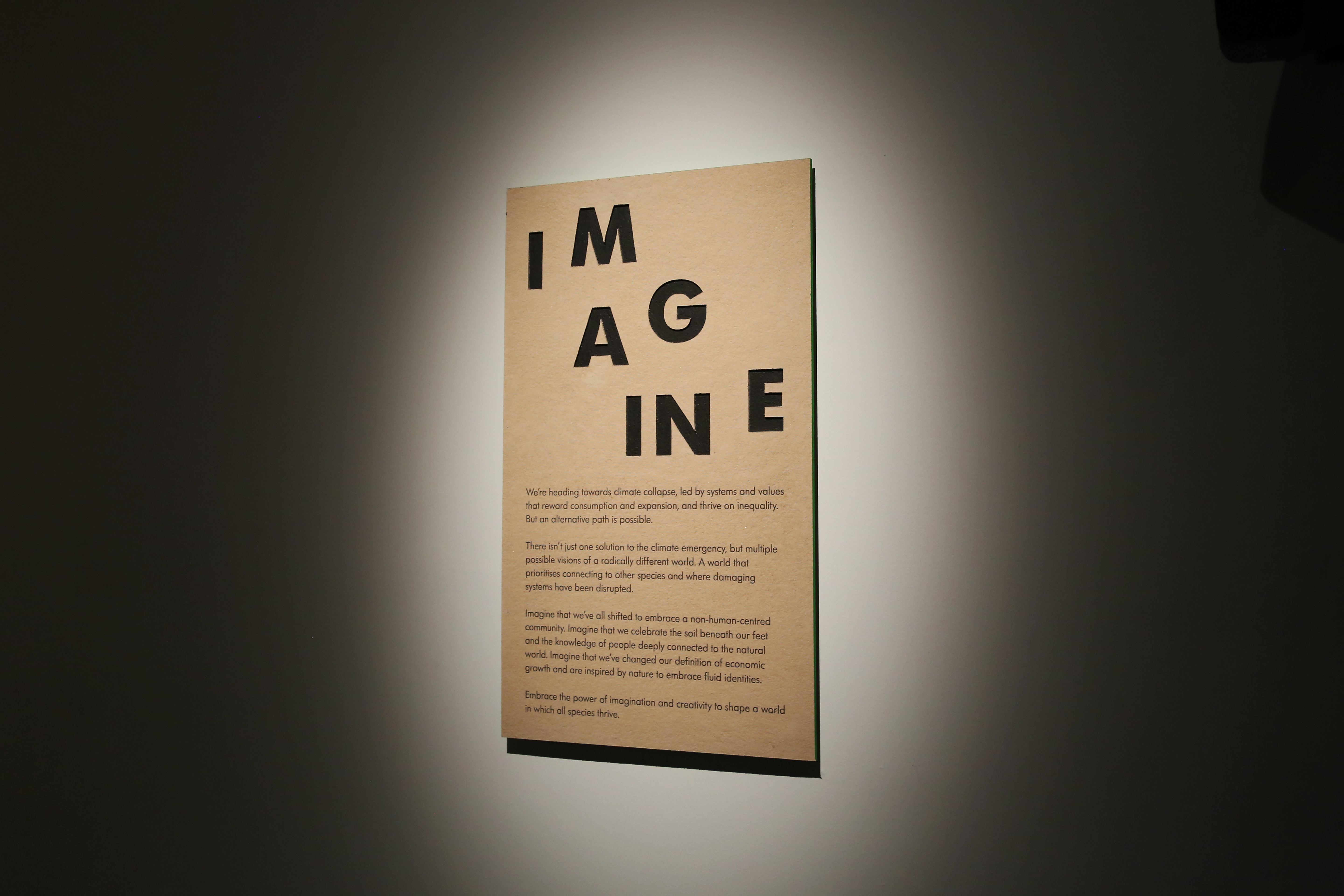

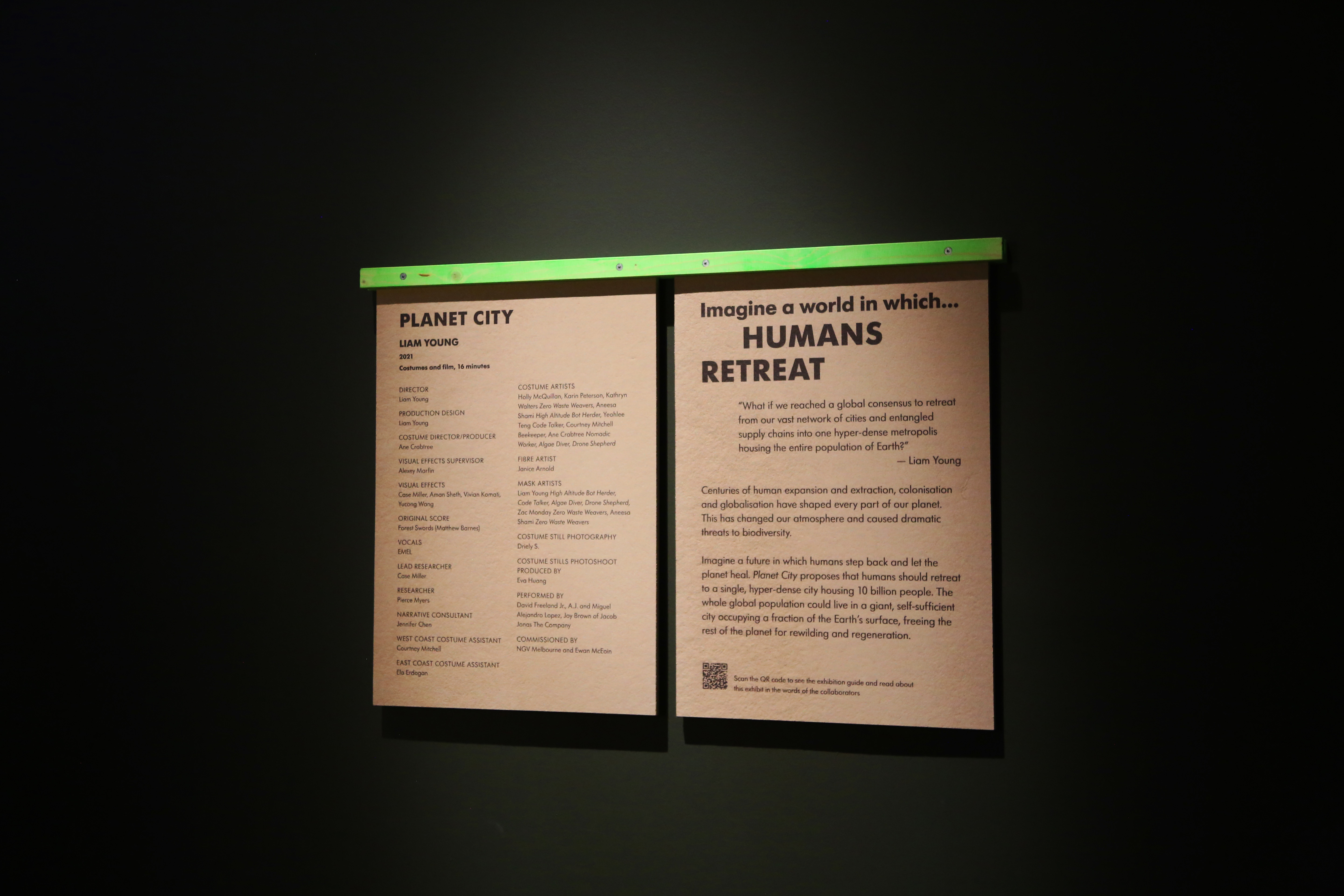


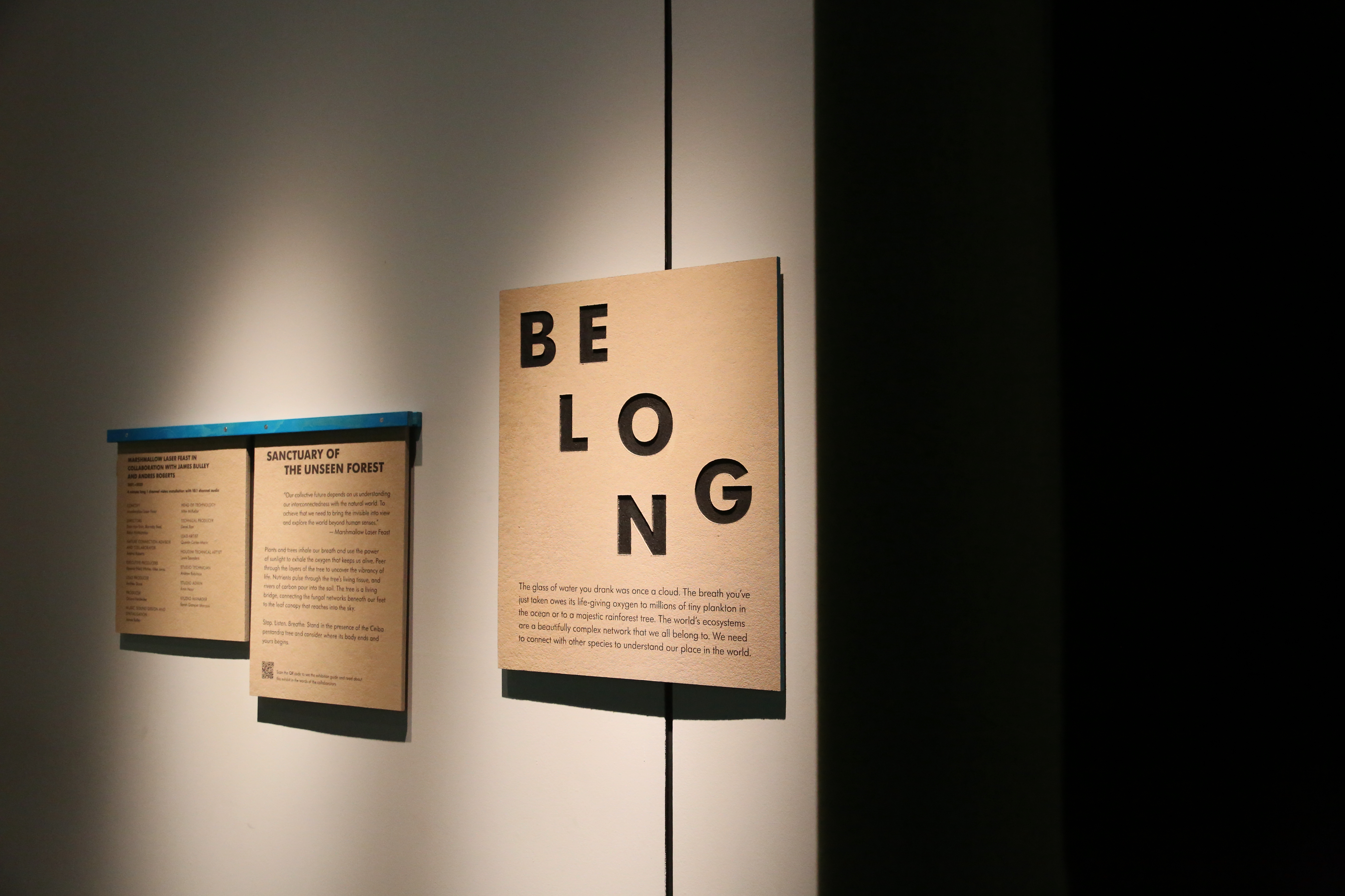

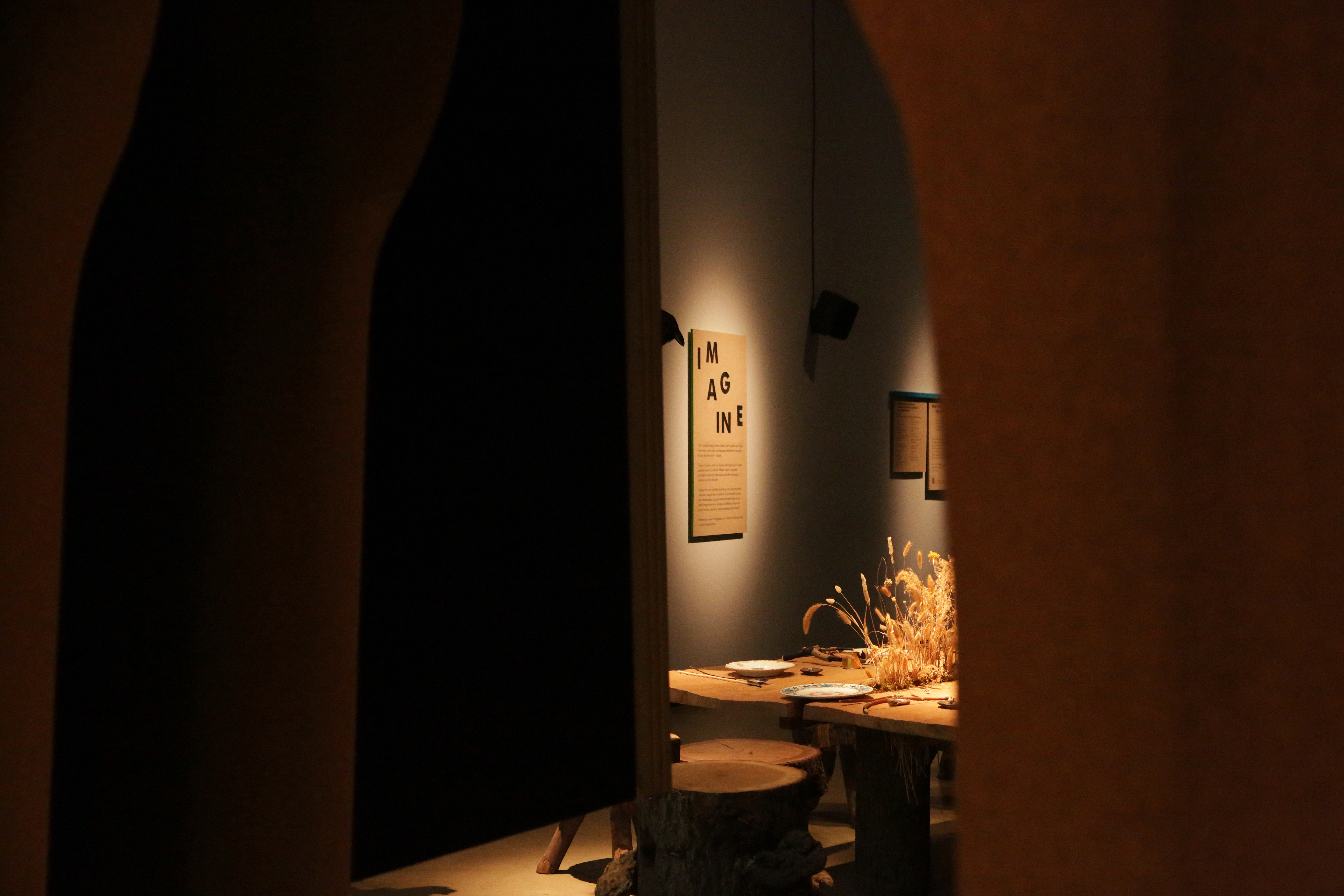


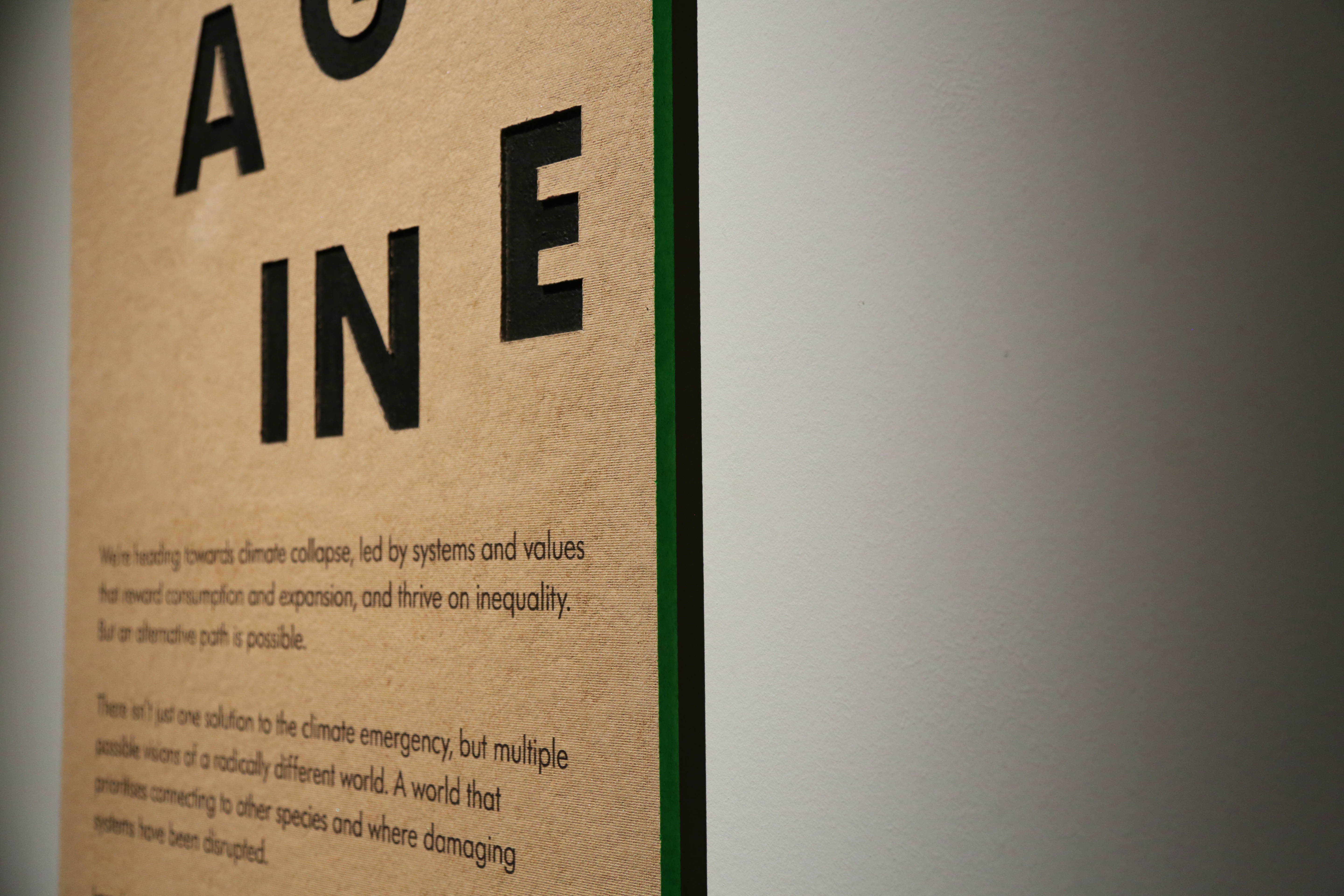
Our Time on Earth 5 May—29 Aug, 2022
Barbican Centre, London
Key visual identity and exhibition graphics for Our Time on Earth, a major exhibition presented by the Barbican Centre, London opening in May 2022. The exhibition takes place in The Curve across three interconnected sections– Belong, Imagine and Engage, designed to create a shift in consciousness, changing the way we think about the natural world.
A journey through immersive, interactive installations and digital works, the exhibition invites visitors to experience a range of perspectives of our shared planet, exploring Earth as a community to which we all belong – humans as just one species among millions.
Artists Marshmallow Lazer Feast, Liam Young, Superflux and Buro Happold in collaboration with Julia Watson
Scope Exhibition Key Visual Identity, Exhibition Graphics
Project completed at HATO


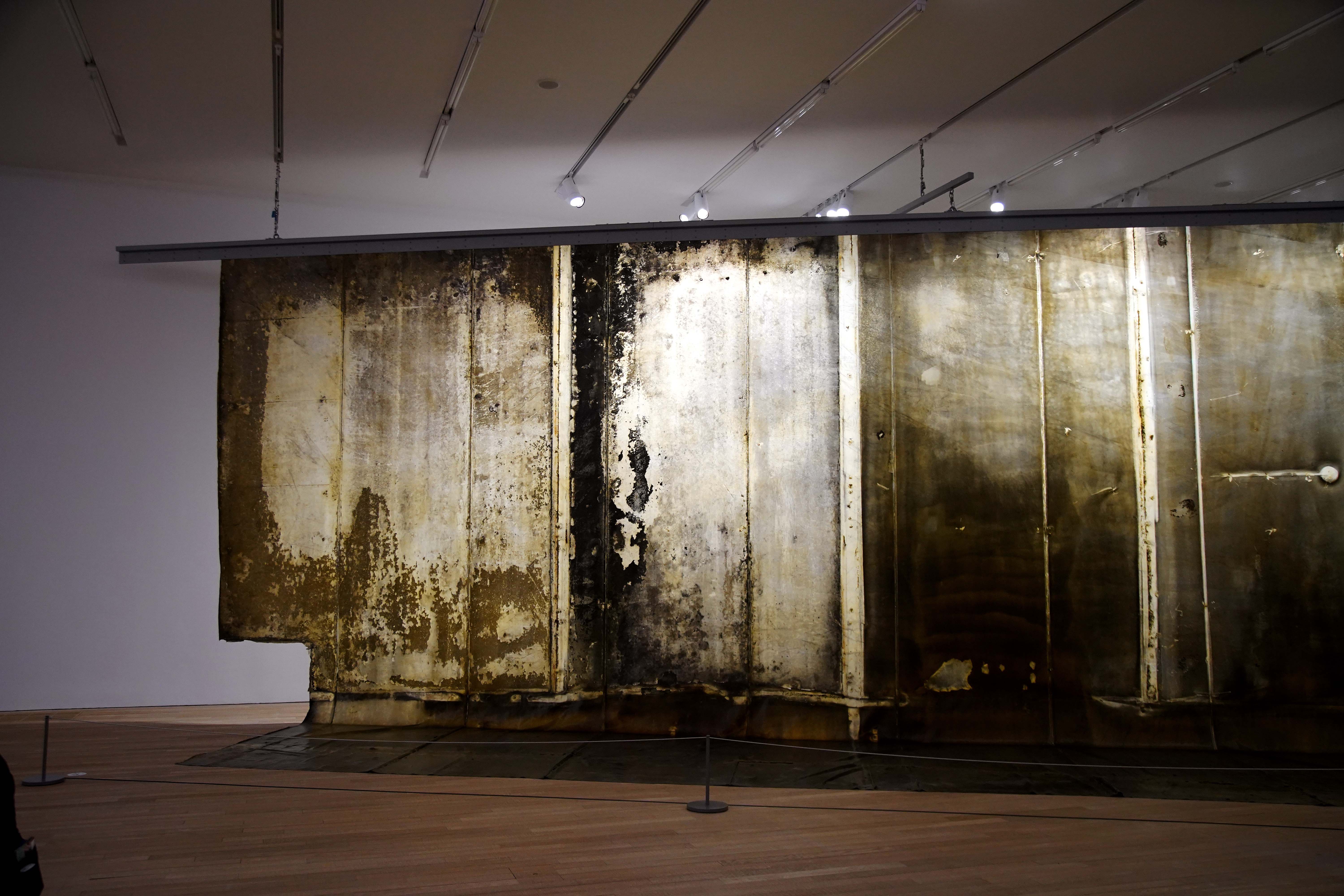
Bruce Nauman 5 May—18 Aug, 2024
Tai Kwun Contemporary, Hong Kong
Key visual identity and exhibition graphics for Bruce Nauman. A major survey exhibition by the US-born artist Bruce Nauman, one of the most influential artists working today.
Artist Bruce Nauman
Scope Exhibition Key Visual Identity, Exhibition Graphics
Project completed at HATO
Photography courtesy of Tai Kwun Contemporary

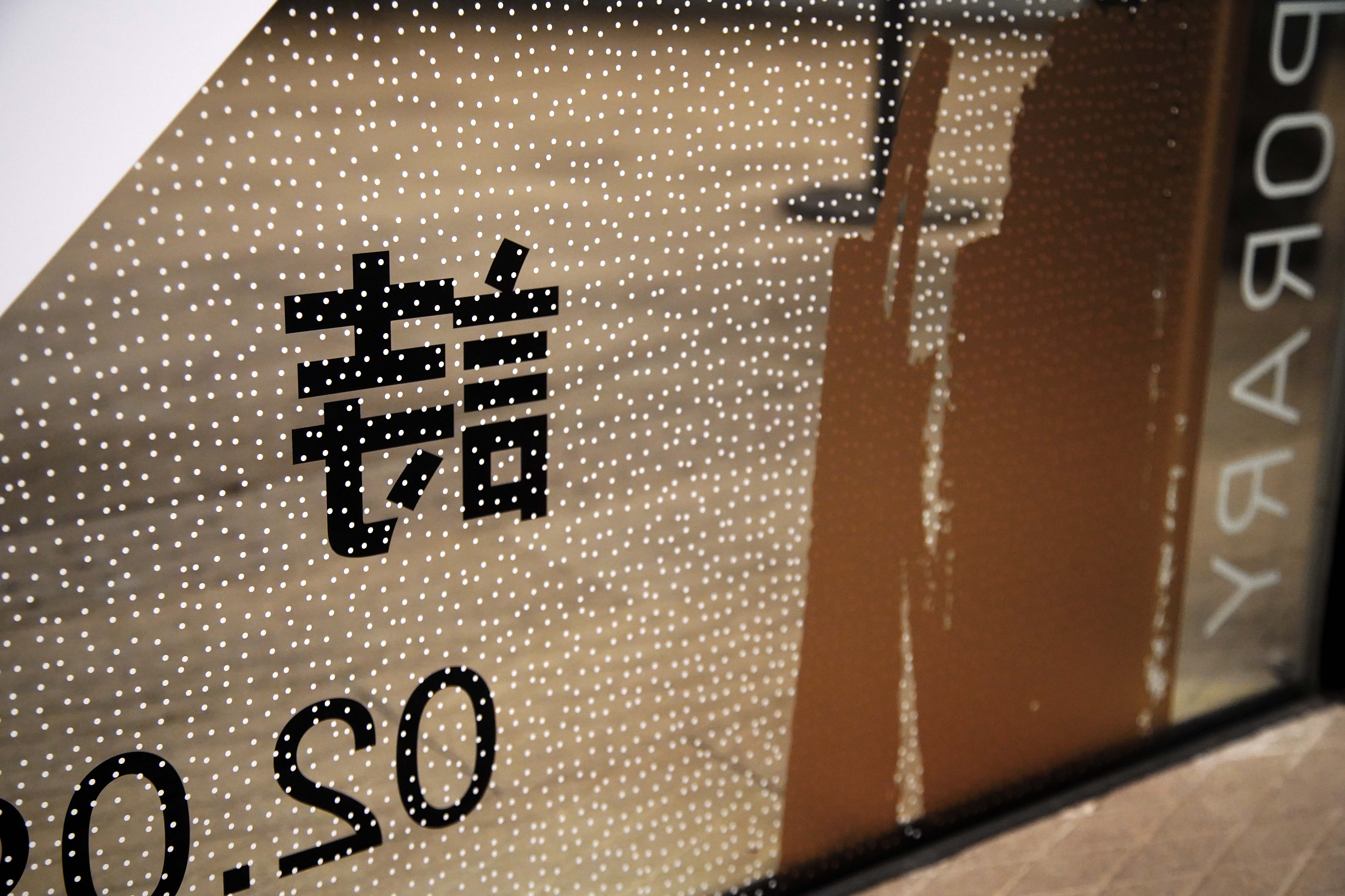
Sarah Morris: Who is Who 誰是誰 16 Mar—14 Apr, 2024
Tai Kwun Contemporary, Hong Kong
Key visual identity and exhibition graphics for Sarah Morris: Who is Who 誰是誰. Tai Kwun Contemporary presents Who is Who, an exhibition of new work by the artist Sarah Morris. The exhibition features her latest film ETC alongside a site-specific wall painting Lippo [Paul Rudolph].
Artist Sarah Morris
Scope Exhibition Key Visual Identity, Exhibition Graphics
Project completed at HATO
Photography courtesy of Tai Kwun Contemporary


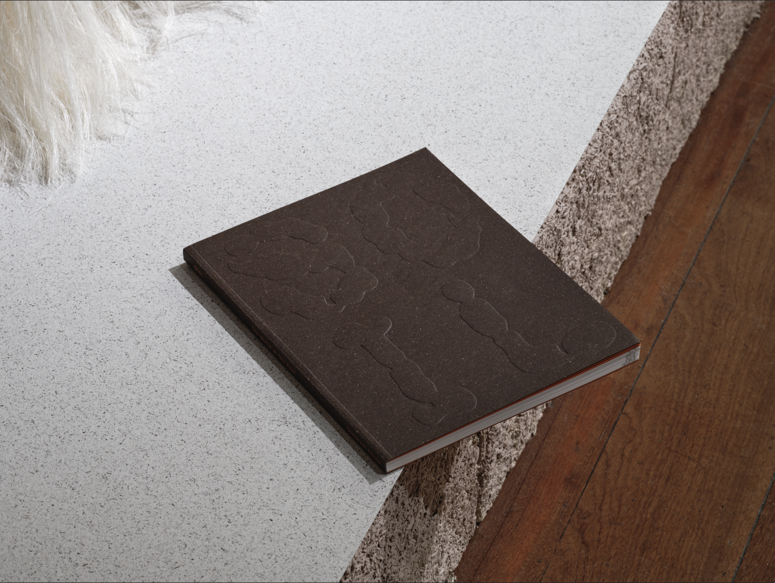


Soil 16 Mar—14 Apr, 2025
Somerset House, London
Key visual identity, exhibition graphics and catalogue design for Soil – The World at Our Feet at Somerset House.
Scope Exhibition Key Visual Identity, Exhibition Graphics, Catalogue Design
Project completed at HATO
Photography courtesy of Thomas Adank
Somerset House, London
Key visual identity, exhibition graphics and catalogue design for Soil – The World at Our Feet at Somerset House.
Scope Exhibition Key Visual Identity, Exhibition Graphics, Catalogue Design
Project completed at HATO
Photography courtesy of Thomas Adank
New Contemporaries 2025
London, UK
New identity and logo for New Contemporaries.
New Contemporaries is a leading UK-based arts organisation founded in 1949 that provides platform and support for emerging and early career artists, a diverse range of creative practices and new voices in contemporary art. Each year, New Contemporaries curates a national group exhibition with a selection of artists from across the UK, touring in major art venues across the country.
Scope Brand Identity, Logo
Project completed at HATO


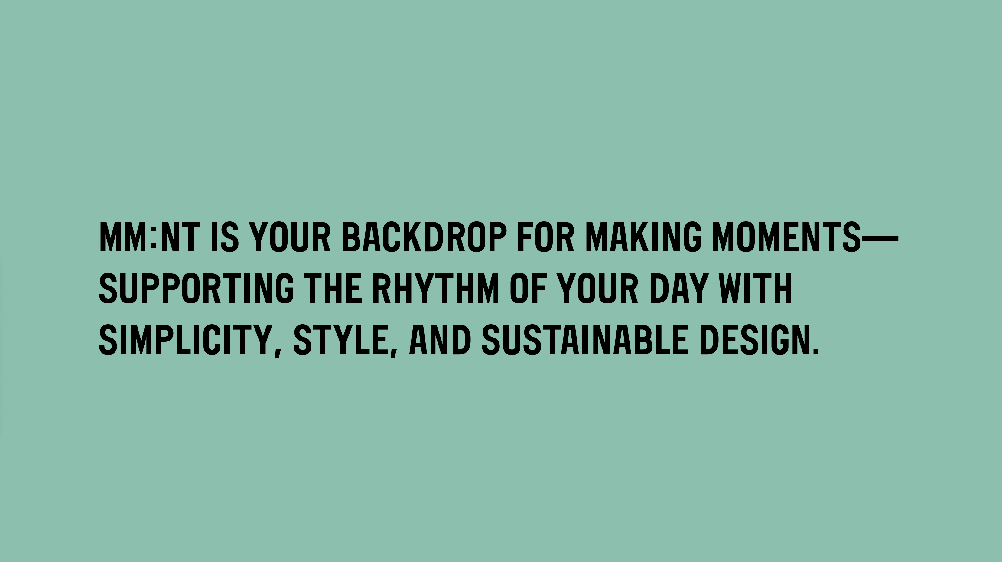


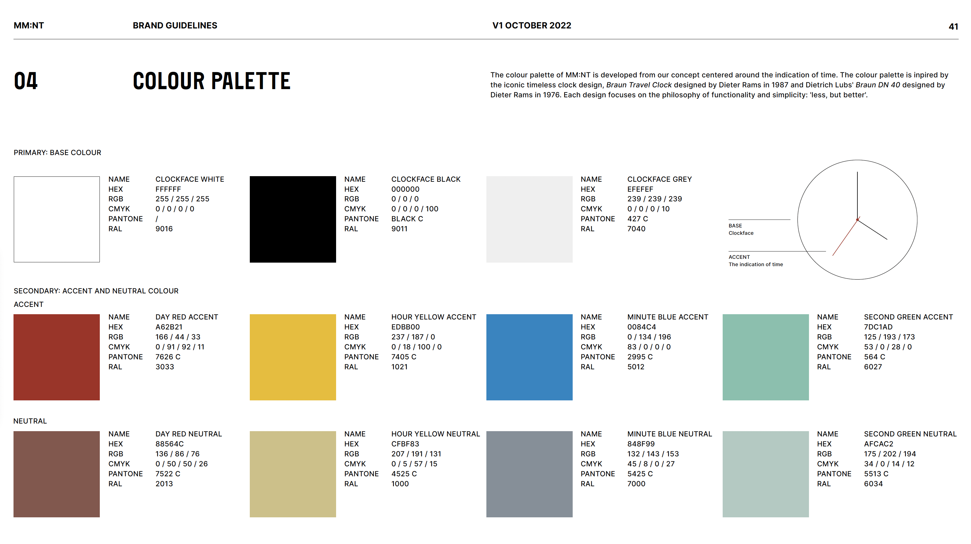
MM:NT 2024
Berlin, Germany
Art direction and design for MM:NT, a Berlin-based apart-hotel focused on transforming unused, underutilised spaces into sustainable and comfortable places to stay. The brand identity includes naming, logo, imagery, and digital touchpoints. The brand is centred around the fleeting moments of travel, using a digital clockface to visually reinforce this concept. With an ethos of “everything you need and nothing you don’t,” we drew inspiration from minimalist design icons like Dieter Rams, creating a clean and considered visual language that reflects the brand’s focus on simplicity.
Scope Brand Identity
Project completed at HATO
Photography courtesy of Lars Brønseth
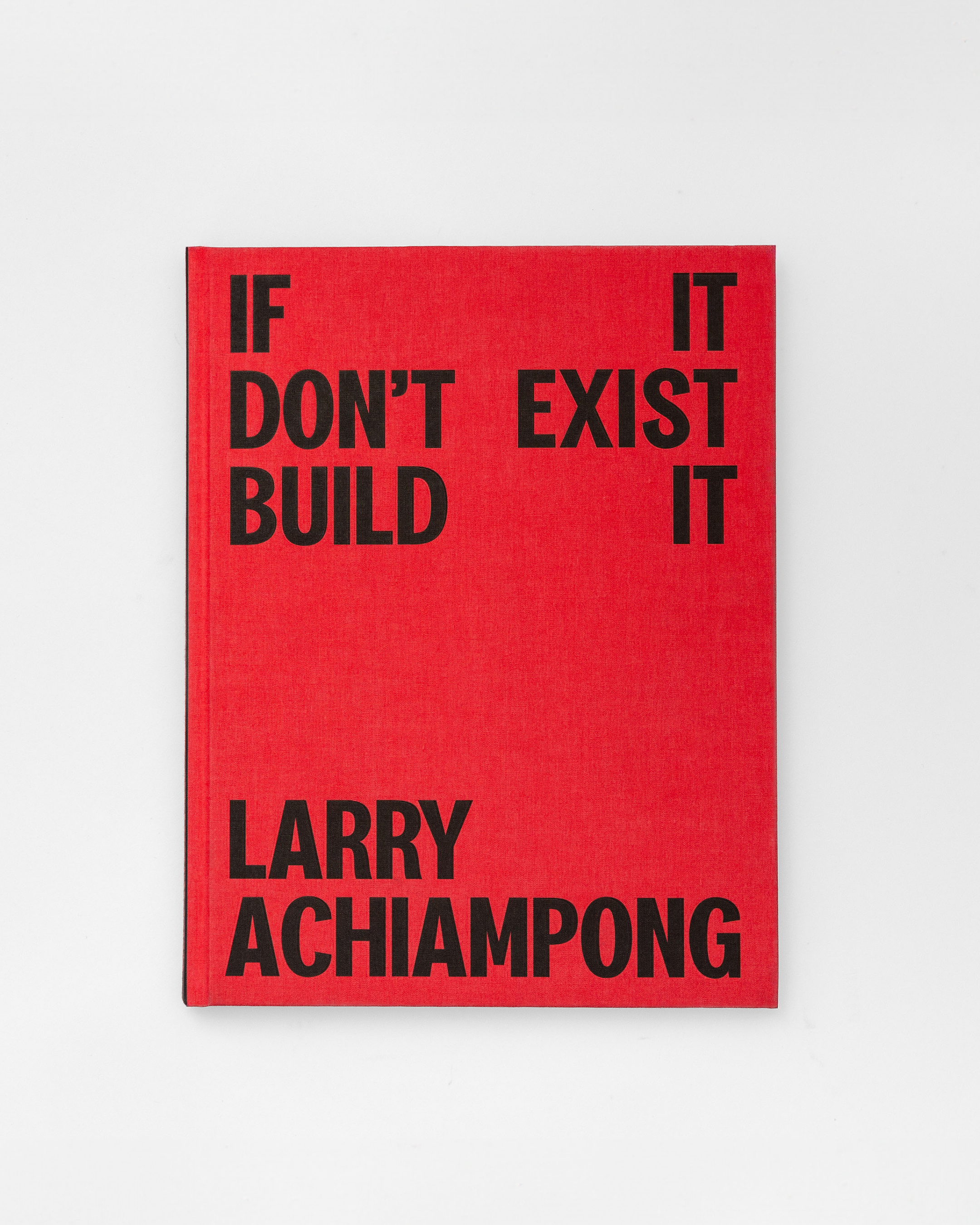
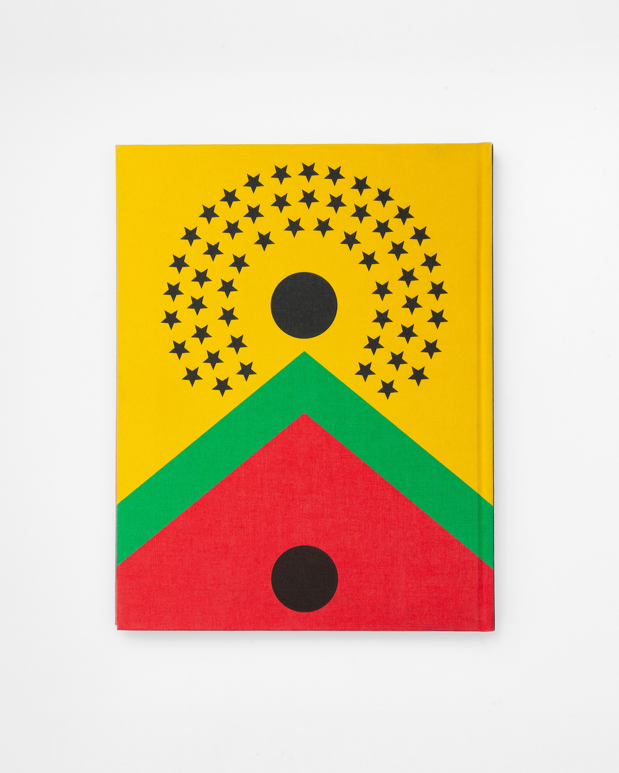
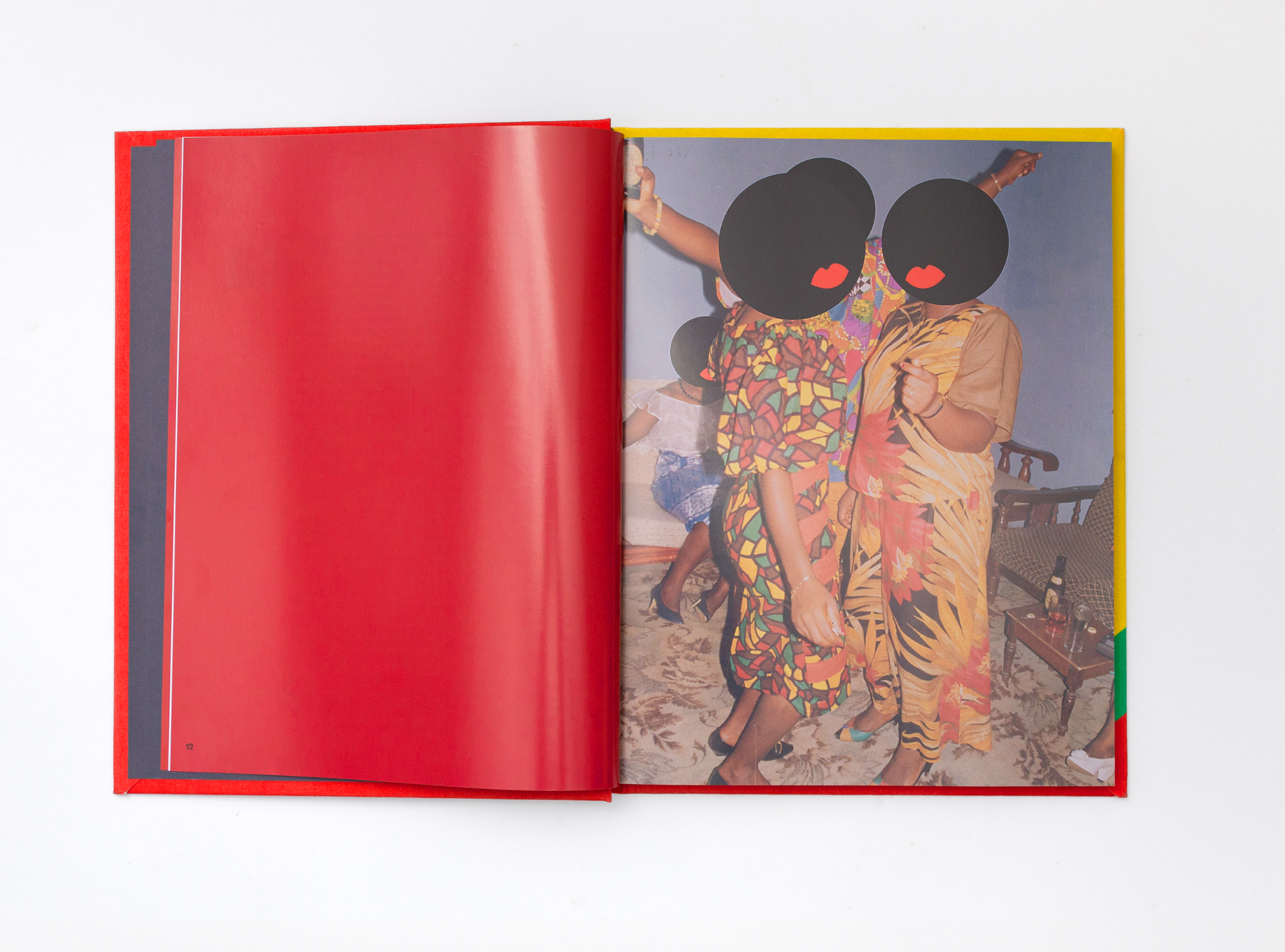
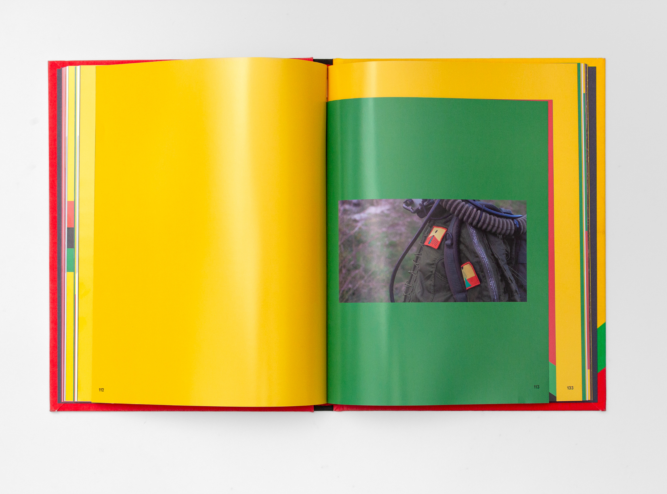
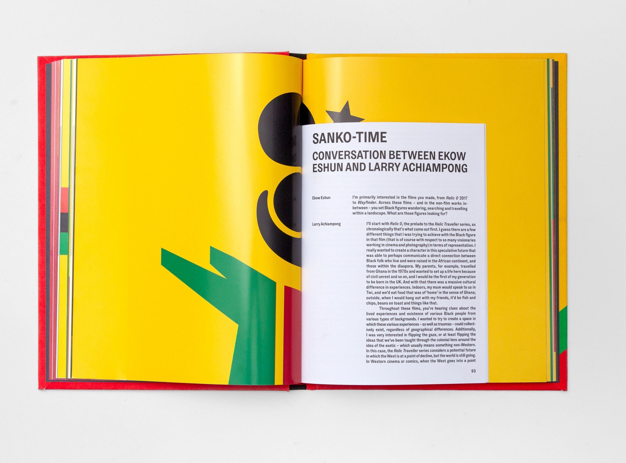
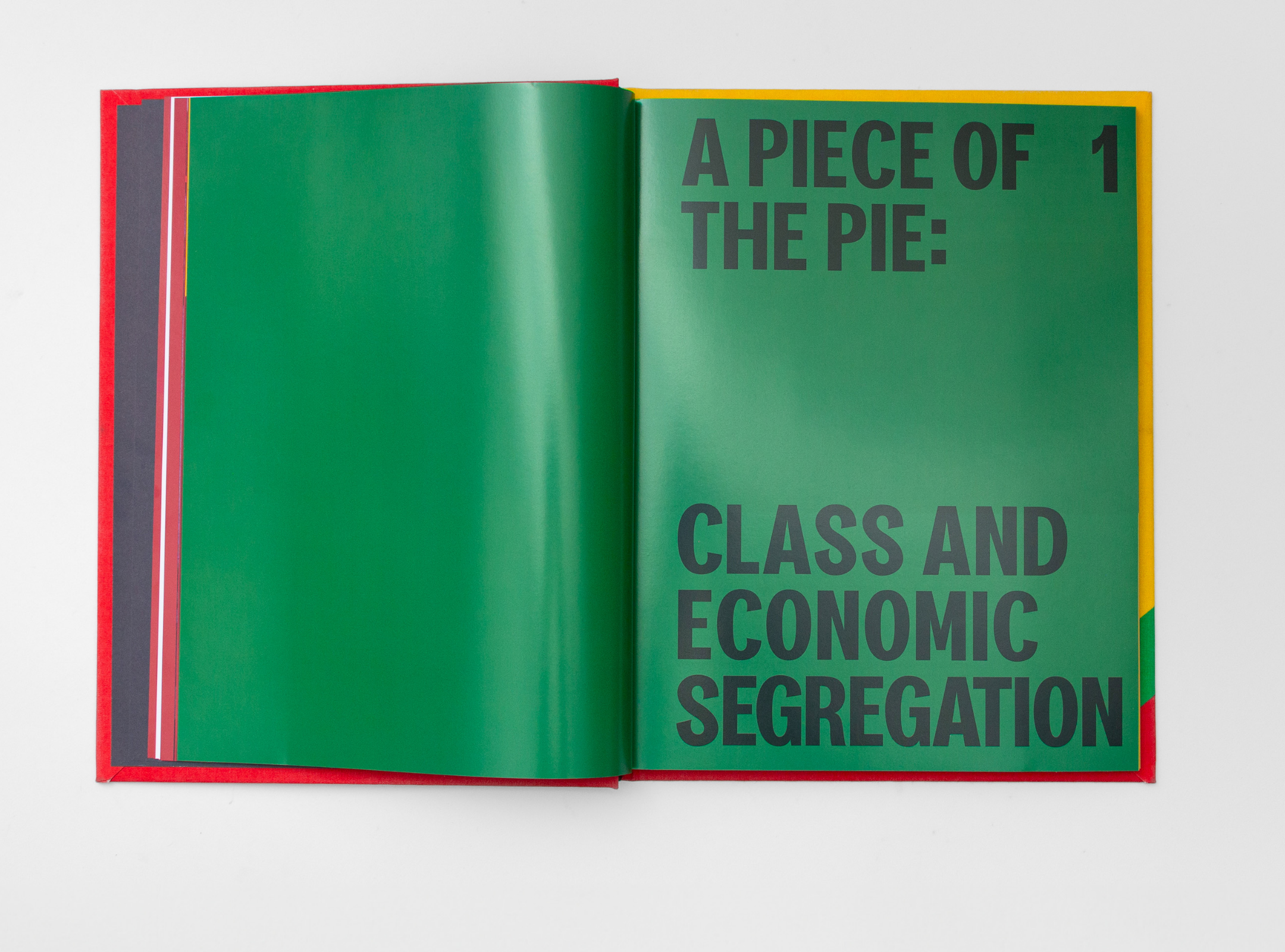


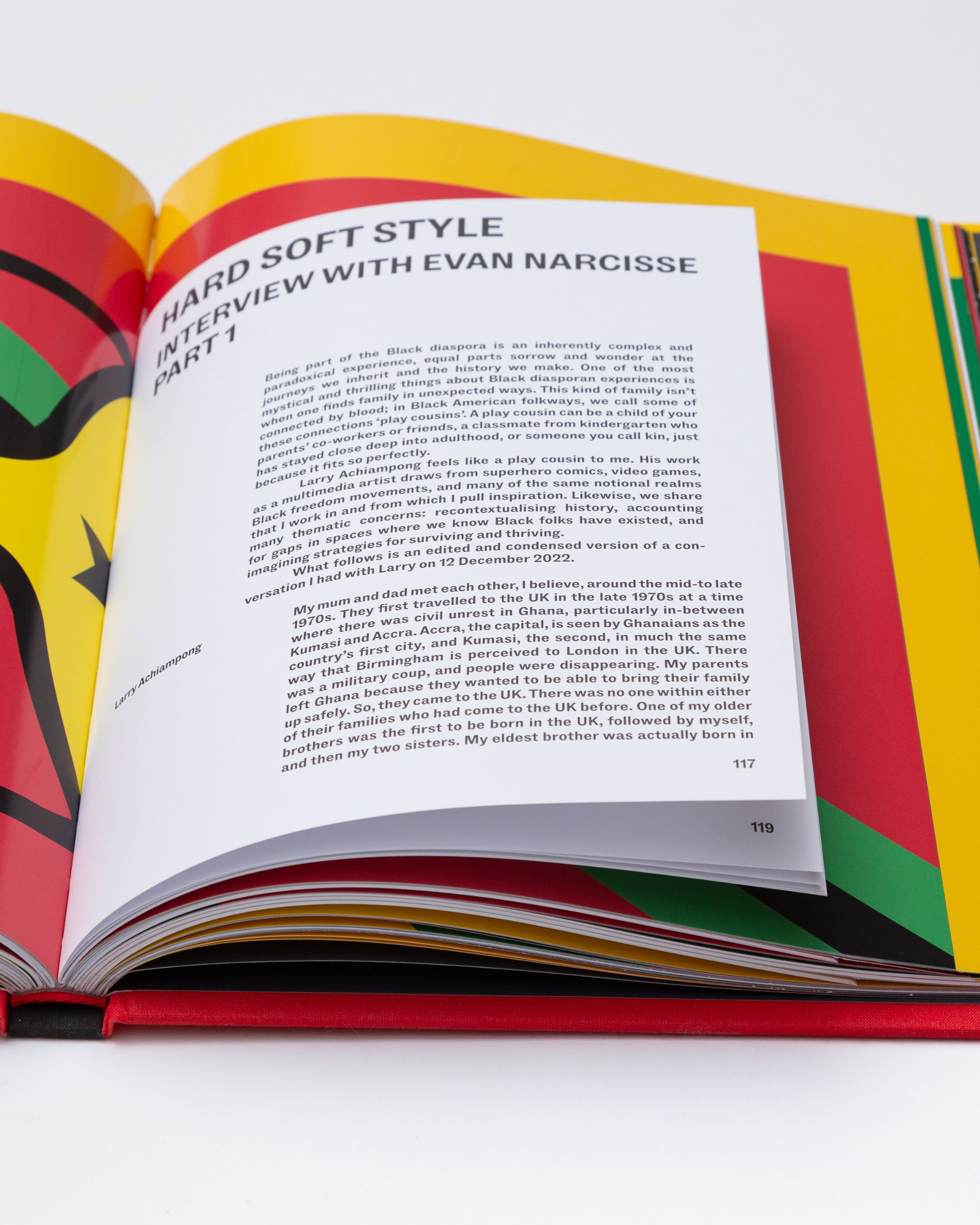

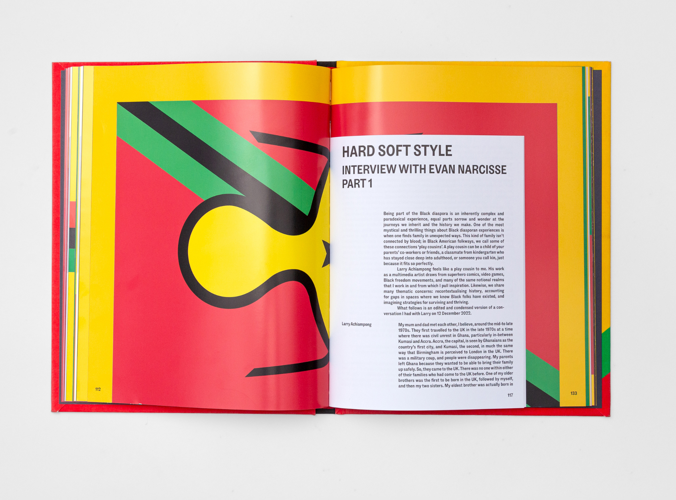

If It Don’t Exist, Build It 2025
Tate, London
Art direction and Book design ‘If It Don’t Exist, Build It’ by Larry Achiampong with Tate Publishing.
Artist Larry Achiampong
Scope Book Design
Project completed at HATO
Tate, London
Art direction and Book design ‘If It Don’t Exist, Build It’ by Larry Achiampong with Tate Publishing.
Artist Larry Achiampong
Scope Book Design
Project completed at HATO
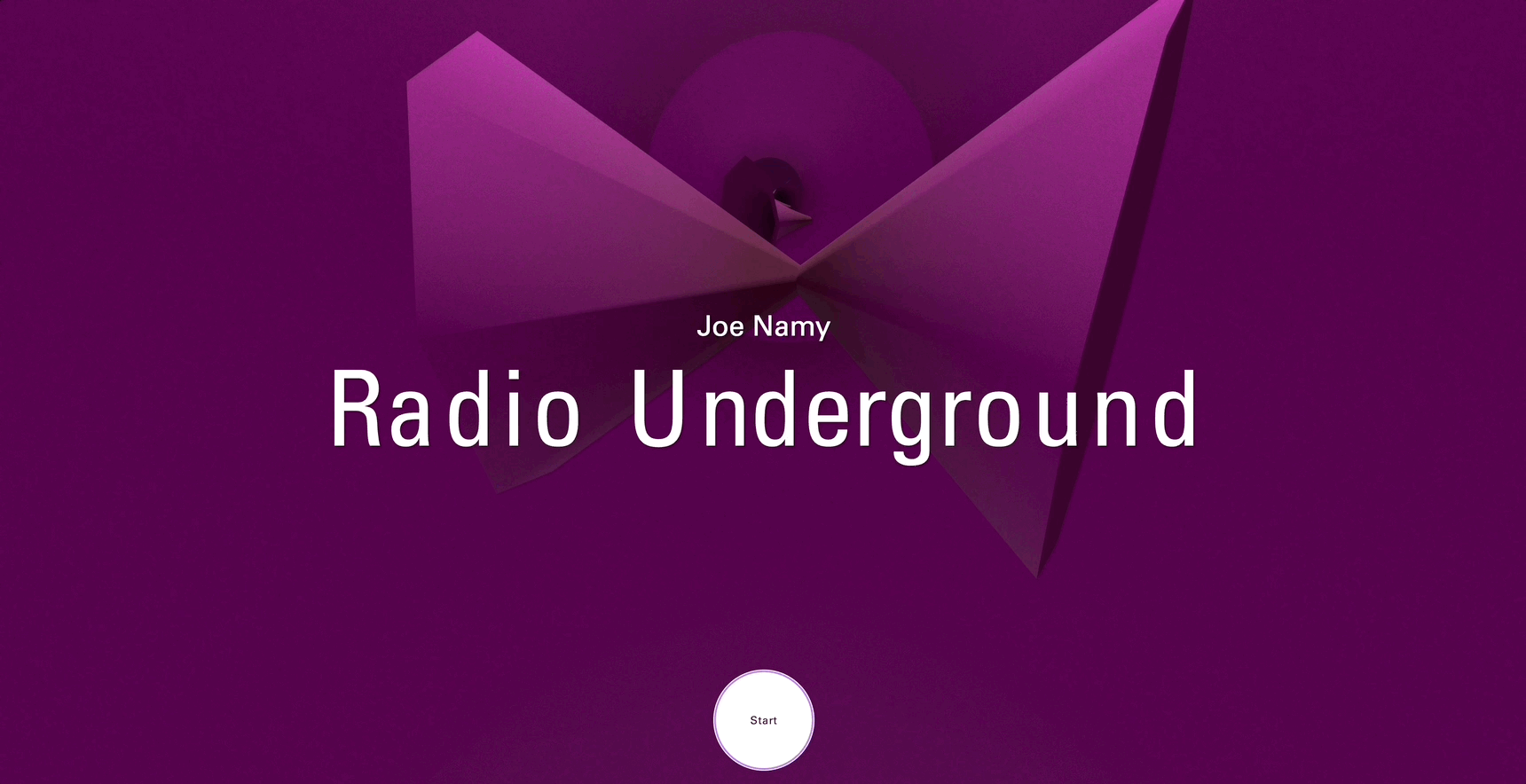


Radio Underground 16 Mar—14 Apr, 2025
Art on the Underground, Waterloo
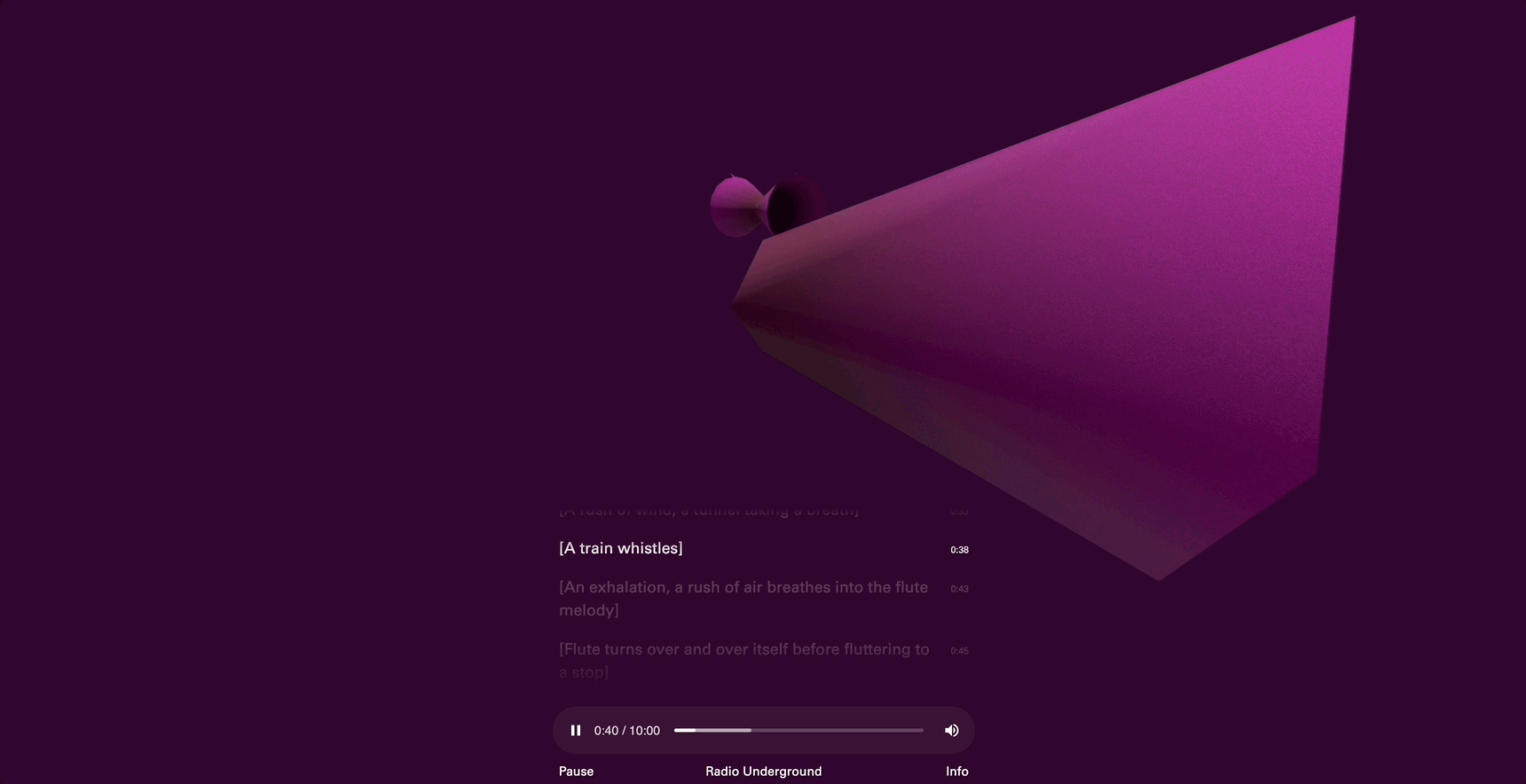
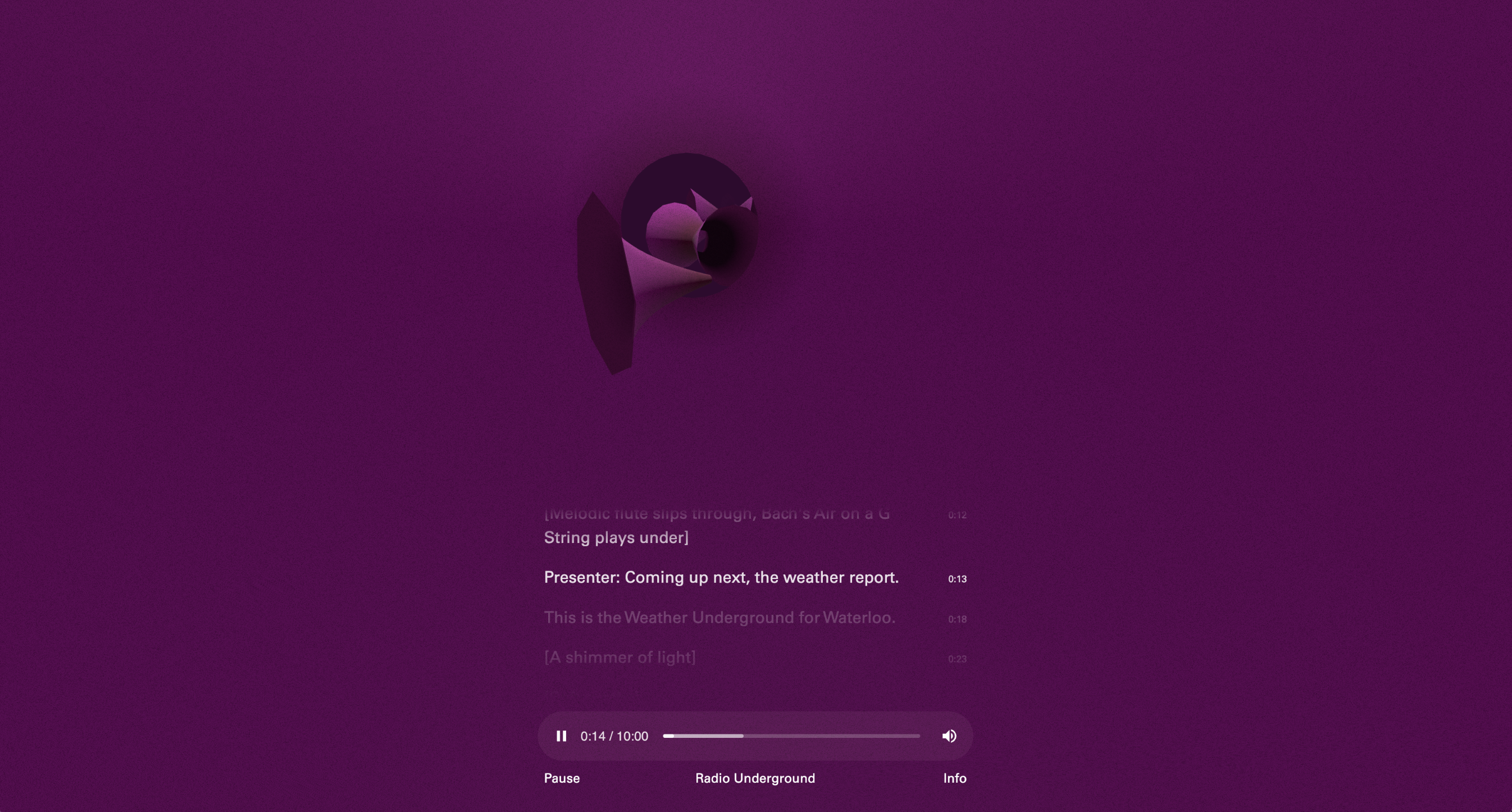
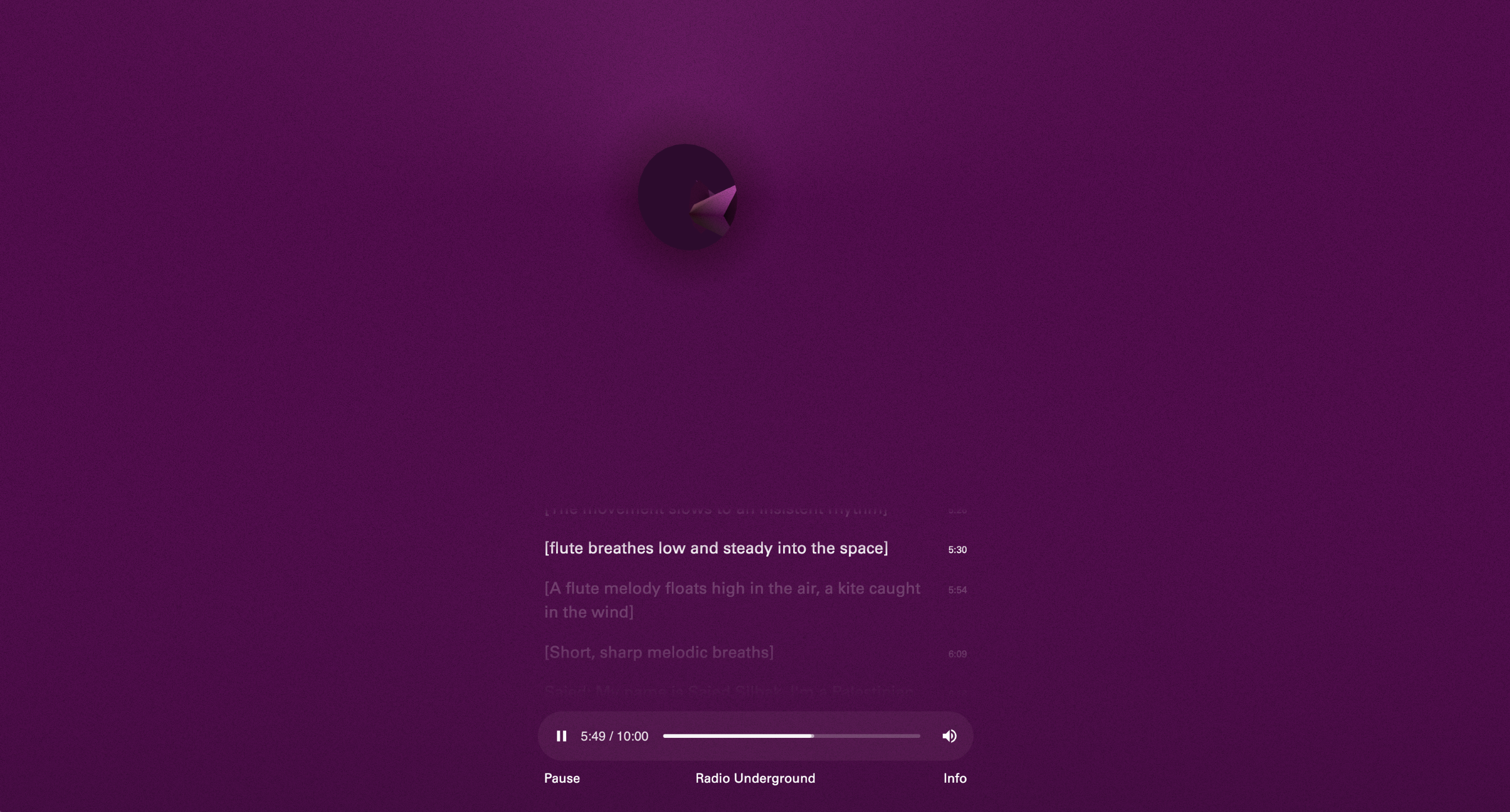
Art direction and design for the key visual identity and mini site of ‘Radio Underground’ by artist Joe Namy for Art on the Underground.
The sound piece by Joe has been developed in collaboration with Sister Midnight, Colour Factory, and PalMusic UK.
The key visual identity is designed with reference to the image bank of tannoys and horn speakers in Joe’s research, they are in different forms, types and materials and made for the purpose of public announcement in different period of time. The identity is applied as various cut-out speaker shapes with transcript texts coming from within, typesetting with variation in spacing in response to vibrations and rhythms in sound.
Visit the website ︎ Radio Underground
Artist Joe Namy
Scope Key Visual Identity, Mini site
Project completed at HATO
Photo credit: Joe Namy, ‘Radio Underground’, 2024. Waterloo Underground station. Commissioned by Art on the Underground. Photo: GG Archard
Art on the Underground, Waterloo
Art direction and design for the key visual identity and mini site of ‘Radio Underground’ by artist Joe Namy for Art on the Underground.
The sound piece by Joe has been developed in collaboration with Sister Midnight, Colour Factory, and PalMusic UK.
The key visual identity is designed with reference to the image bank of tannoys and horn speakers in Joe’s research, they are in different forms, types and materials and made for the purpose of public announcement in different period of time. The identity is applied as various cut-out speaker shapes with transcript texts coming from within, typesetting with variation in spacing in response to vibrations and rhythms in sound.
Visit the website ︎ Radio Underground
Artist Joe Namy
Scope Key Visual Identity, Mini site
Project completed at HATO
Photo credit: Joe Namy, ‘Radio Underground’, 2024. Waterloo Underground station. Commissioned by Art on the Underground. Photo: GG Archard
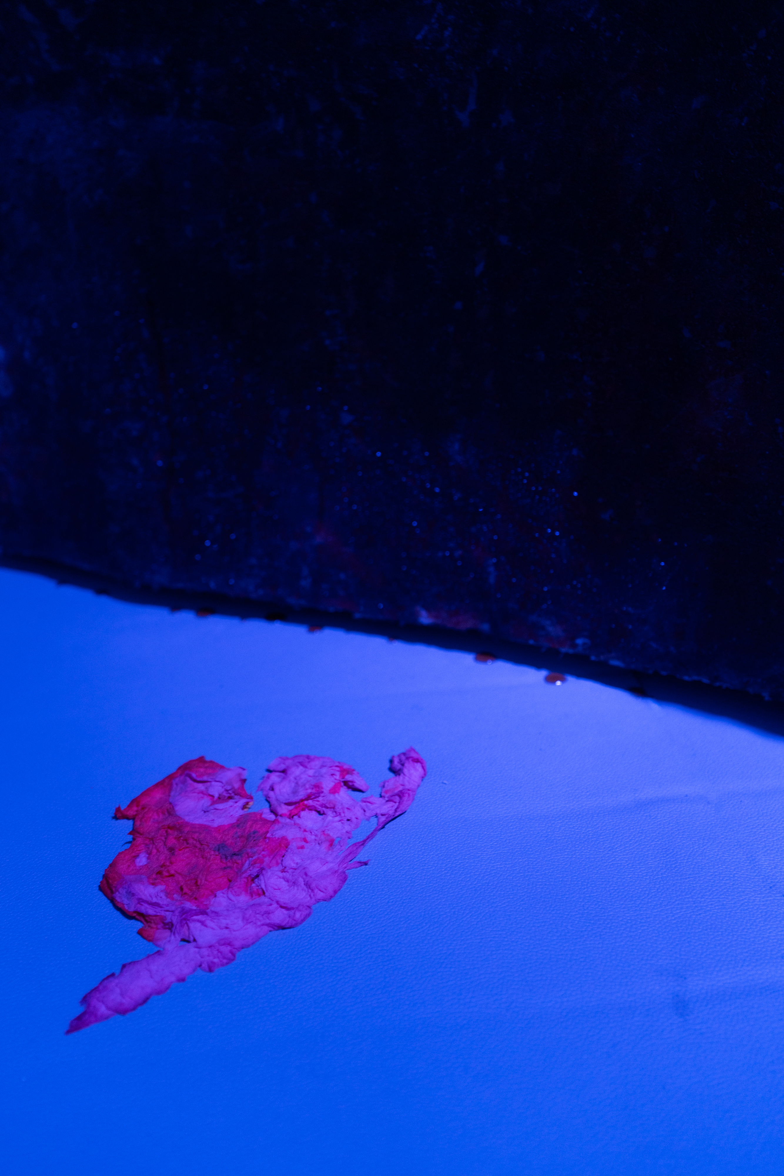

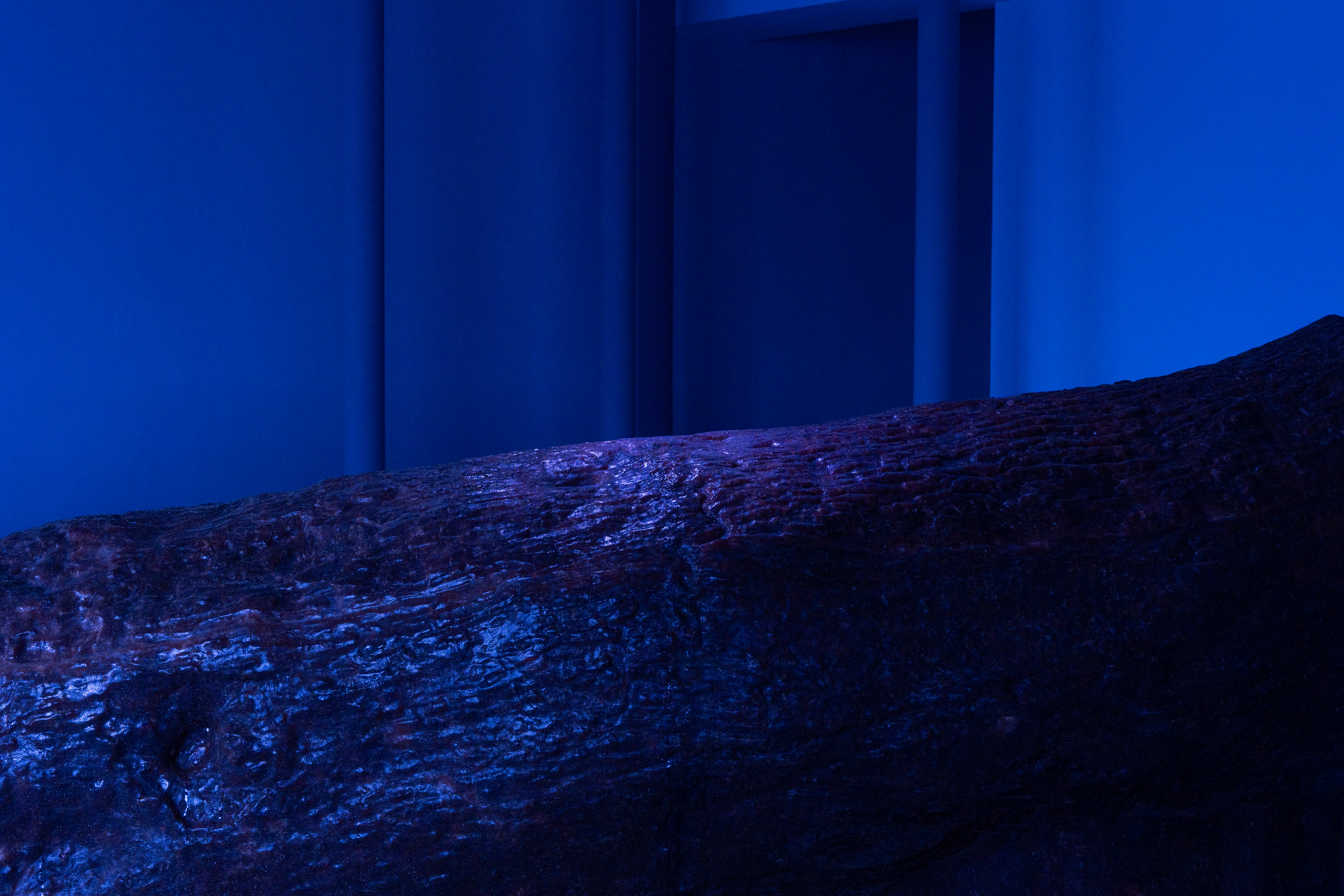


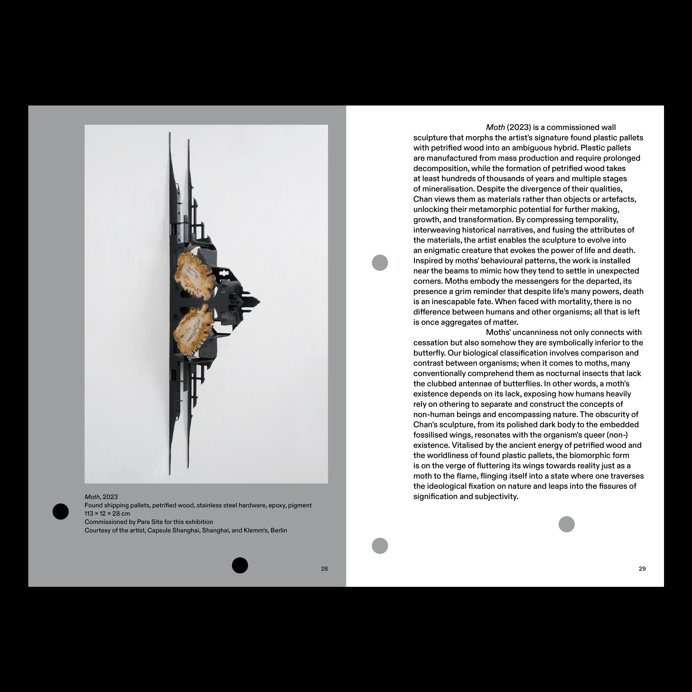
Soft breath 微息 6 Mar—28 July, 2024
Para Site 677 King's Road, Quarry Bay, Hong Kong
Key visual identity, catalogue design and exhibition graphics for ‘Soft breath’ 微息 by Trevor Yeung 楊沛鏗, curated by Billy Tang at Para Site.
Artist Trevor Yeung 楊沛鏗
Scope Exhibition Key Visual Identity, Exhibition Graphics, Book Design, Print Collaterals
Installation view of Trevor Yeung: ‘Soft breath’, 2024, Para Site, Hong Kong. Photo: Ray Leung.

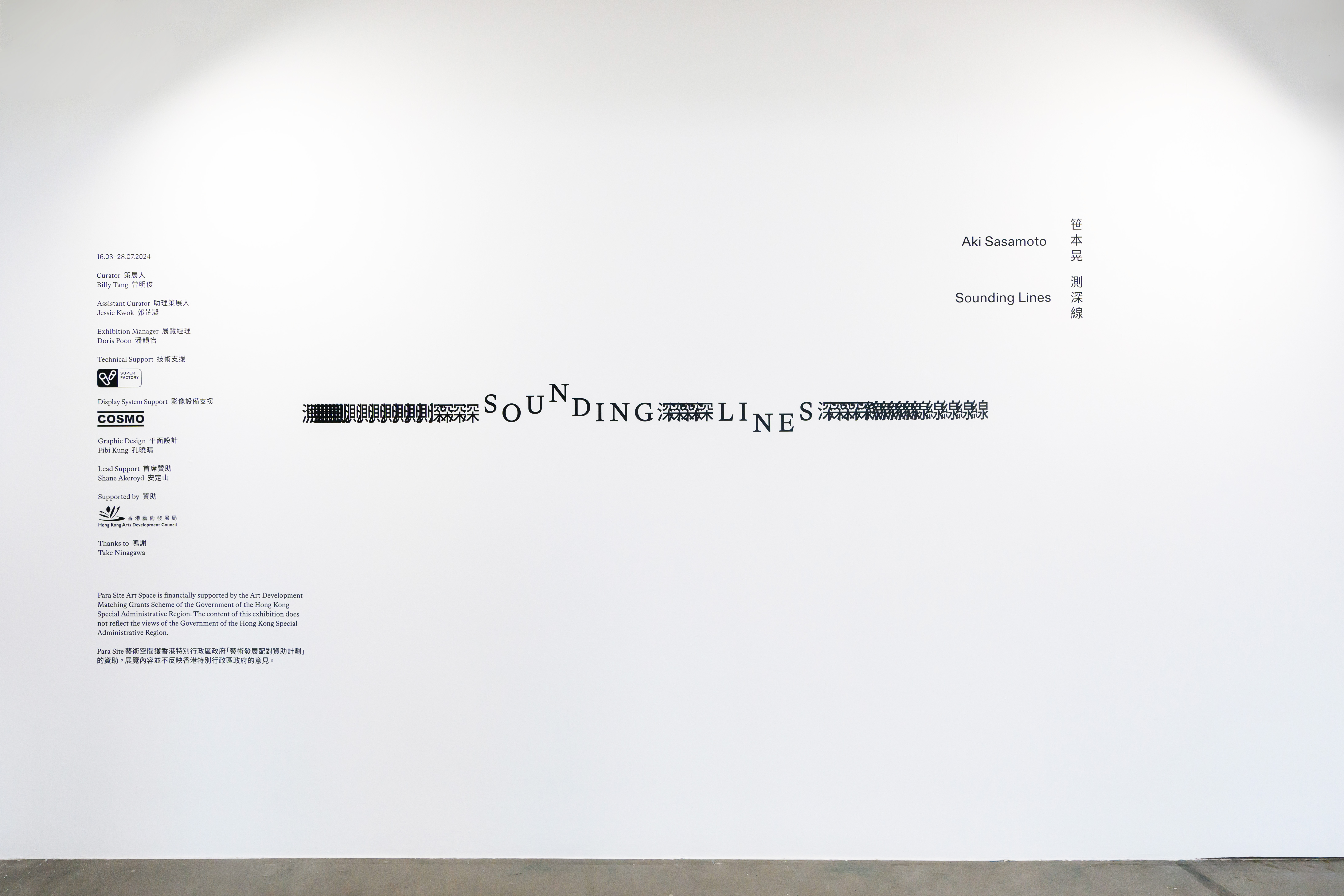


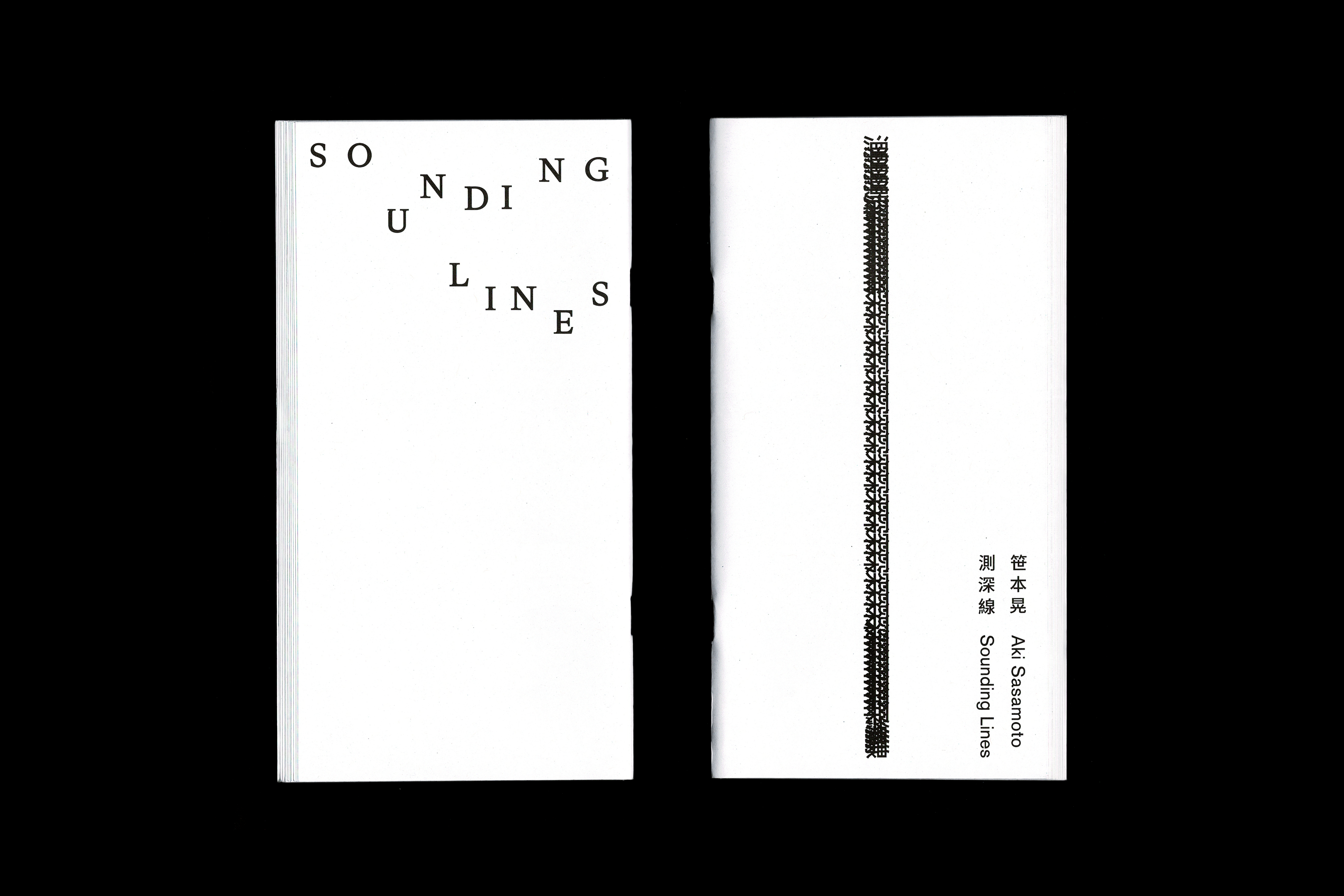
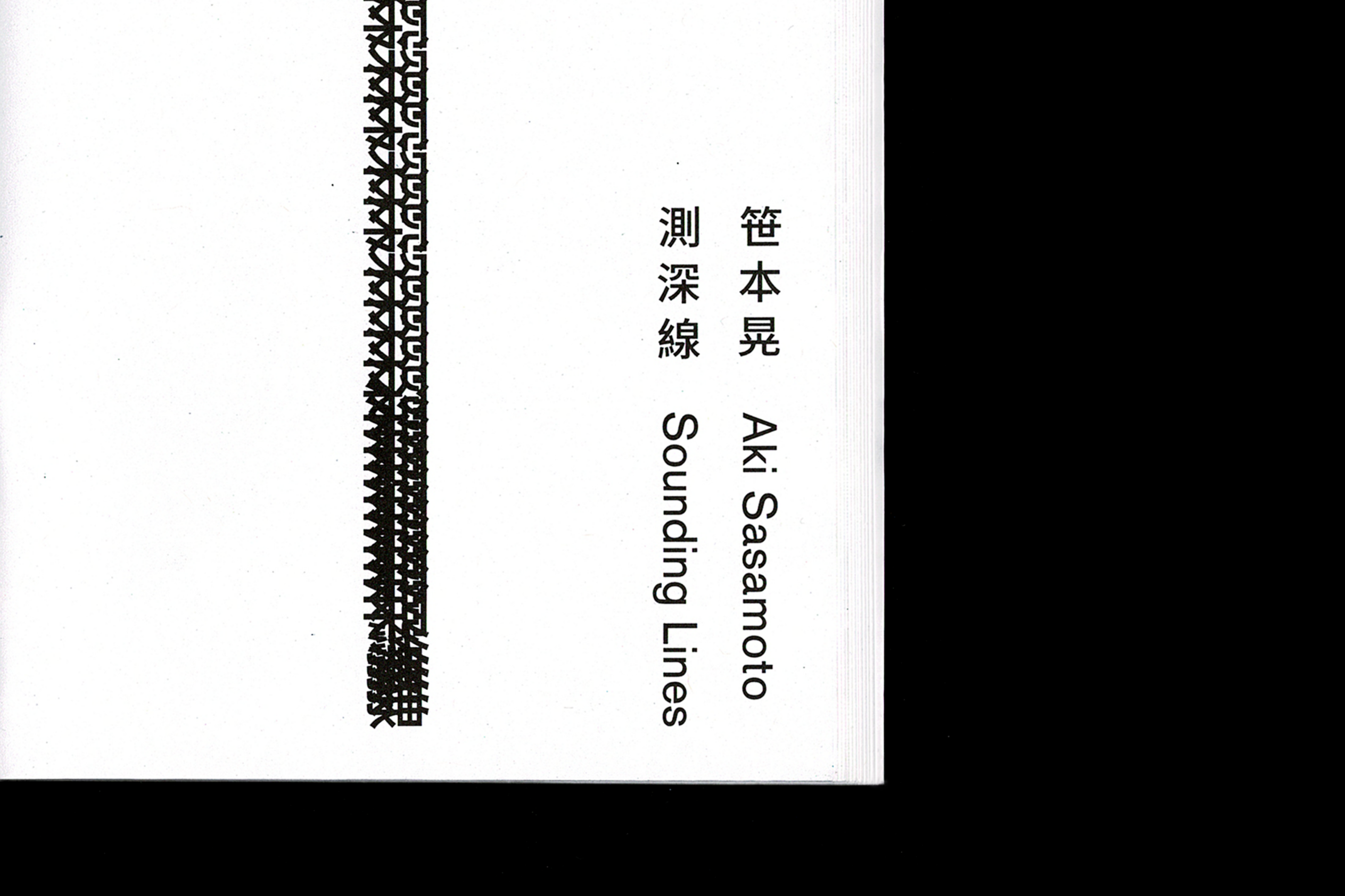


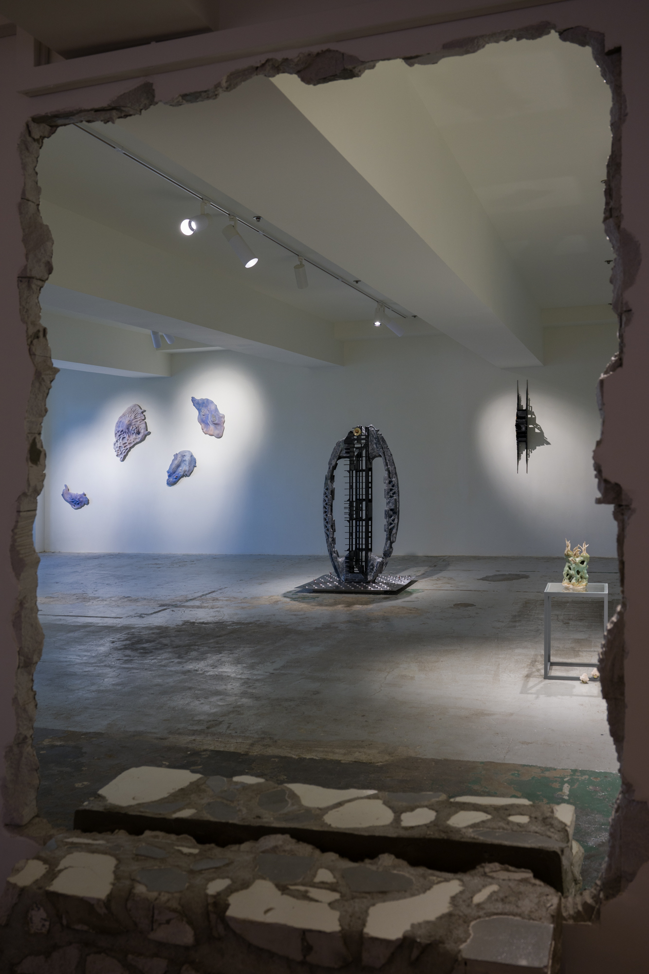
Sounding Lines 測深線 6 Mar—28 July, 2024
Para Site 677 King's Road, Quarry Bay, Hong Kong
Key visual identity, catalogue design and exhibition graphics for ‘Sounding Lines’ 測深線 by Aki Sasamoto 笹本晃, curated by Billy Tang at Para Site.
Rhythmic offset letters typeset like signals transmitting along a spring in a parabola curve while passages flow through the pages like a sounding line descending deep into the sea.
Artist Aki Sasamoto 笹本晃
Scope Exhibition Key Visual Identity, Exhibition Graphics, Book Design, Print Collaterals
Installation view of Aki Sasamoto: ‘Sounding Lines’, 2024, Para Site, Hong Kong. Photo: Studio Lights On.


Hope 希望 — Patricia Piccinini 24 May—3 Sep, 2023
Tai Kwun Contemporary, Hong Kong
Key visual identity for Patricia Piccinini, Hope 希望 at Tai Kwun Contemporary.
Featuring sculptural, photographic and filmic works by the Australian artist Patricia Piccinini, the immersive exhibition HOPE taps into our hopes and fears about the impact of science on humanity. Her hyperrealistic and surreal works, often rooted in art historical forms, explore various “unexpected consequences”, whether negative or positive. HOPE raises important questions about the nature of history, progress, and technology, and ponders our collective ability to create warm and caring relationships and to live lovingly with each other.
The bespoke type design and motion are inspired by The Awakening, 2020, Video (3’ loop), in both English and Traditional Chinese for the title of the show.
Artist Patricia Piccinini
Scope Exhibition Key Visual Identity, Exhibition Graphics
Project completed at HATO
Photography courtesy of Tai Kwun Contemporary


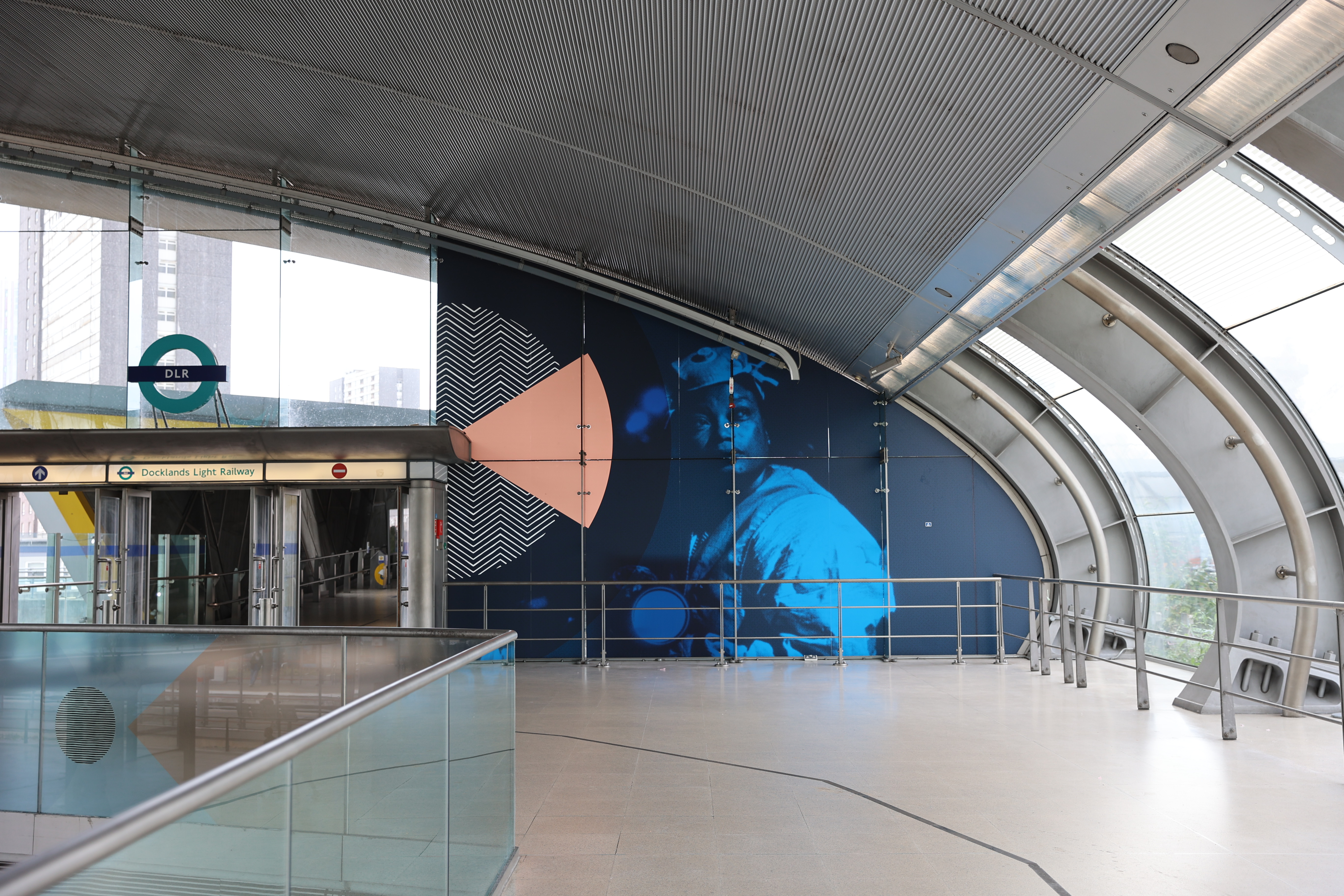
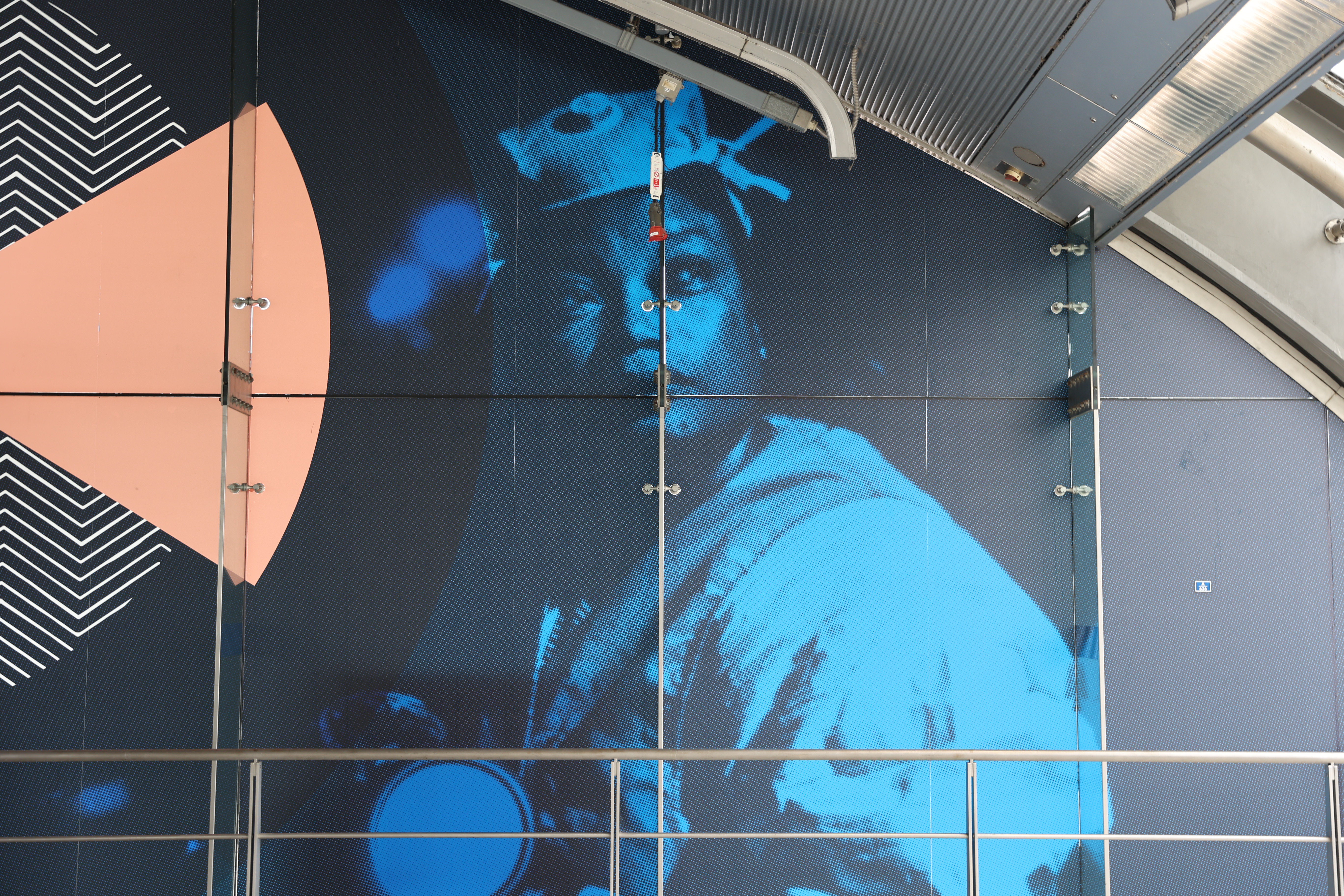
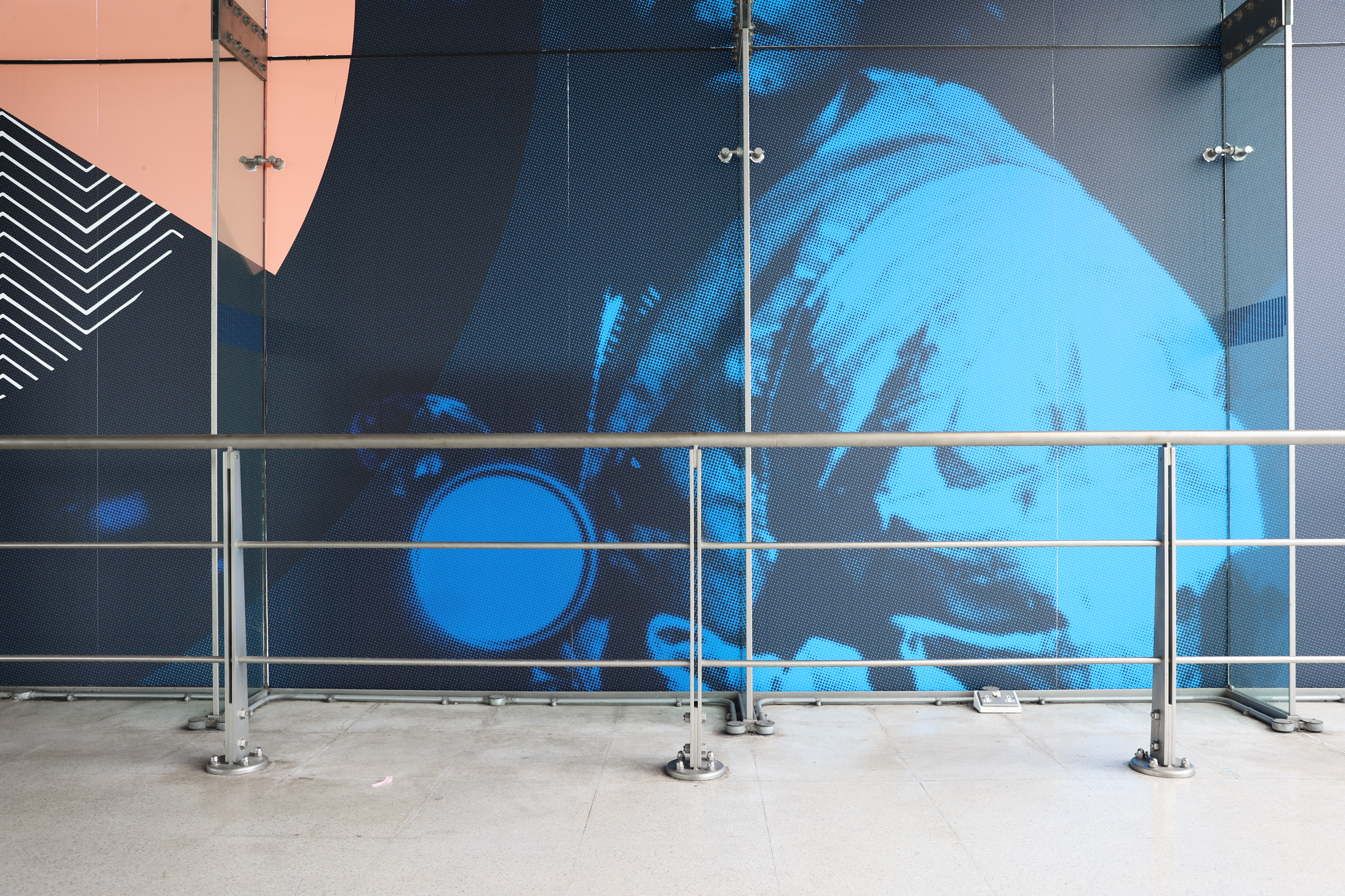


Declaration of Independence September 2023—September 2024
TfL Art on The UndergroundStratford, Bethnal Green and Notting Hill Green Tube stations, London
‘Declaration of Independence’ is a multi-site artwork by London-based artist Barby Asante in collaboration with Innavisions and TfL Art on The Underground.
‘Declaration of Independence’ was launched with a collective performance at Stratford Tube station, it was developed out of a series of workshops with TfL employees producing a script that was read and sung aloud to those congregated and passing through the station. Together, the newly written and performed declaration and station artworks foreground Black diaspora narratives of non-binary people and women. In producing this artwork, Asante spent time in the photography archives at the London Transport Museum finding images of women of colour at work in different roles across TfL’s history. These found images, including those employed by London Transport’s direct recruitment in Barbados in 1956, became a part of the group’s collective process, adding to individual narratives and enriching the artwork’s examination of postcolonial and migration histories.
The archive images can be seen in three large-scale visual artworks installed at Stratford, Bethnal Green and Notting Hill Green Tube stations.
Artist Barby Asante
Scope Visual Identity, Large-scaled Site Specific Graphics
Project completed at HATO
Photography courtesy of Tai Kwun Contemporary


Trees in Motion 20 Apr—18 May, 2024
Ensō London, 65A Hopton St, London
Trees in Motion - a collaborative exhibition between Cynthia Fan and Kamil Szczepaniak, and elements of the natural world that they draw creative inspiration from. Experimentation with the potential of plants as a sculptural medium form the basis of their conversation, and through the interactions of their works, they seek to focus on the subtleties of nature. The visual identity reflects this thoughtful interaction, with a refined line and carefully considered typography that translates the sculptural forms and arrangemnet of the artists’ work in a minimalist approach.
Artists Cynthia Fan, Kamil Szczepaniak
Scope Visual Identity, Leaflet, Exhibition Graphics


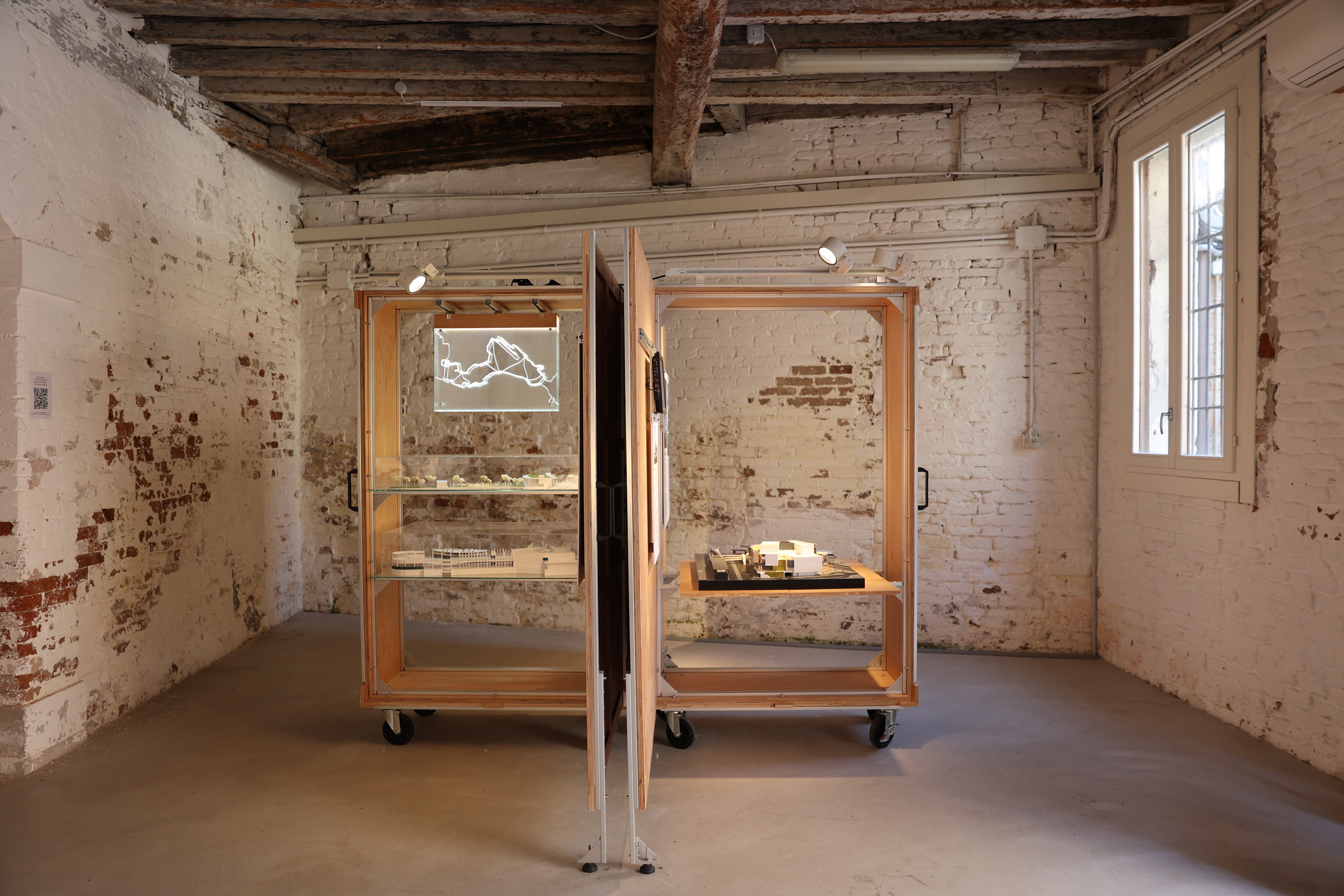

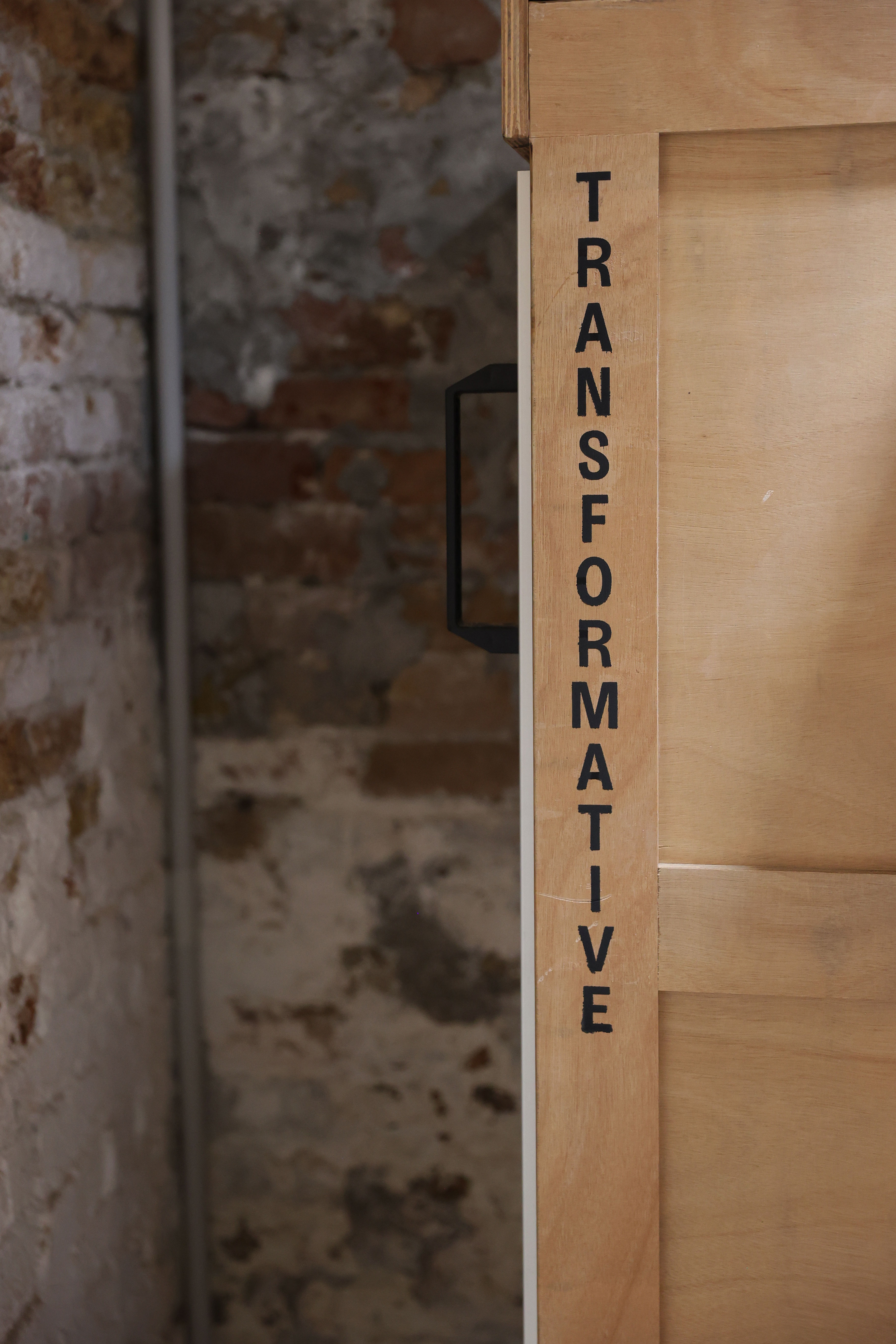
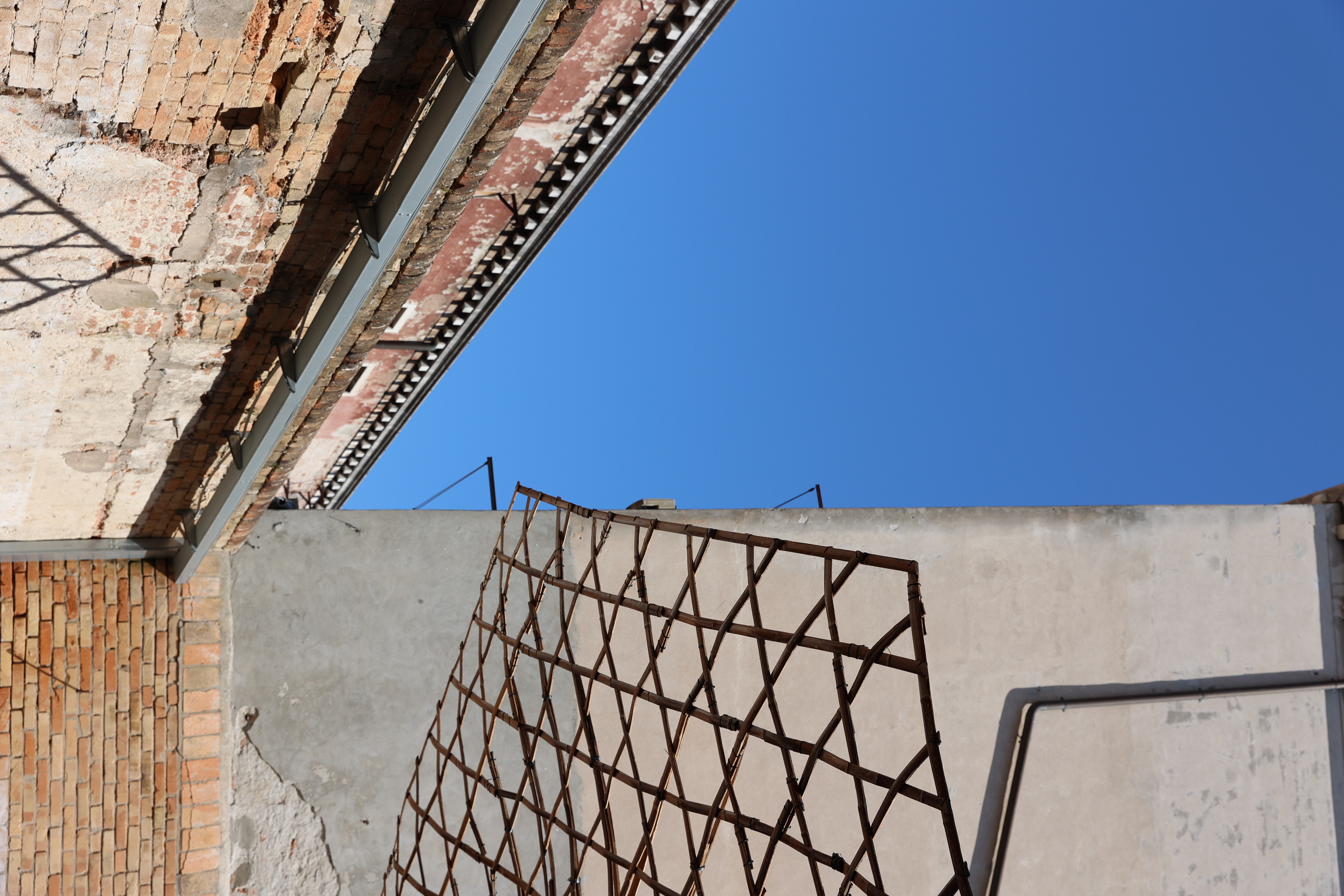
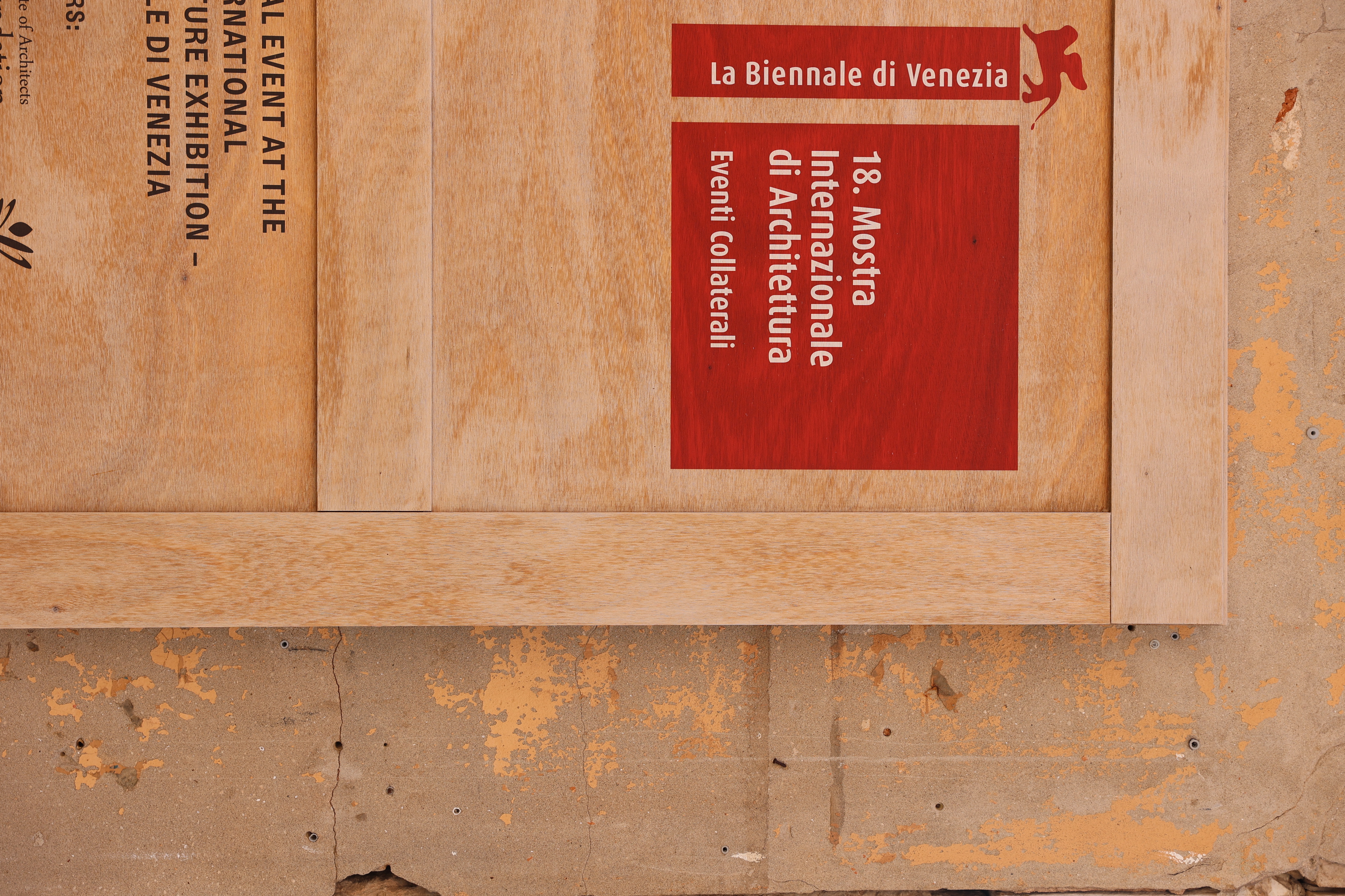


Transfomative Hong Kong 20 May—26 November 2023
Venice Biennale Architettura 2023, The Laboratory of the Future, Hong Kong Pavilion, Venice
Exhibition graphic system for the Hong Kong pavilion of Venice Biennale Architettura 2023 ‘Transformative Hong Kong’ curated and designed by Architecture Practice Sky Yutaka.
‘Transformative Hong Kong’ is this year's Venice Biennale Hong Kong pavilion proposal: The design is conceived as a travelling exhibition system whereby the same crates used for the transportation transform into various display systems once deployed.
Scope Visual Identity, Large-scaled Site Specific Graphics
Project completed at HATO
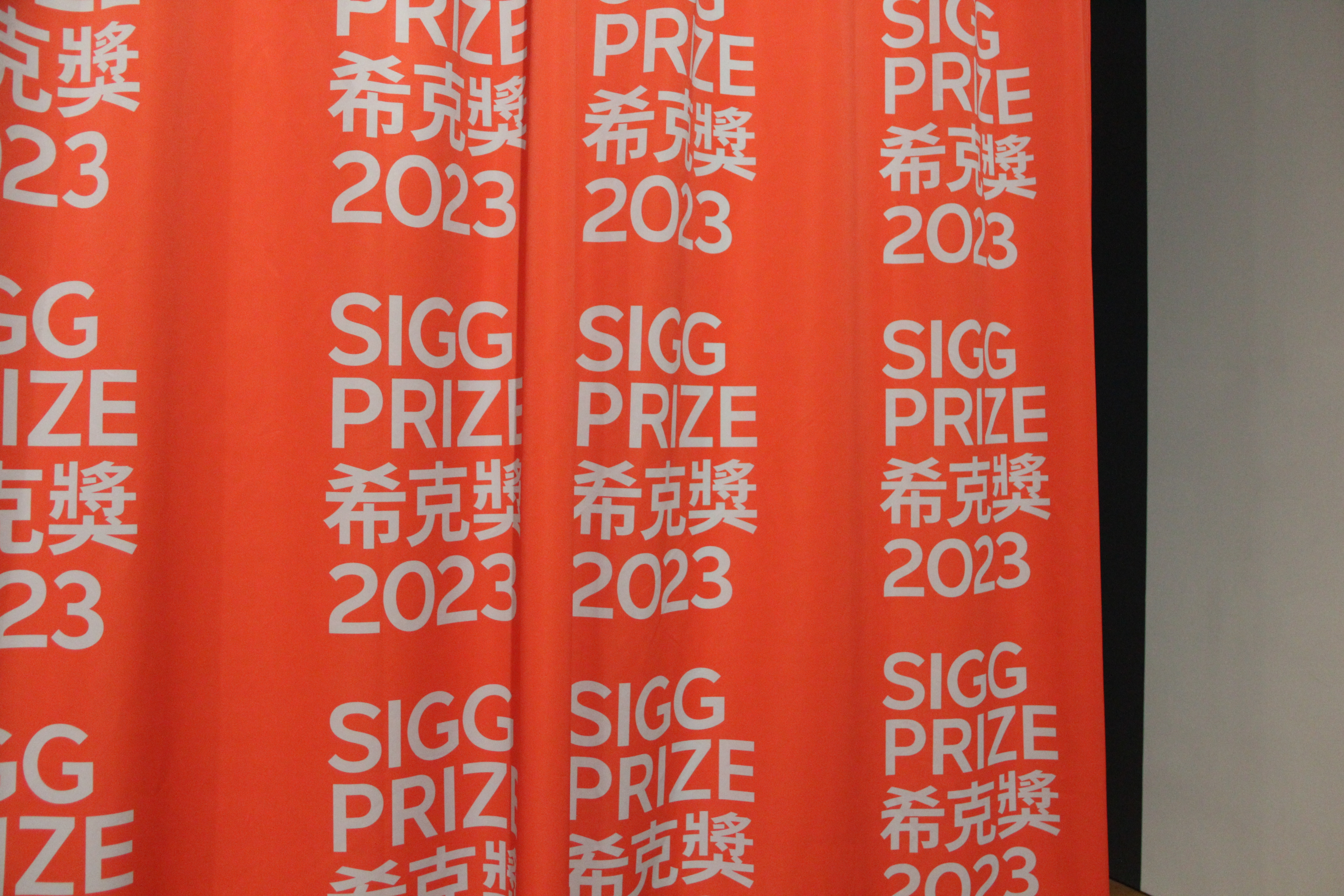
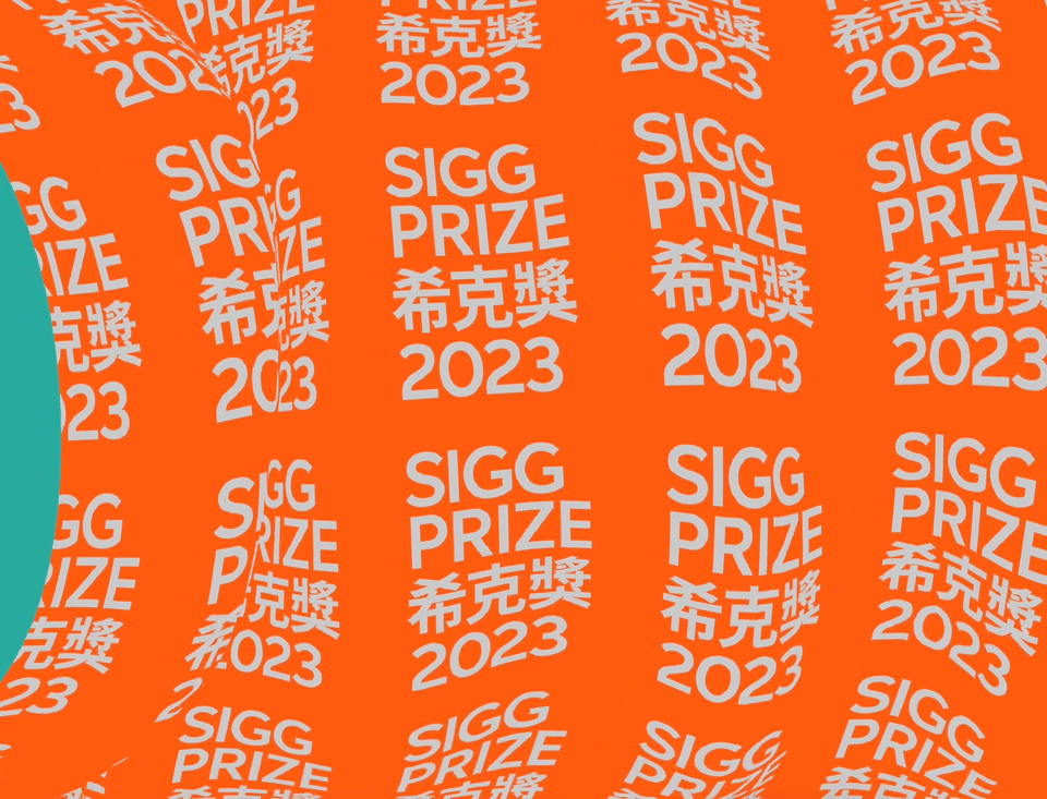
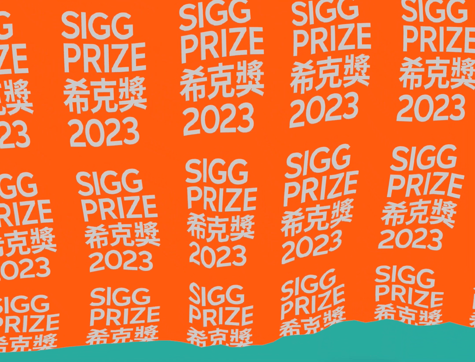
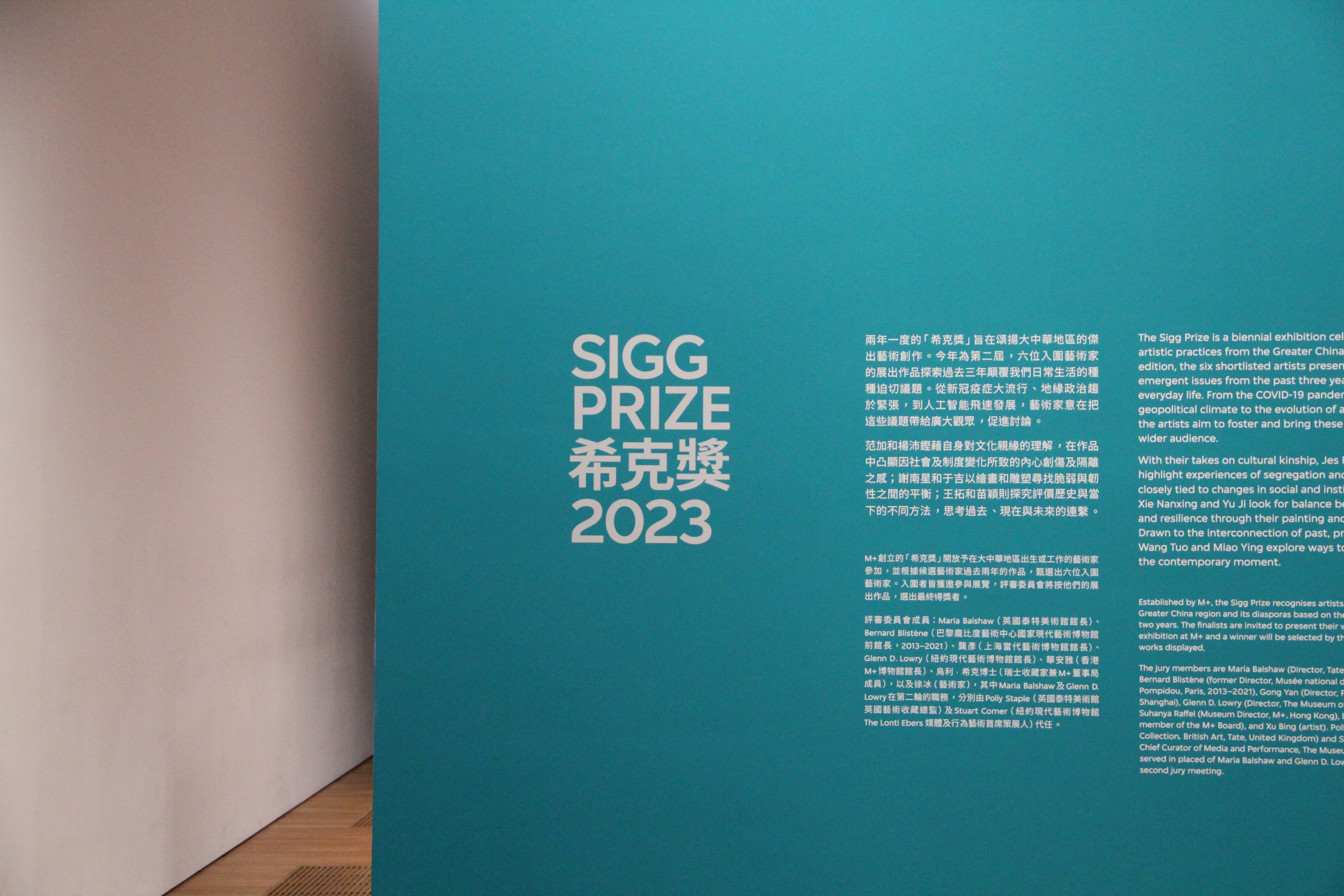
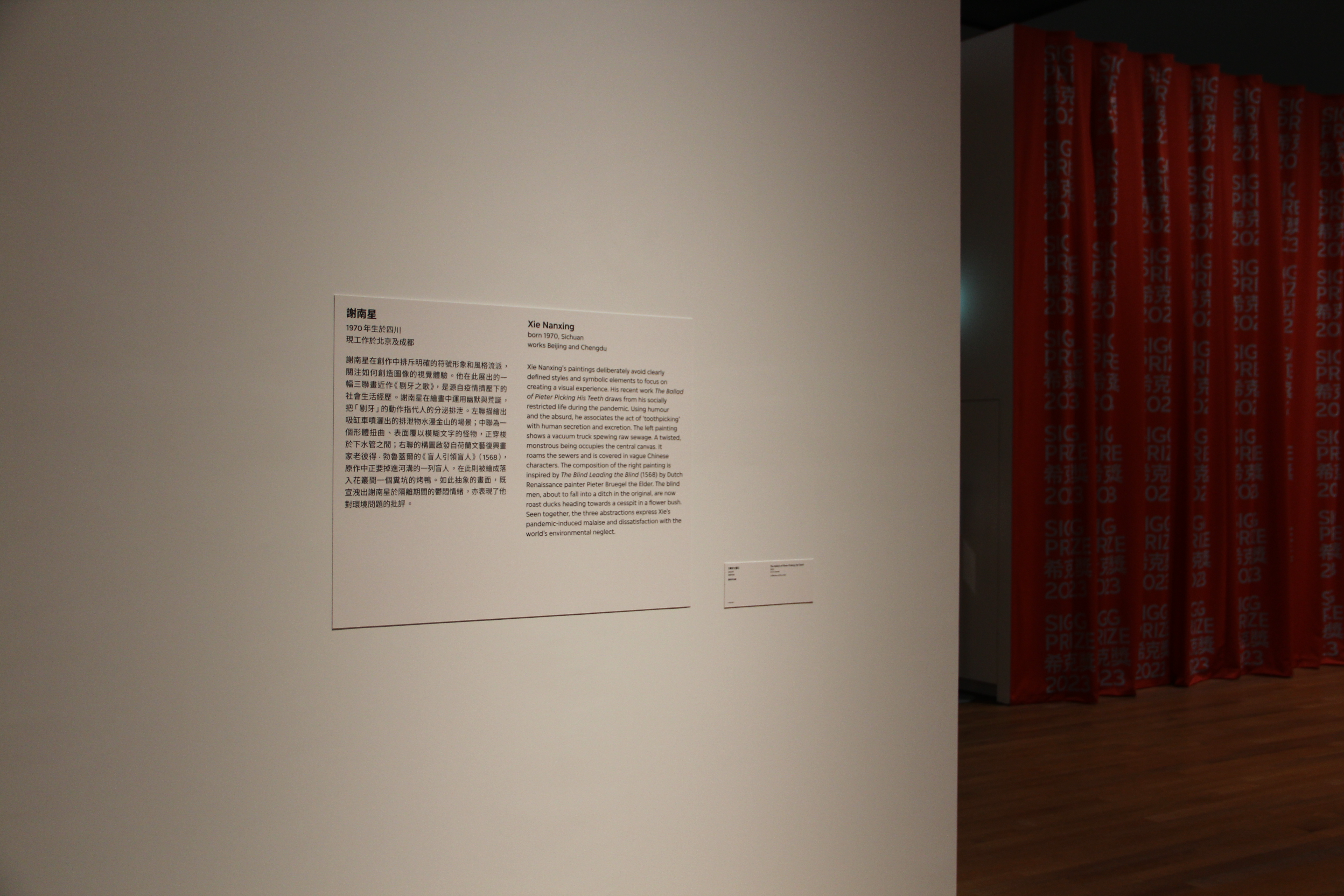
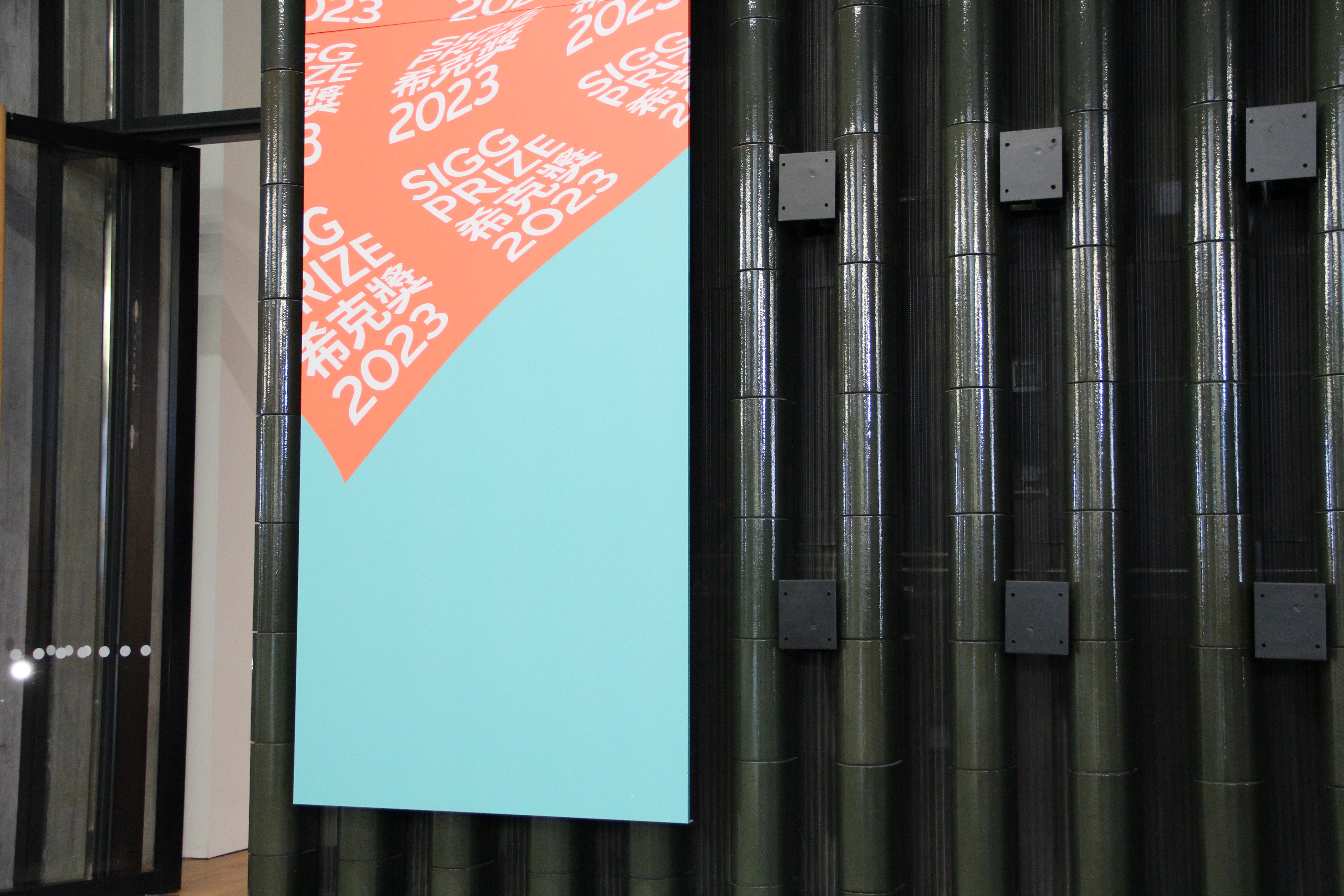
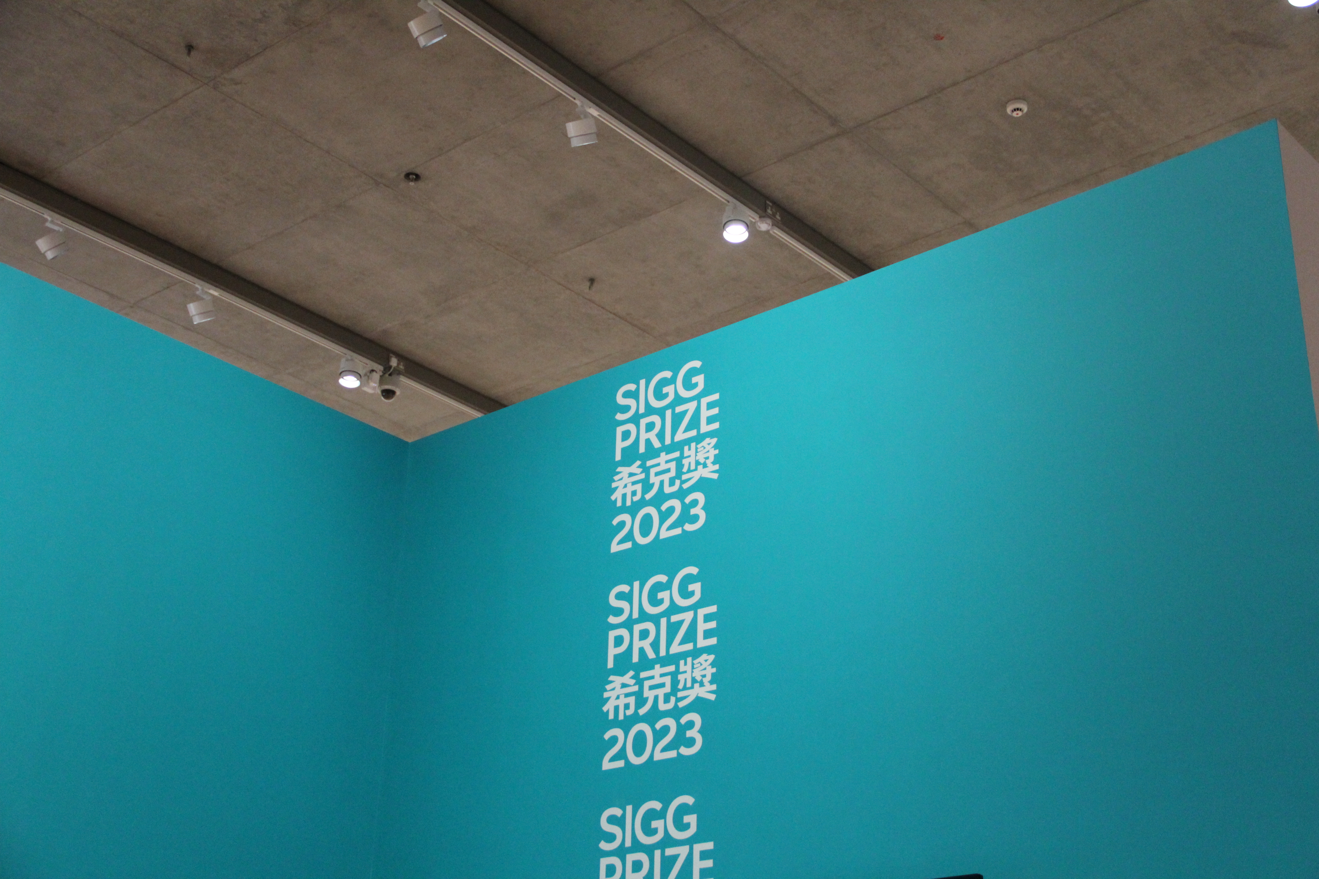
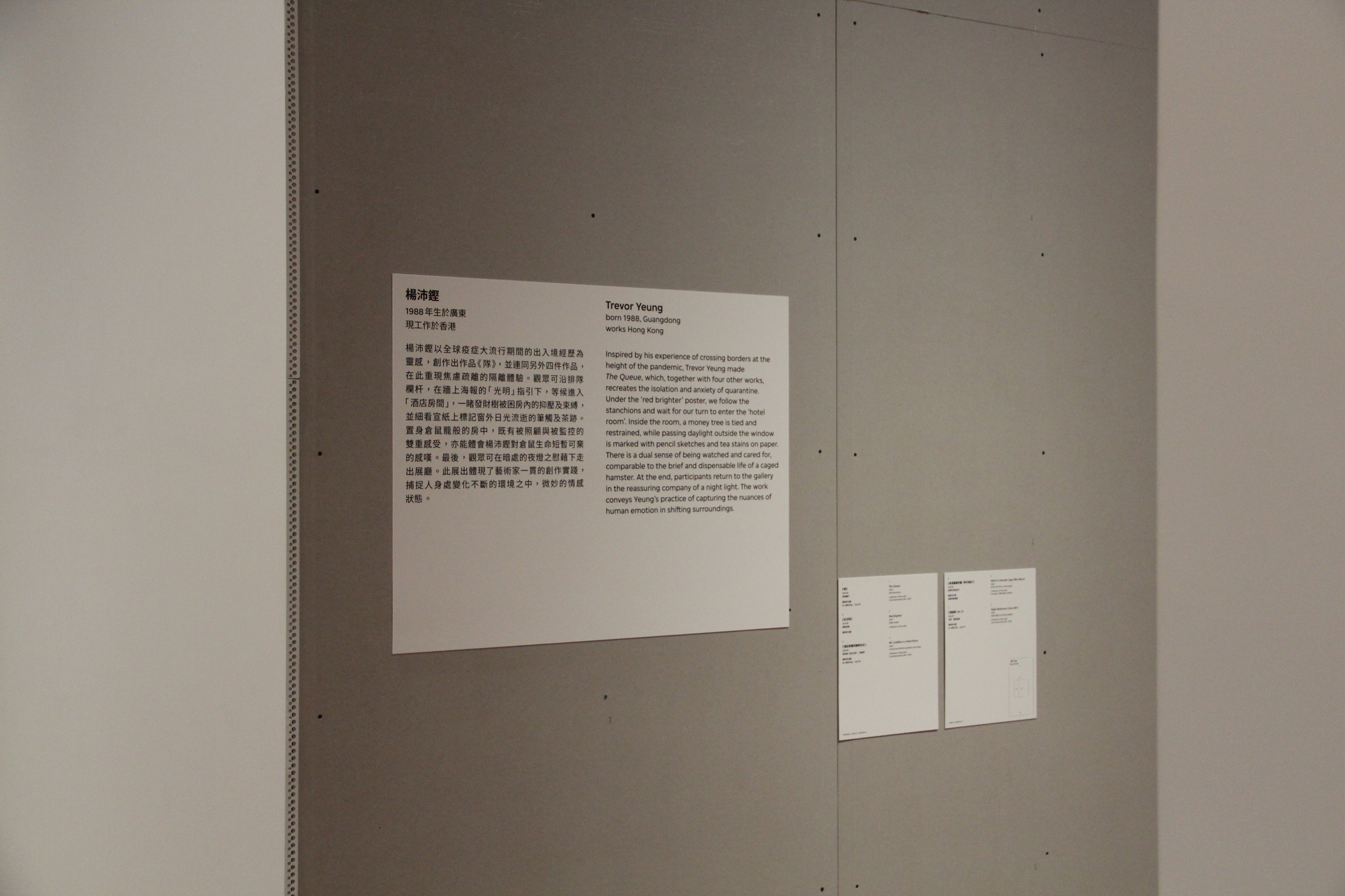
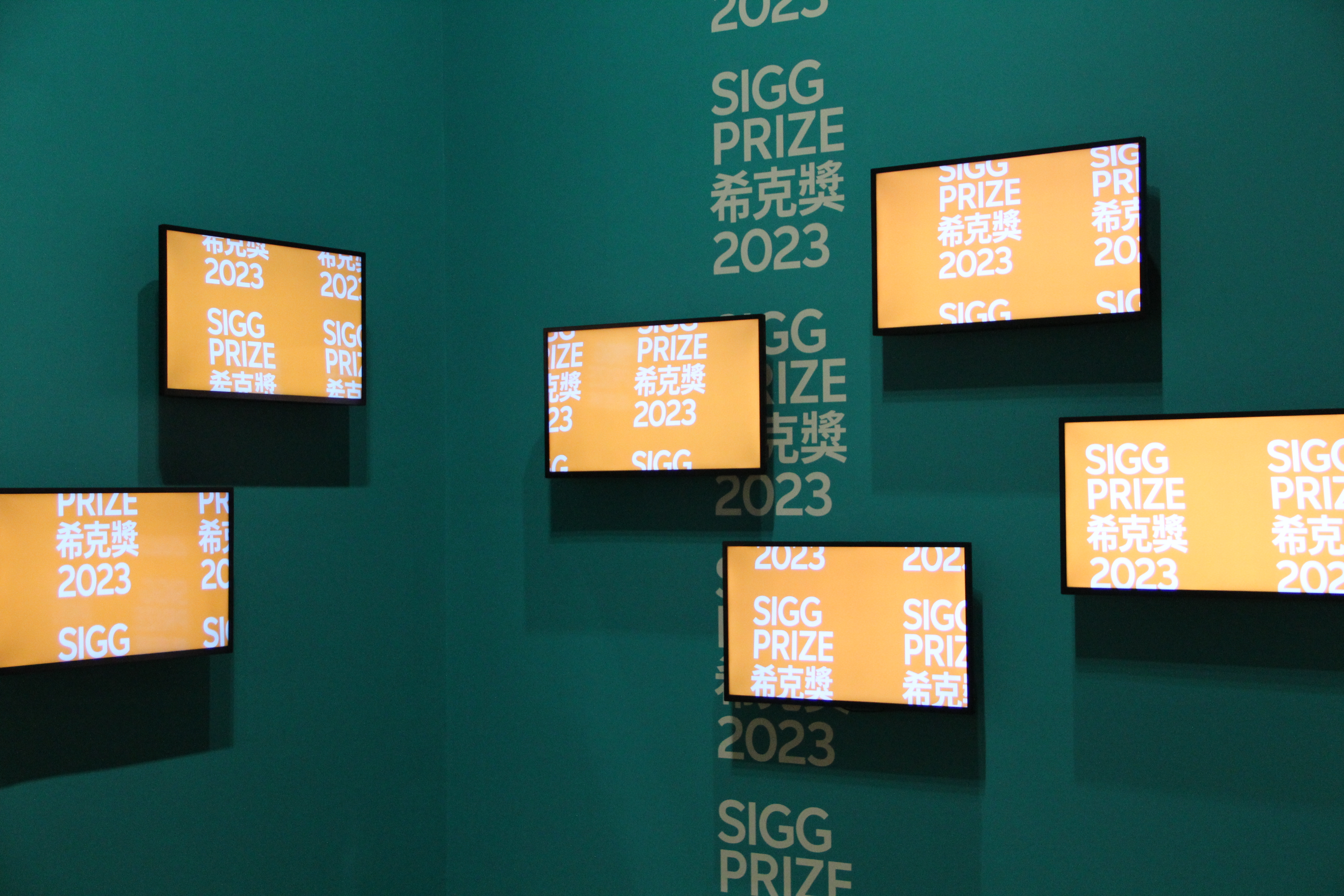
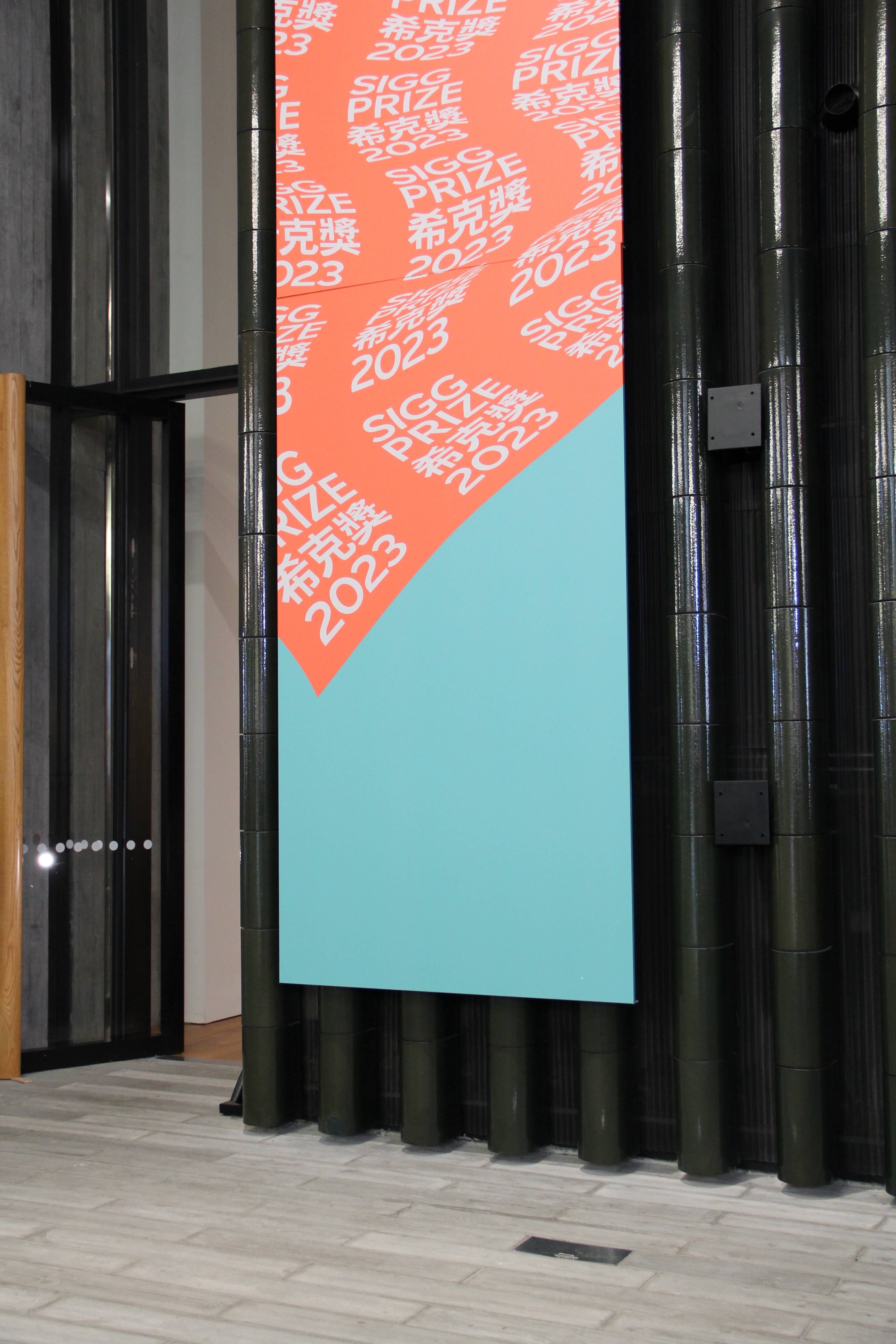
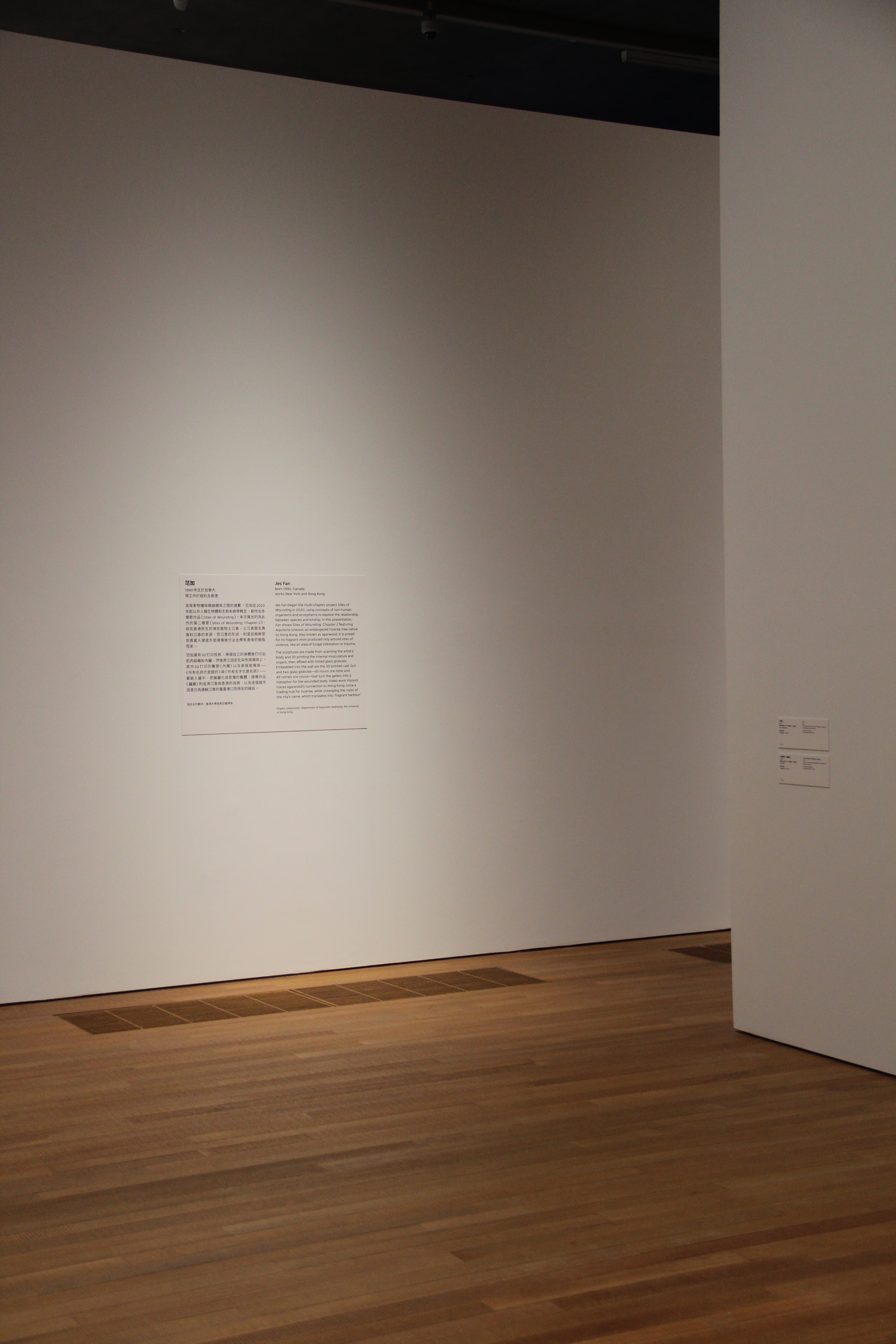
M+ Sigg Prize 希克獎 2023 23 Aug, 2023—14 Jan, 2024
M+, West Kowloon Cultural District, Hong Kong
Identity and exhibition graphics for M+ Sigg Prize 希克獎2023. The Sigg Prize is dedicated to honouring the significant contributions of artists born or working in the Greater China region, with a focus on highlighting and promoting their diverse artistic practices on an international stage.
The identity is created through a digital tool that simulates the dynamic motion of a flowing curtain. This visual identity captures the essence of the moment when the prize winner is revealed, adding a layer of intrigue and excitement.
Artists Jes Fan 范加, Miao Ying 苗穎, Wang Tuo 王拓, Xie Nanxing 謝南星, Trevor Yeung 楊沛鏗 and Yu Ji 于吉
Scope Visual Identity, Exhibition Graphics
Project completed at HATO


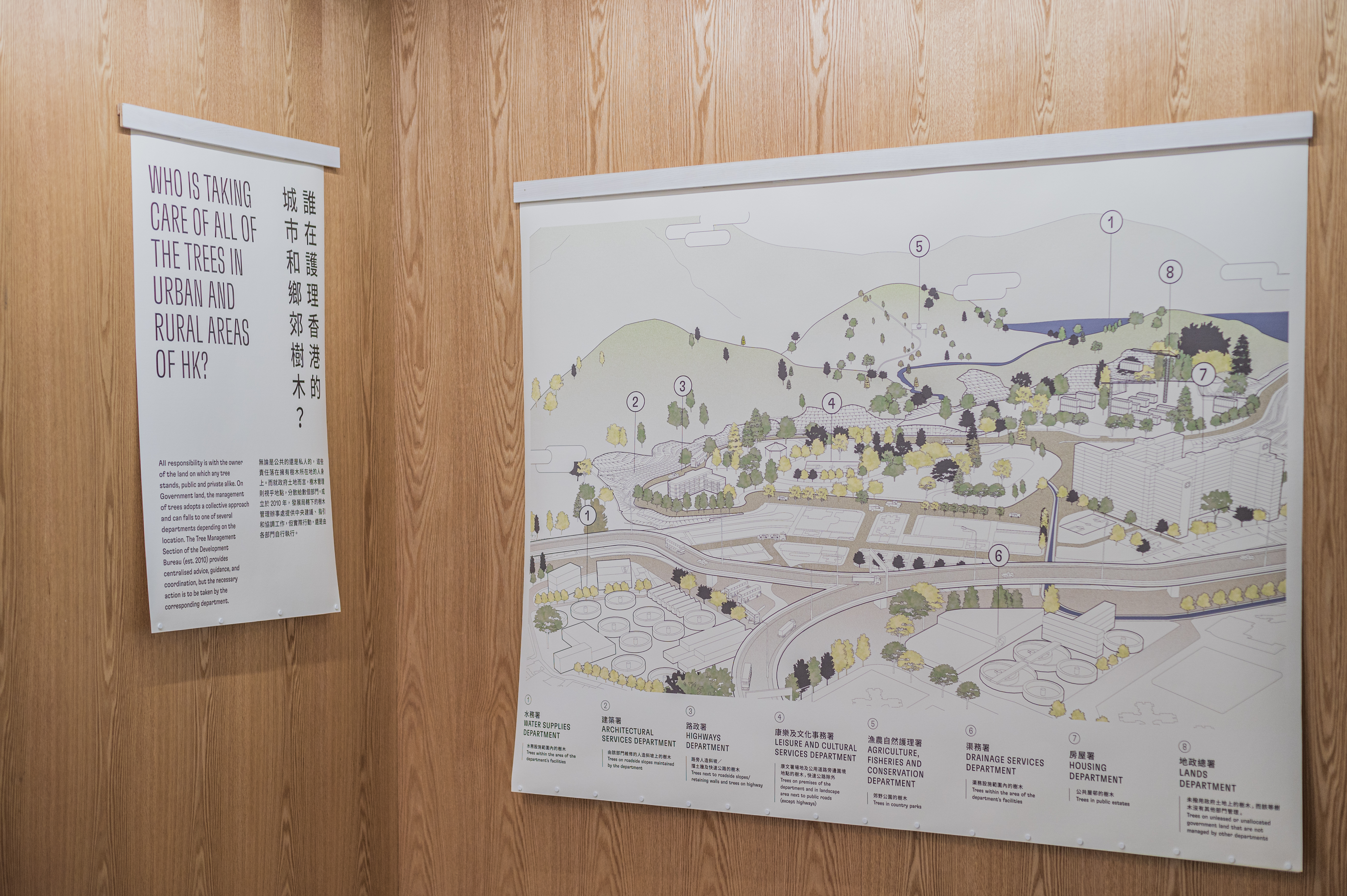


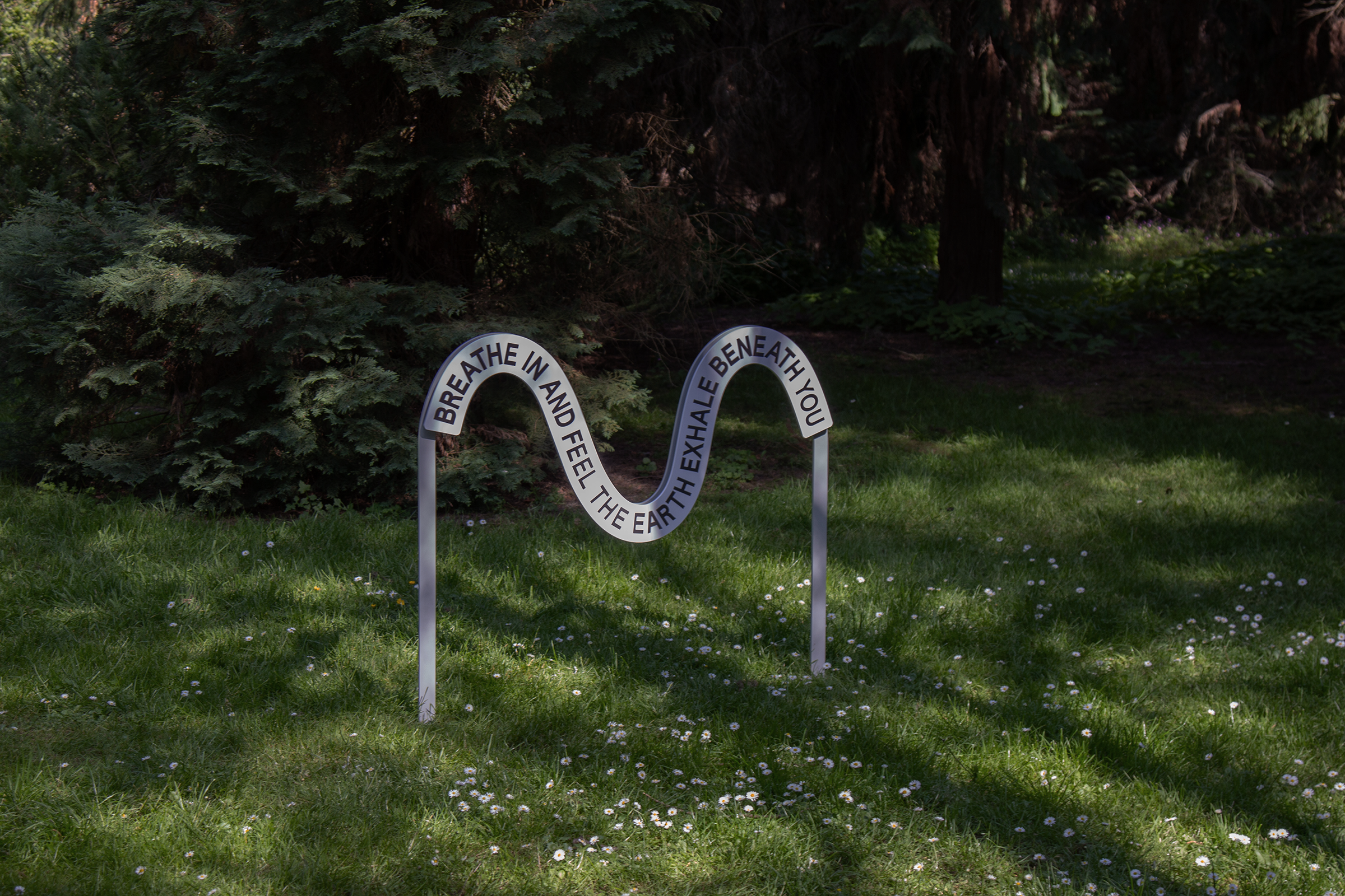
Breathing with Trees 8 Jul—12 Sep, 2022
Tai Kwun, Hong Kong
Key visual identity and exhibition graphics for Breathing with Trees at Tai Kwun, Hong Kong.
This exhibition acknowledges the vital role that trees play in our daily lives and explores some of the most advanced ways of protecting, preserving, and nurturing them to ensure future generations can continue to enjoy the benefits that trees bring to us.
Scope Visual Identity, Exhibition Graphics
Project completed at HATO
Photography courtesy of Tai Kwun
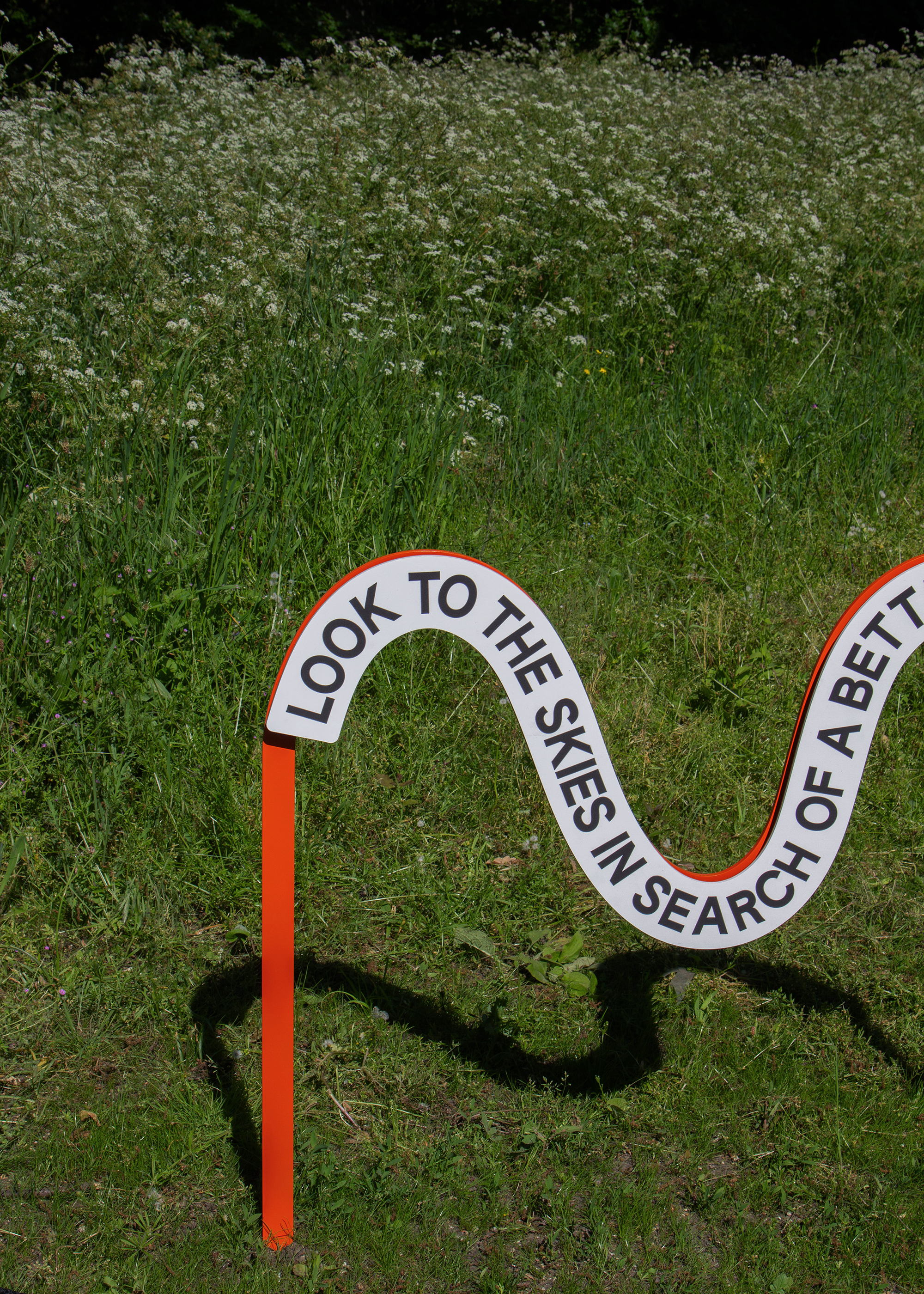

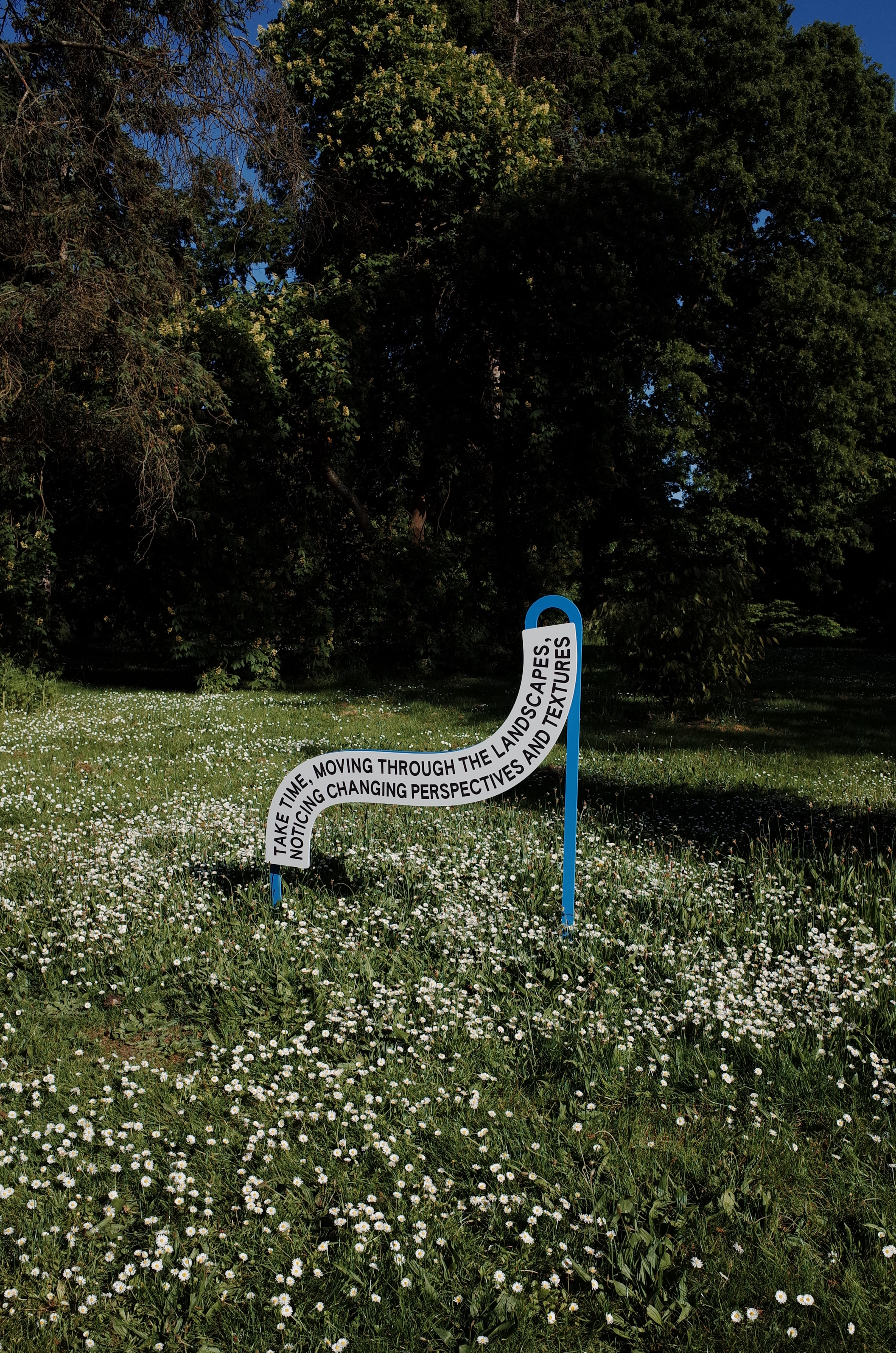
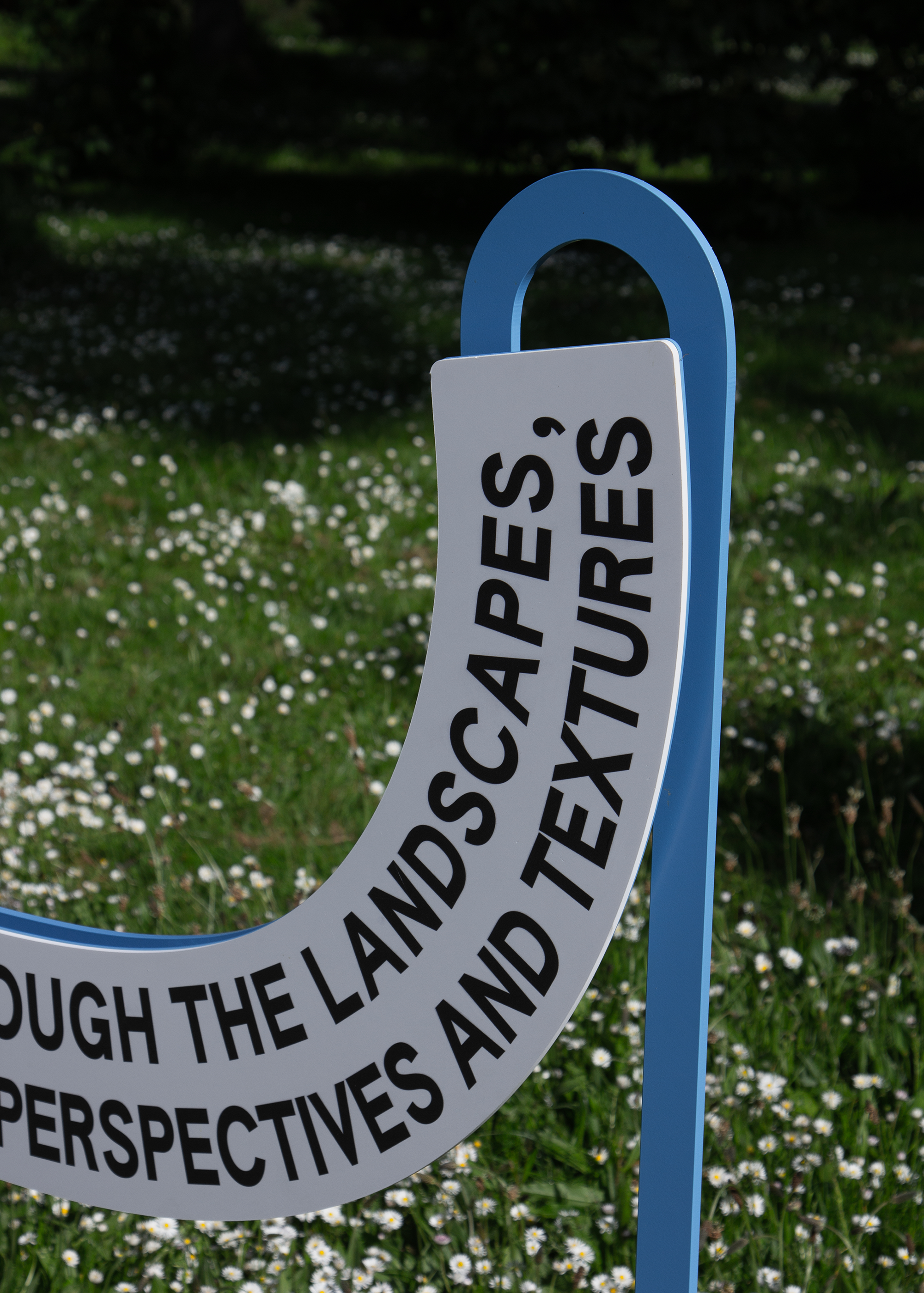
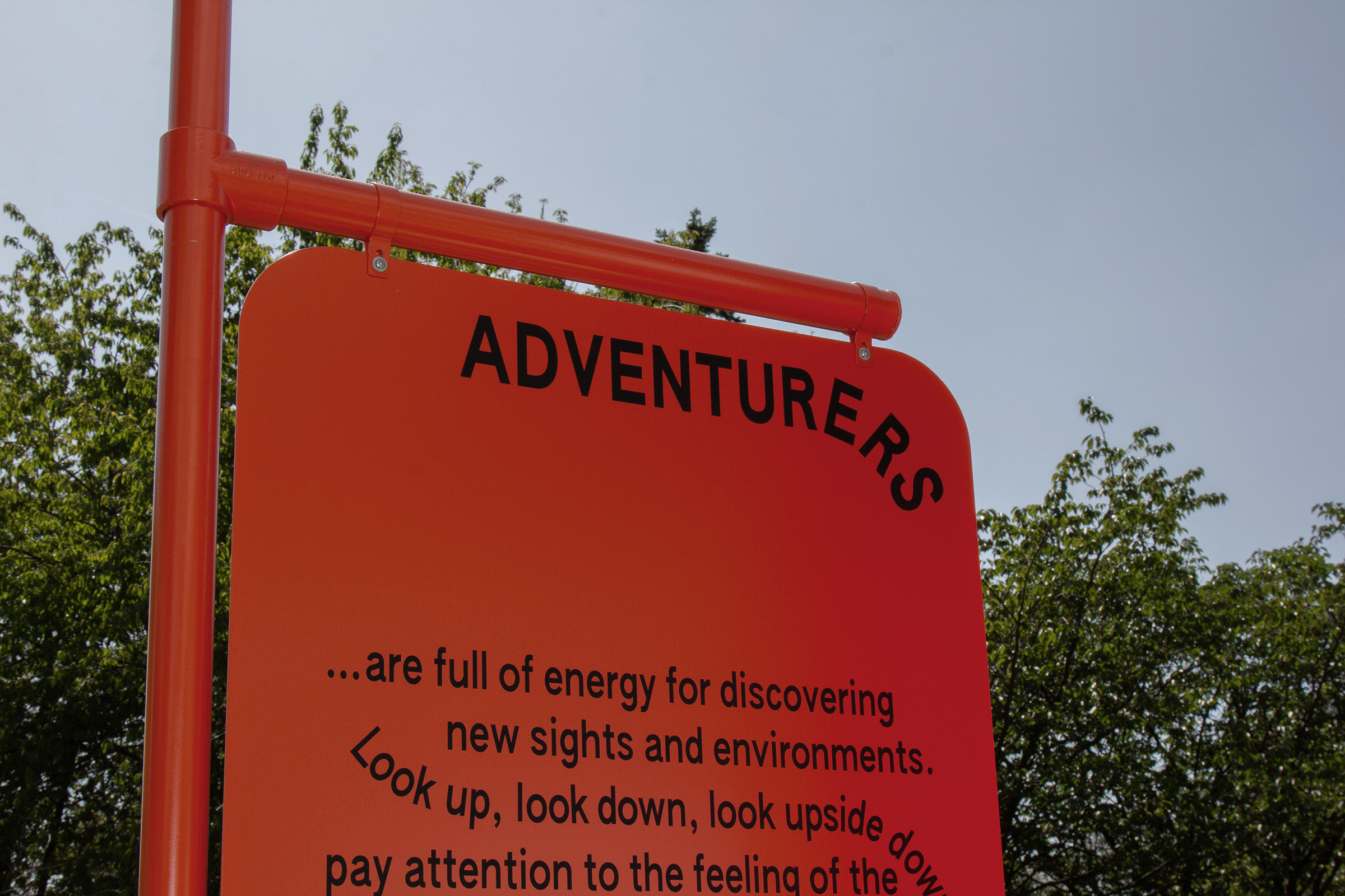
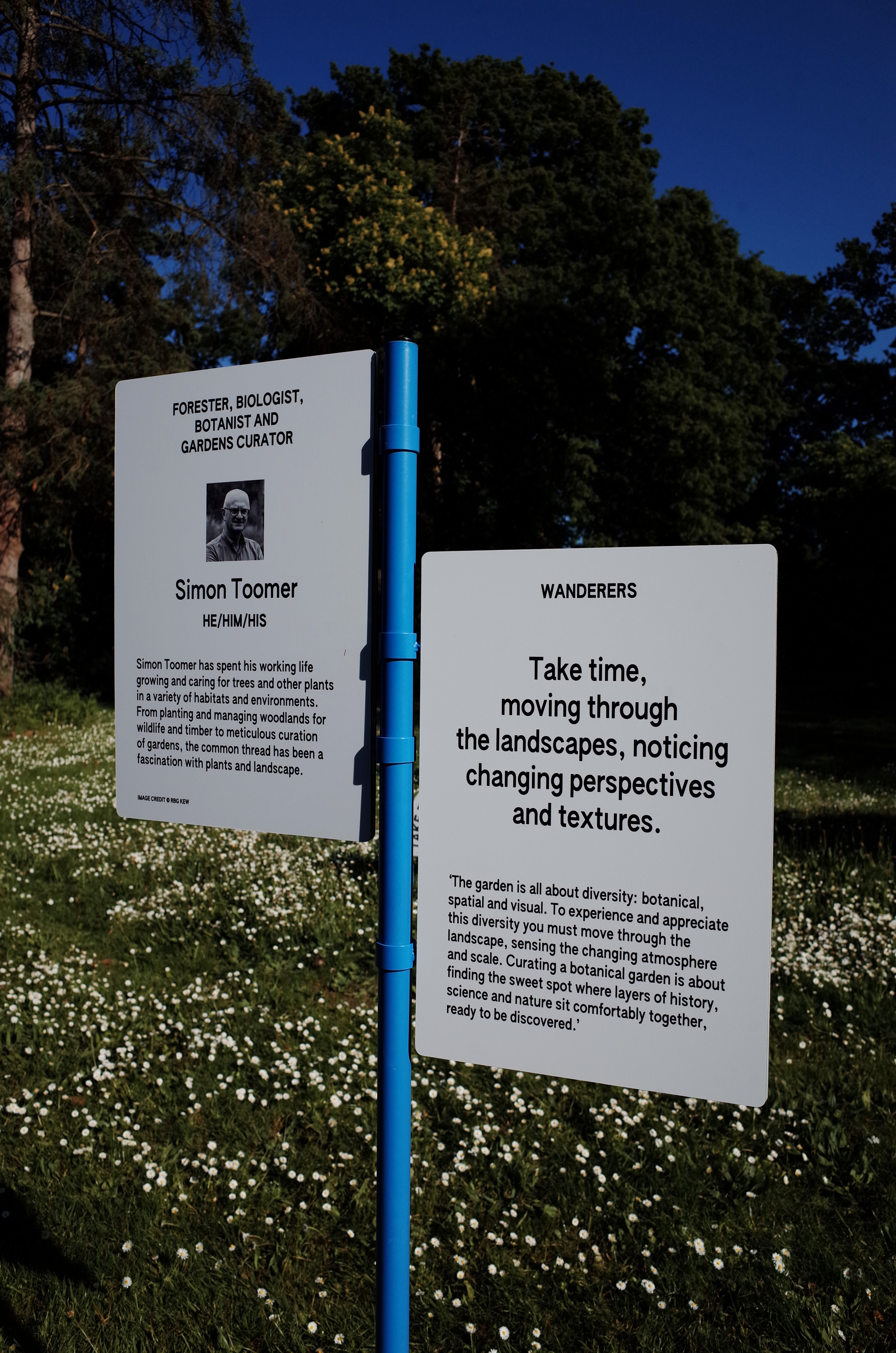
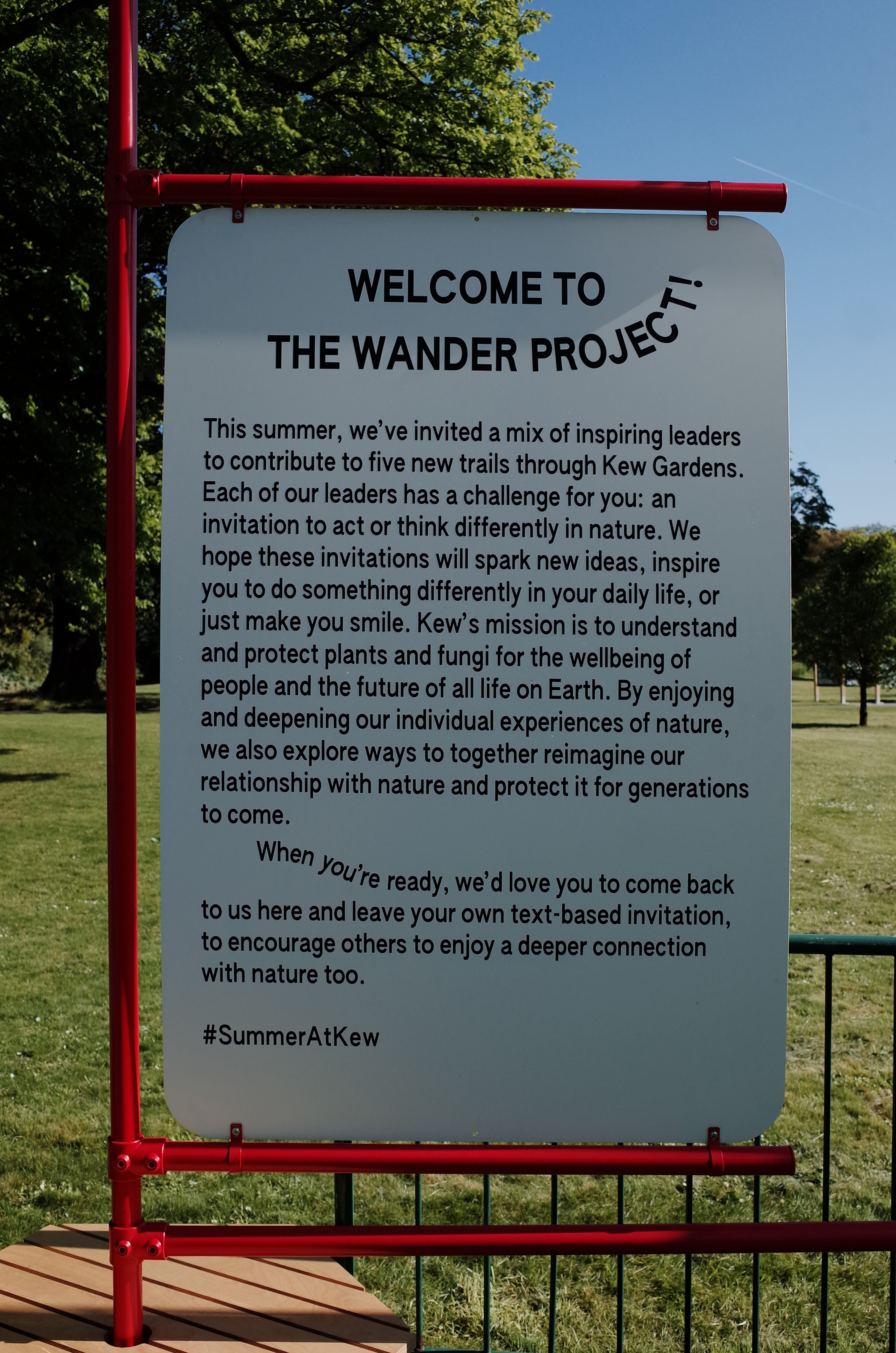
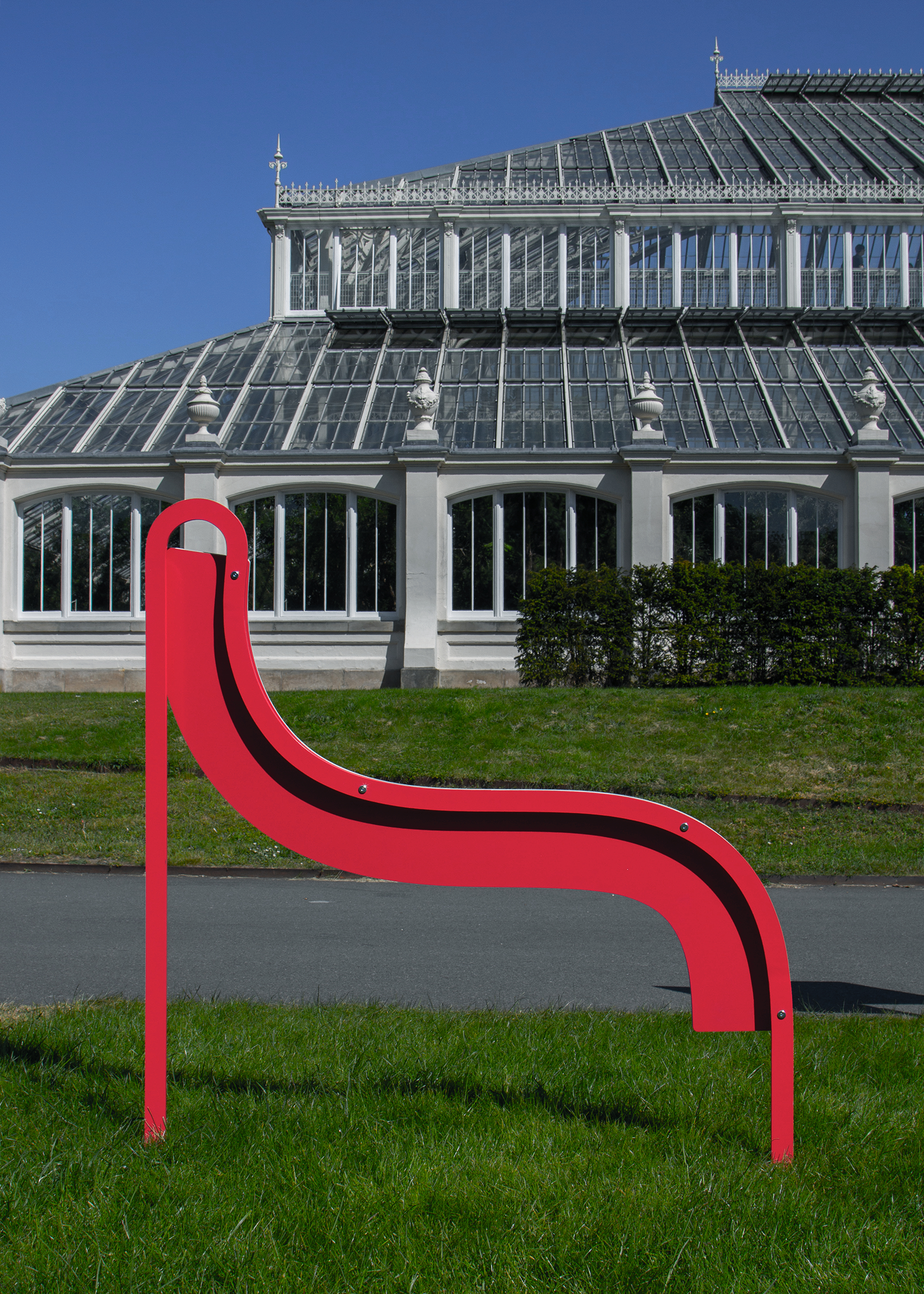

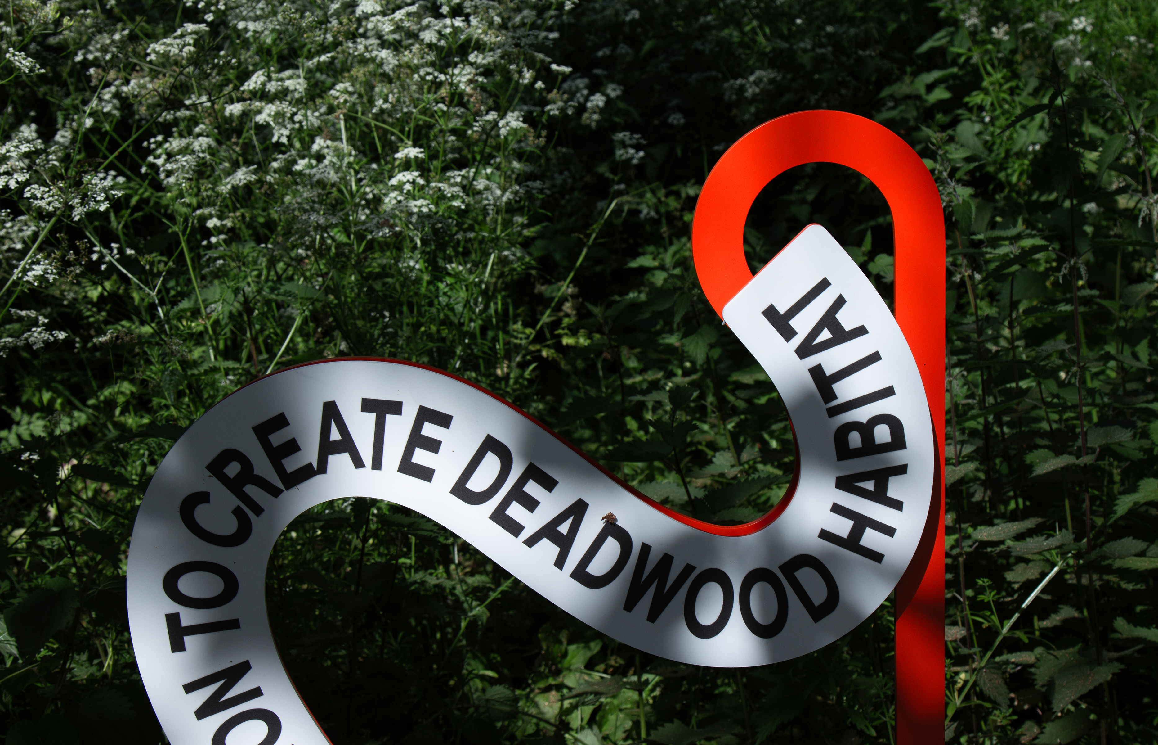
The Wander Project 27 May—3 Sep, 2023
Kew Gardens, Royal Botanic Gardens, London
Key visual identity, site-specific graphics and 3D designs for ‘The Wander Project’ at Kew Gardens. Kew Gardens has invited a mix of inspiring leaders to contribute to five new trails through the garden. Each trail is made up of text-based invitations from artists, musicians, and environmentalists to feel, hear, move, and think differently in nature.
We designed 3D installations together with 3D designer Andrés Ros Soto: The Exchange Hub, a pavilion that serves as an welcoming invitation to the visitors and a place for leaving their thoughts for others to enjoy after they completed the journey. 5 big site-specific installations are located throughout the Garden as an indicator for the starting point of the 5 trails: Wanderer, Adventurer, Time Traveller, Dreamer and Protector, together with 40 satellite text-based installations throughout the Garden.
Scope Visual Identity, Exhibition Graphics
Project completed at HATO
Photography courtesy of Tai Kwun
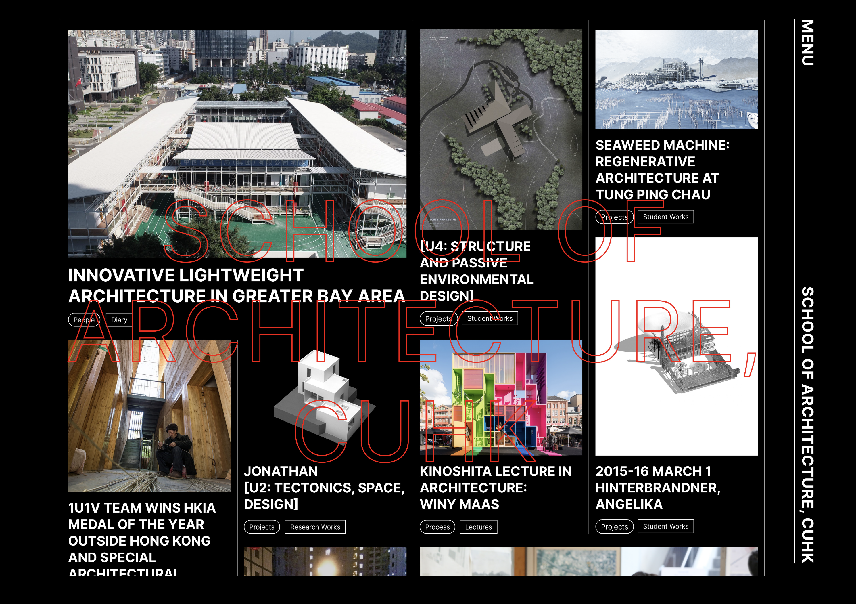


CUHK, School of Architecure 2022
The Chinese University of Hong Kong, Hong Kong
Website design for CUSA, School of Architecture, the Chinese University of Hong Kong. An ever-evolving, interactive frontpage is designed in this new website to showcase student’s work and staff research in a captivatin manner, it serves as a tool for research and inspiration with an education purpose.
To allow exploration and eas access to its content, an multi-facete navigation system in trilingual is built, resulting in user experience that truly reflects th pedagogic structure of CUSA.
Visit the website ︎ CUSA
Scope Web Deisgn
Project completed at HATO
Photography courtesy of Tai Kwun

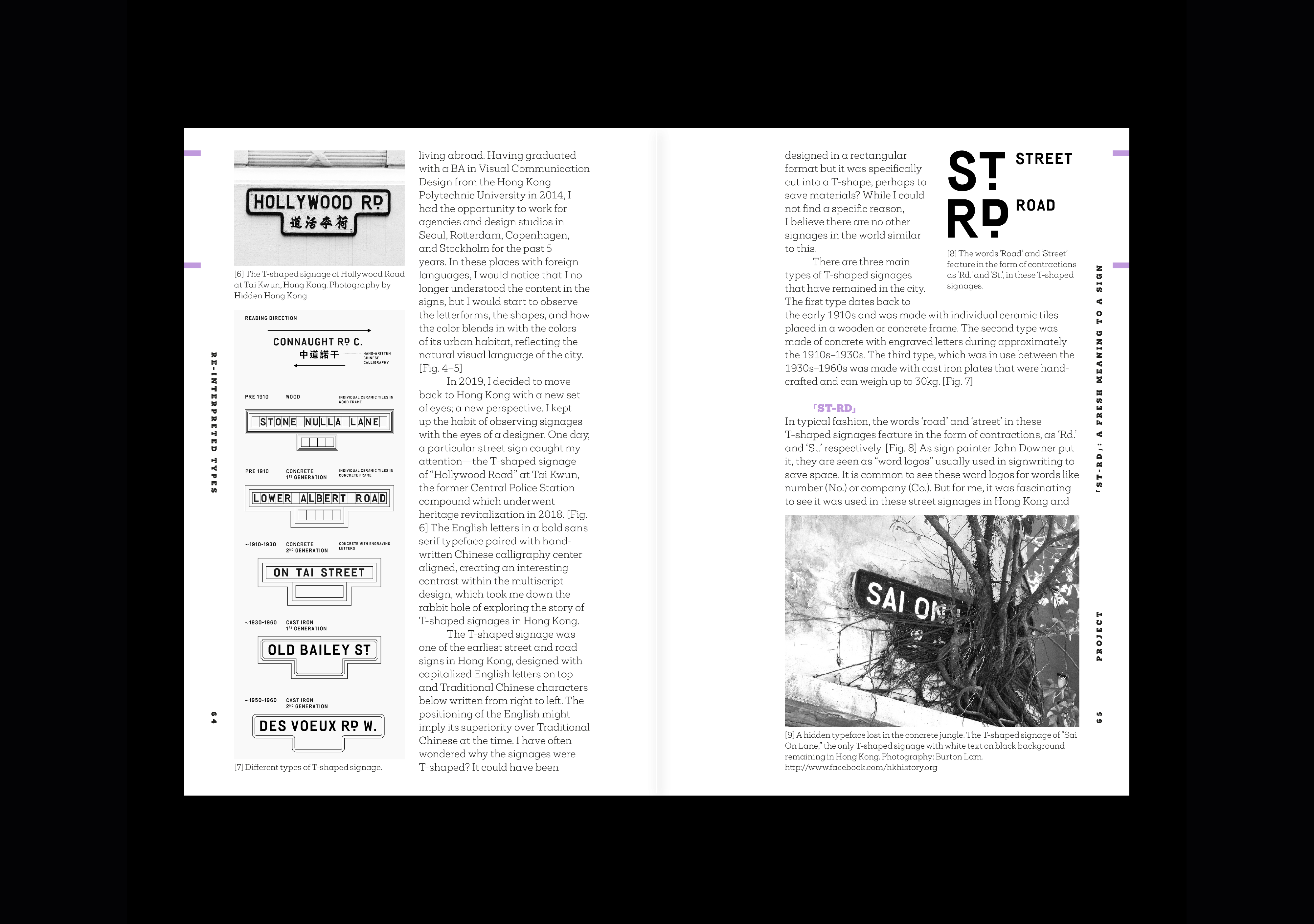


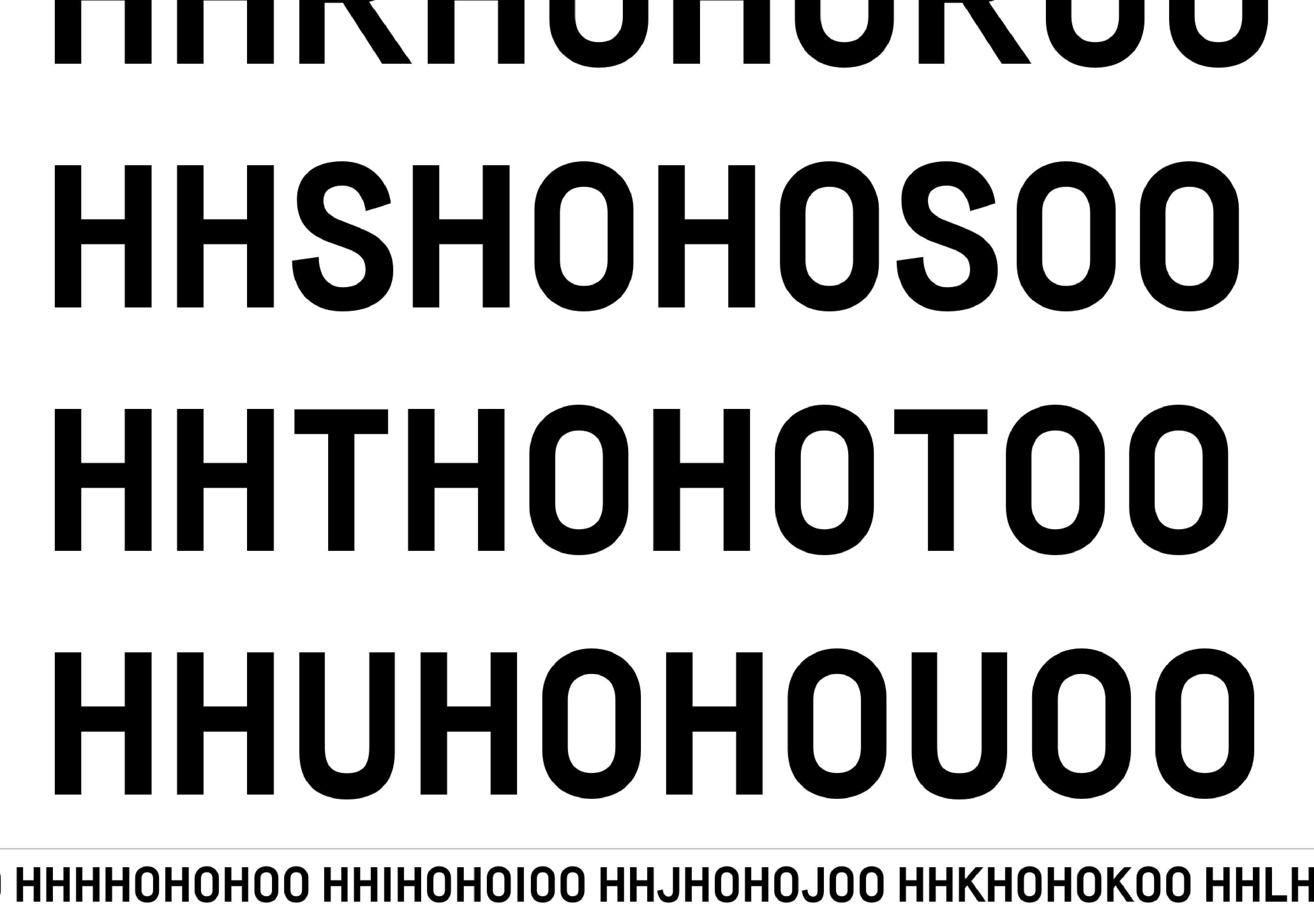


ST-RD 2021
Hong Kong
ST-RD is a typeface inspired by the letters on the T-shaped signages from the 30s to 60s in Hong Kong. The words ‘Road’ and ‘Street’ are uniquely designed in the form of contraction “RD.” & “ST.” in these signages, which I found immensely interesting, and hence, to start exploring and research into the type design of these signages, giving birth to this project.
Today, there are less than 200 uniquely T-shaped signages remaining in Hong Kong that are hidden throughout the urban landscape. The objective for this project is to research, preserve, and re-interpret the letterforms on these T-shaped signages as they’re gradually disappearing from this city.
Scope Type design, Typeface
A self-initiated project

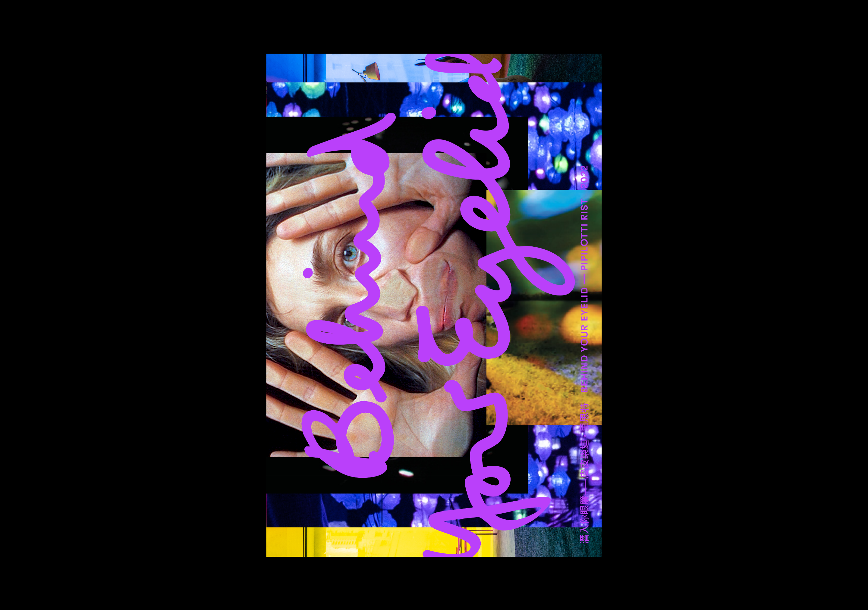


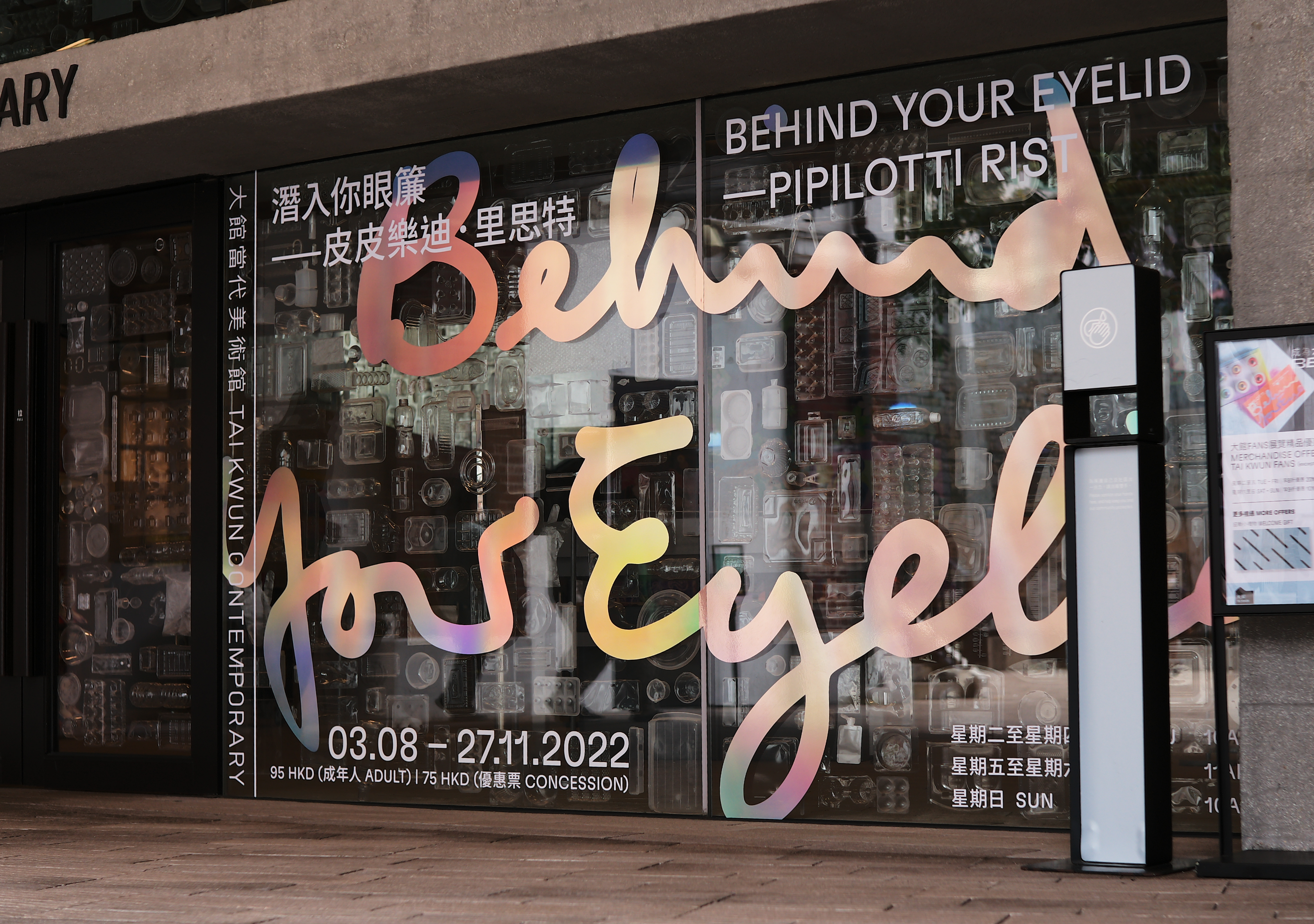
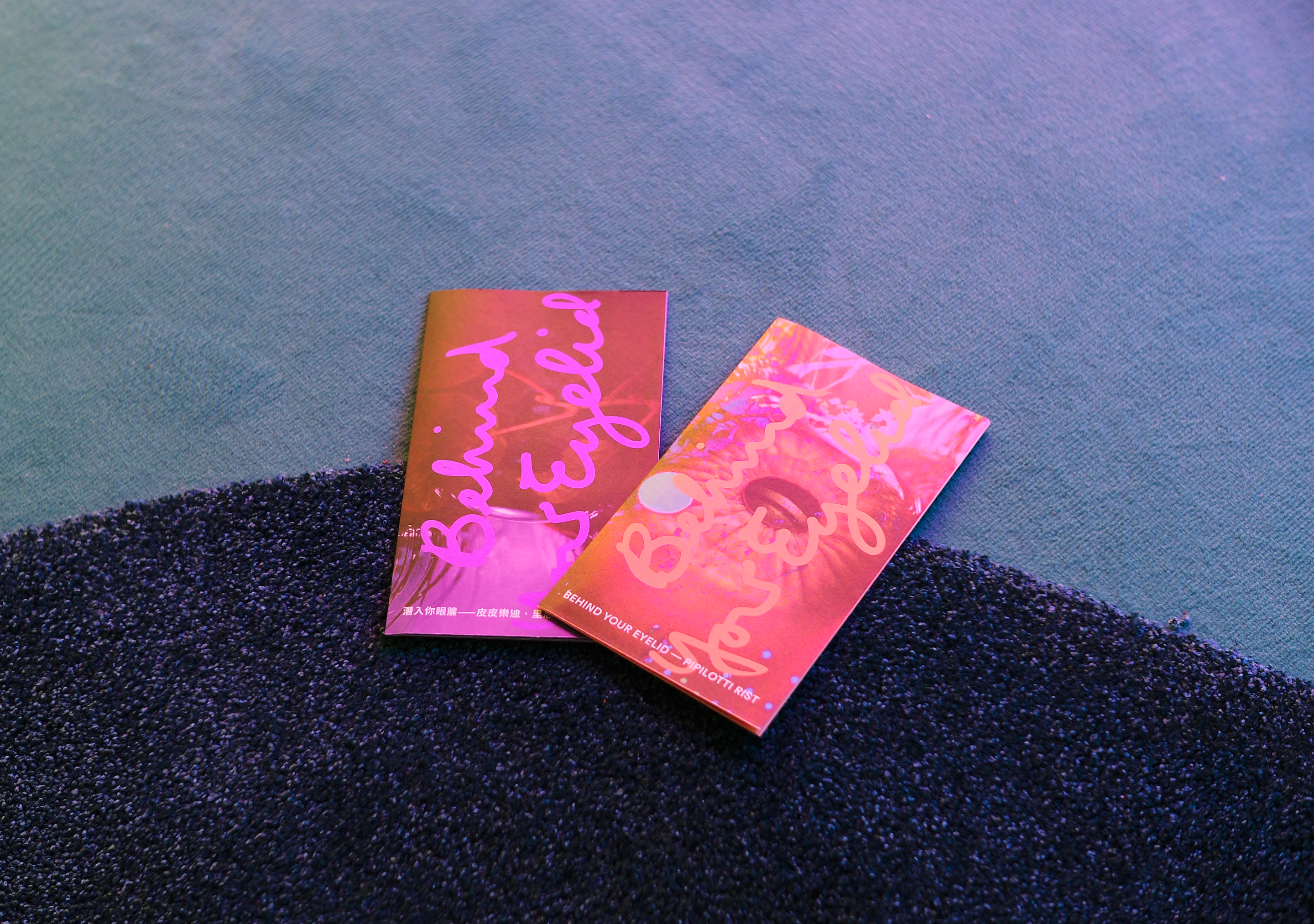
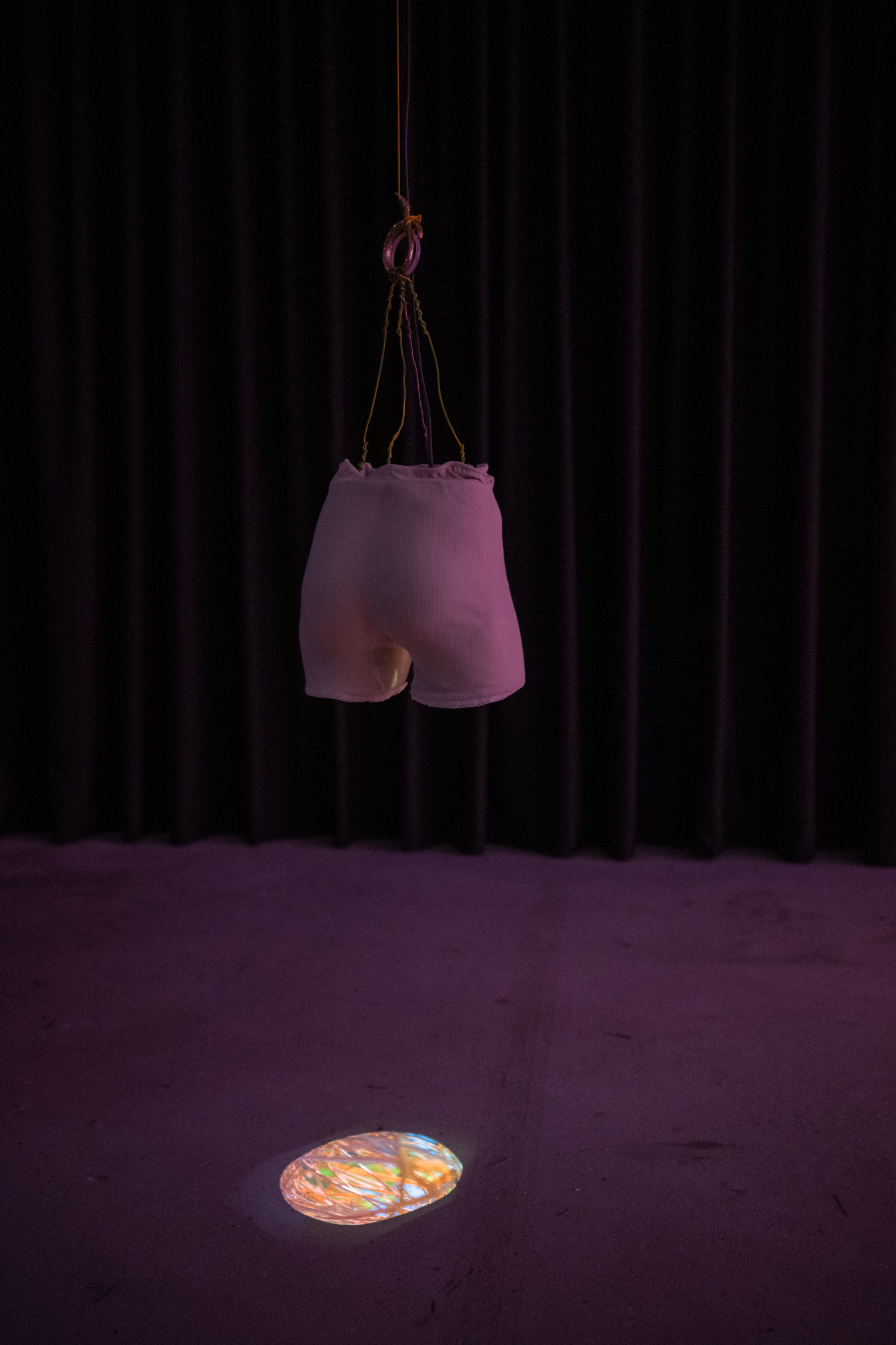
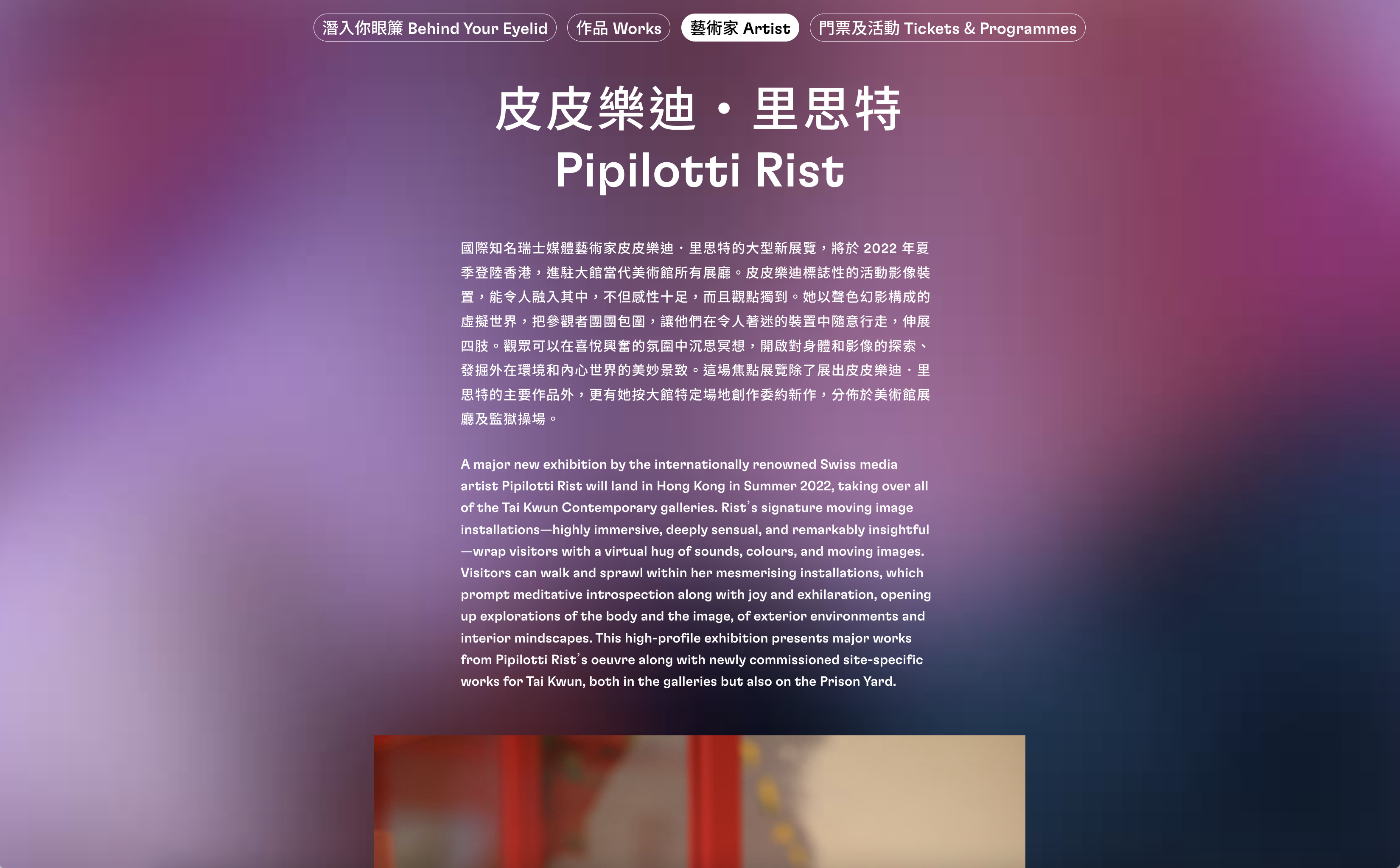
Behind Your Eyelid—Pipilotti Rist 3 Aug—27 Nov, 2022
Tai Kwun Contemporary, Hong Kong
Key visual identity and exhibition graphics for ‘Behind Your Eyelid—Pipilotti Rist’. An exhibtion offers entry into the artist’s remarkable vision and her fascination with the liminal—the screen, the skin, the membrane, and the filter. Her ability to push video out of the frame and into the physical space generates perceptual shifts and intellectual reconsiderations, opening doors into a wondrous world of inner vision full of beauty, whimsy, and possibility.
The lettering of the title was hand-written by Pipilotti and then refined by us. It acts as a typographic anchor throughout all the touchpoints.
In the digital world, it is rendered as 3D see-through lines resembling veins within the eye. For on-site wayfinding, it is reproduced in a special reflective iridescent vinyl giving off hundreds of different colours. And in printed ephemera, spot Pantone colours are used.
Whatever guise Pipilotti’s title might take, it ultimately guides us into a wondrous world of inner vision full of beauty, whimsy, and possibility.
Artist Pipilotti Rist
Scope Exhibition Key Visual Identity, Exhibition Graphics, Book Design, Print Collaterals
Project completed at HATO
Photography courtesy of Tai Kwun Contemporary


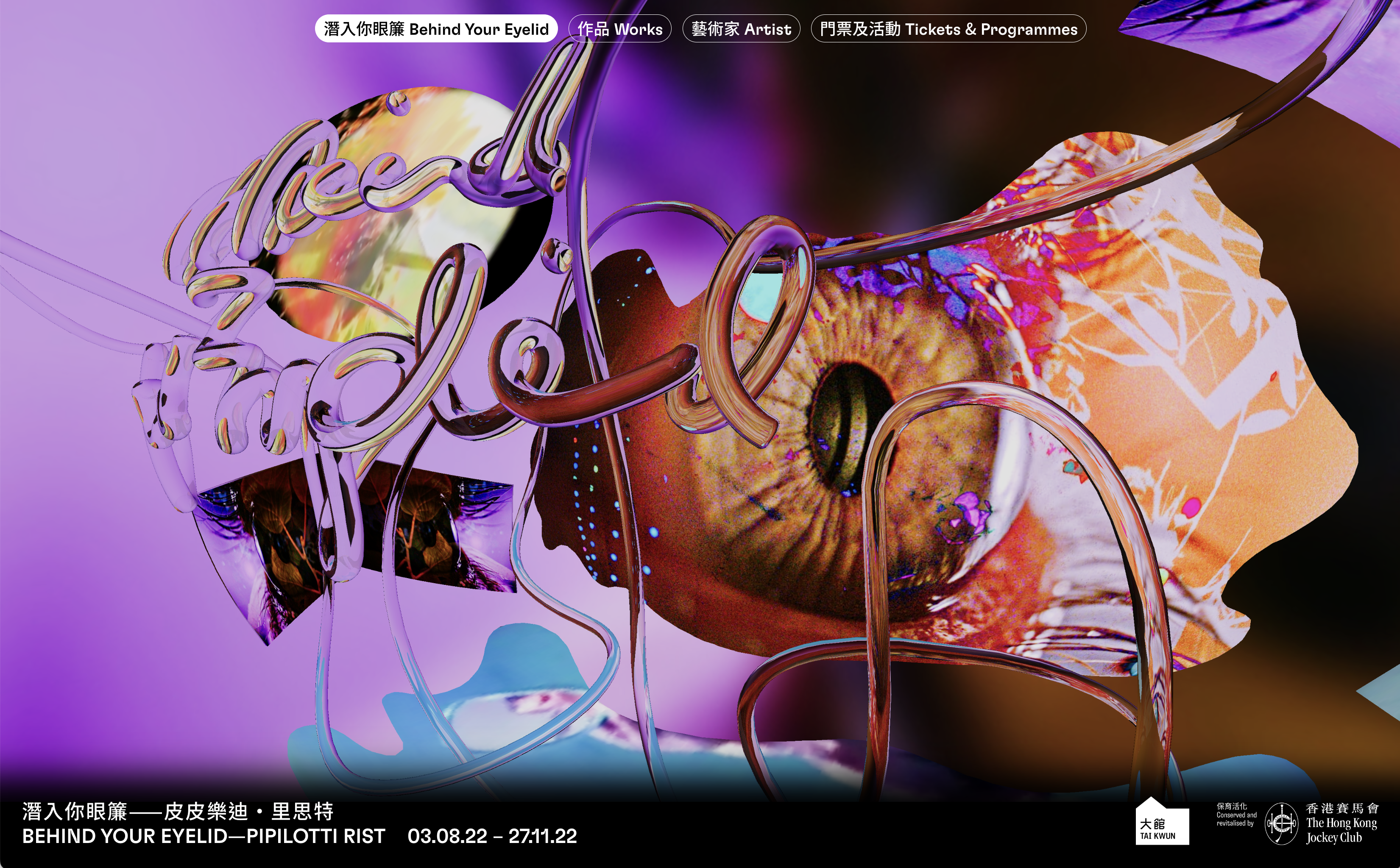
Behind Your Eyelid—Pipilotti Rist 3 Aug—27 Nov, 2022
Tai Kwun Contemporary, Hong Kong
Minisite for ‘Behind Your Eyelid—Pipilotti Rist’. In the digital world, the exhibition title lettering written by Pipilotti herself is rendered as 3D see-through lines resembling veins within the eye. We developed an immersive digital dreamscape reminiscent of the interior of an eyeball. Through this, we hope to welcome visitors into the fantastic world of Pipitolitti Rist.
Visit the website ︎ Behind Your Eyelid — Pipilotti Rist
Scope Web Deisgn
Project completed at HATO
Photography courtesy of Tai Kwun Contemporary


Anna Bjerger 2018
Stockholm, Sweden
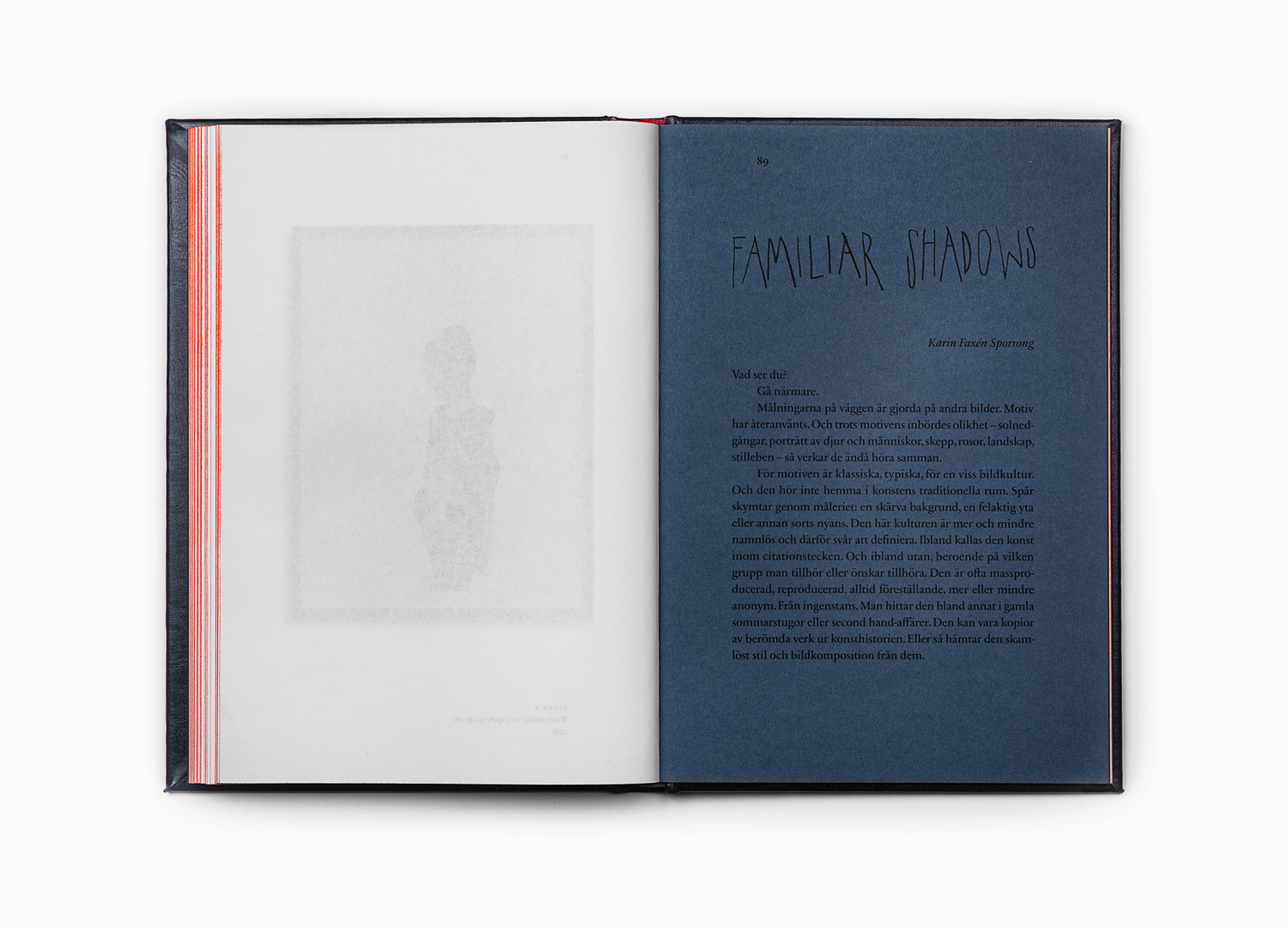
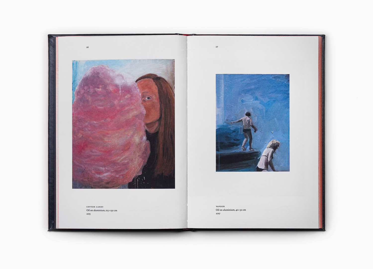
Artist Book for Anna Bjerger of her works 2013—2017. This was published by Galleri Magnus Karlsson, David Risley Gallery and Kristianstads konsthall in conjunction with her solo exhibition Familiar Shadows.
Anna Bjerger is a Swedish artist, born 1973 in Skallsjö, now living and working in Älmhult. Through a process of reconfiguring found imagery, bought from secondhand stores and garage sales, by transforming their context and reordering hierarchy with paint and a focus on dimension, Anna intends to intensify experience and create new narratives.
Scope Book Design
Project completed at Bedow
Photography courtesy of Bedow
Stockholm, Sweden
Artist Book for Anna Bjerger of her works 2013—2017. This was published by Galleri Magnus Karlsson, David Risley Gallery and Kristianstads konsthall in conjunction with her solo exhibition Familiar Shadows.
Anna Bjerger is a Swedish artist, born 1973 in Skallsjö, now living and working in Älmhult. Through a process of reconfiguring found imagery, bought from secondhand stores and garage sales, by transforming their context and reordering hierarchy with paint and a focus on dimension, Anna intends to intensify experience and create new narratives.
Scope Book Design
Project completed at Bedow
Photography courtesy of Bedow

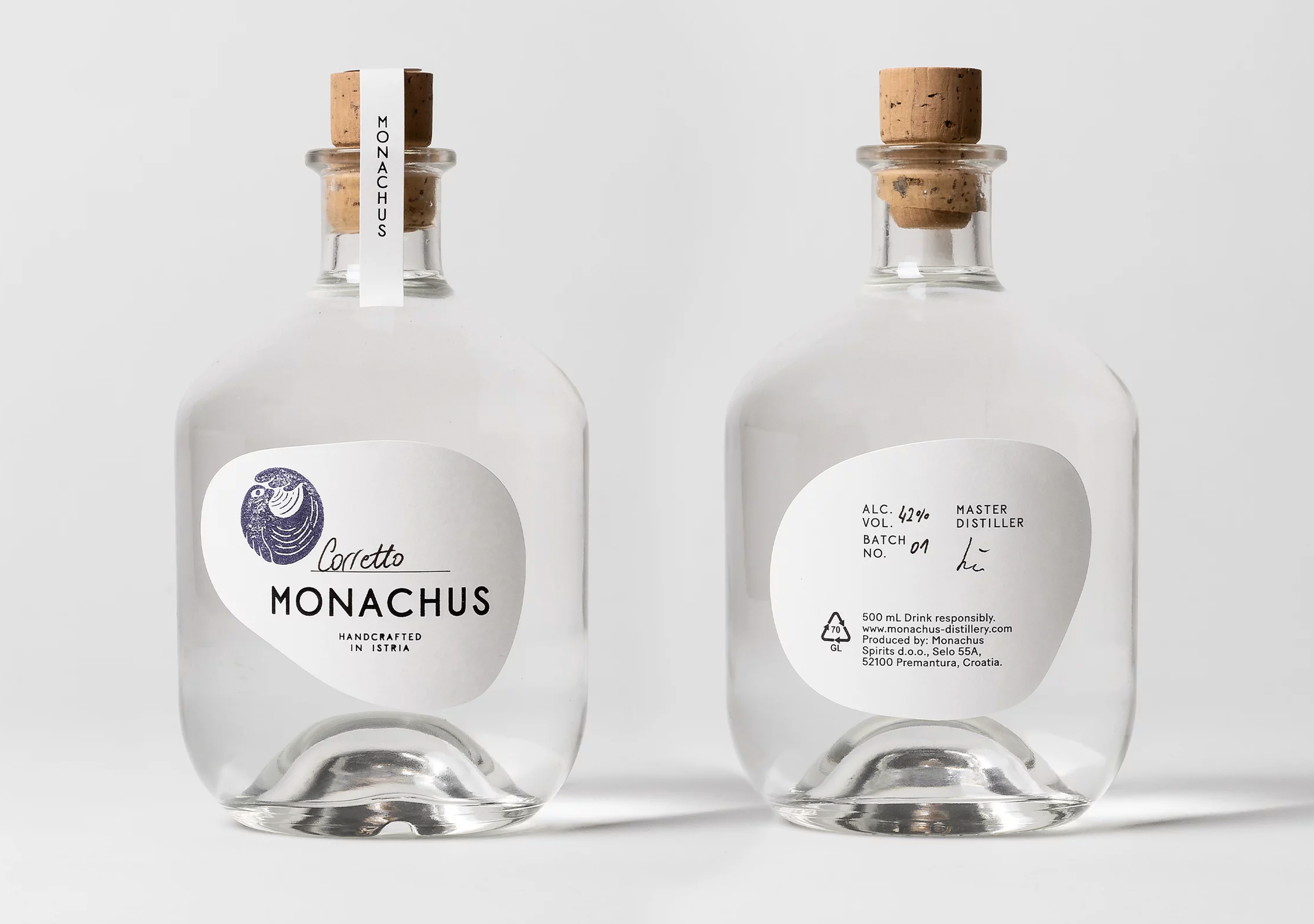


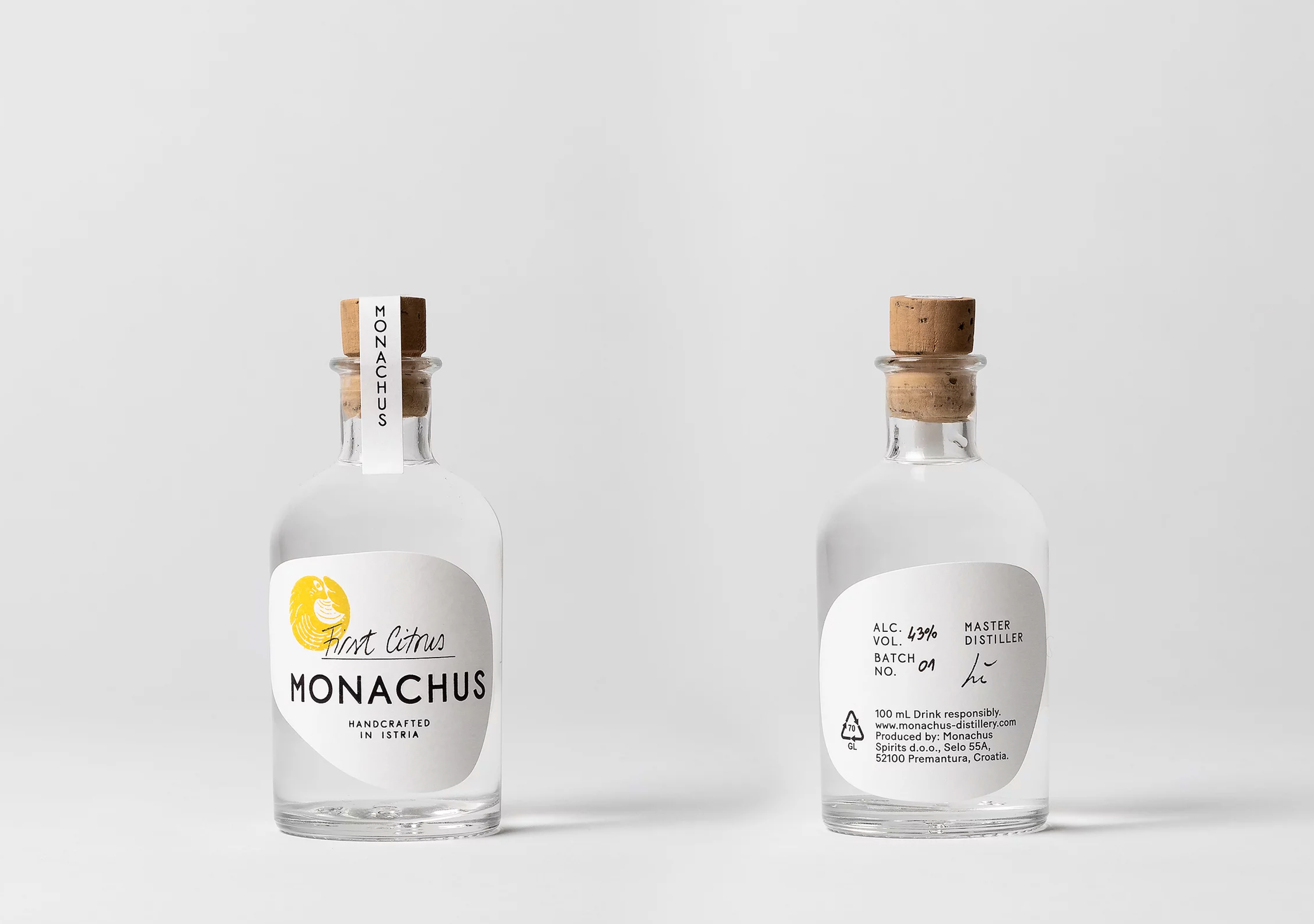

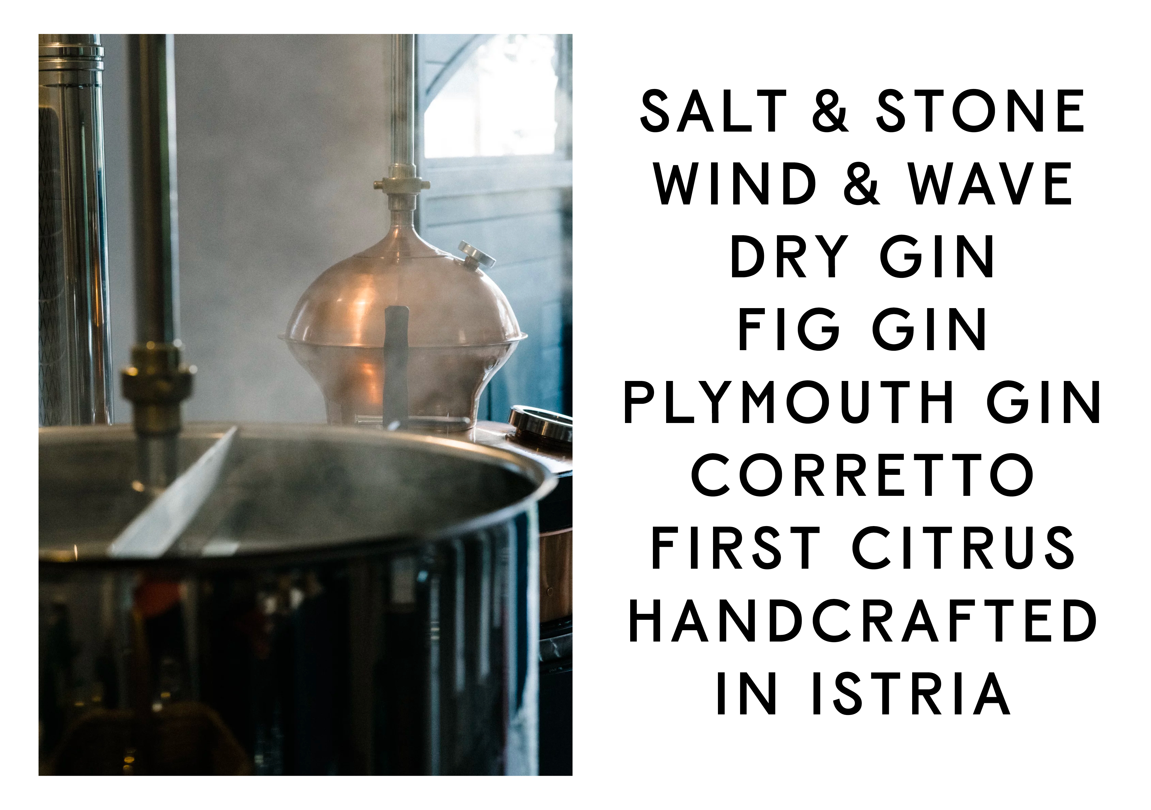

Monachus 2018
Hand-crafted gin distillery, Istria, Croatia
Brand identity and packaging design for Monachus, a hand-crafted gin distillery based in Croatia. The brand identity included the logotype typeset in a bespoke typeface, Monachus Display, and a hand-drawn symbol that visualised a seal tumbling in the waves and a series of packaging design.
The distillery’s connection to the nature of Istria runs throughout the design, from the seal stamped on each bottle, to the pine cones strewn on the hills behind the distillery. A set of five custom labels shaped by the natural history of Istria: salt and stone, wind and wave and pine cone. We put hand-crafted elements at the heart of the branding, every logomark is stamped onto each bottle and carefully packaged by hand. And the packaging is plastic-free, to match the distillery’s ethos.
Scope Brand Identity, Type Design, Typeface
Project completed at Bedow
Photography courtesy of Bedow


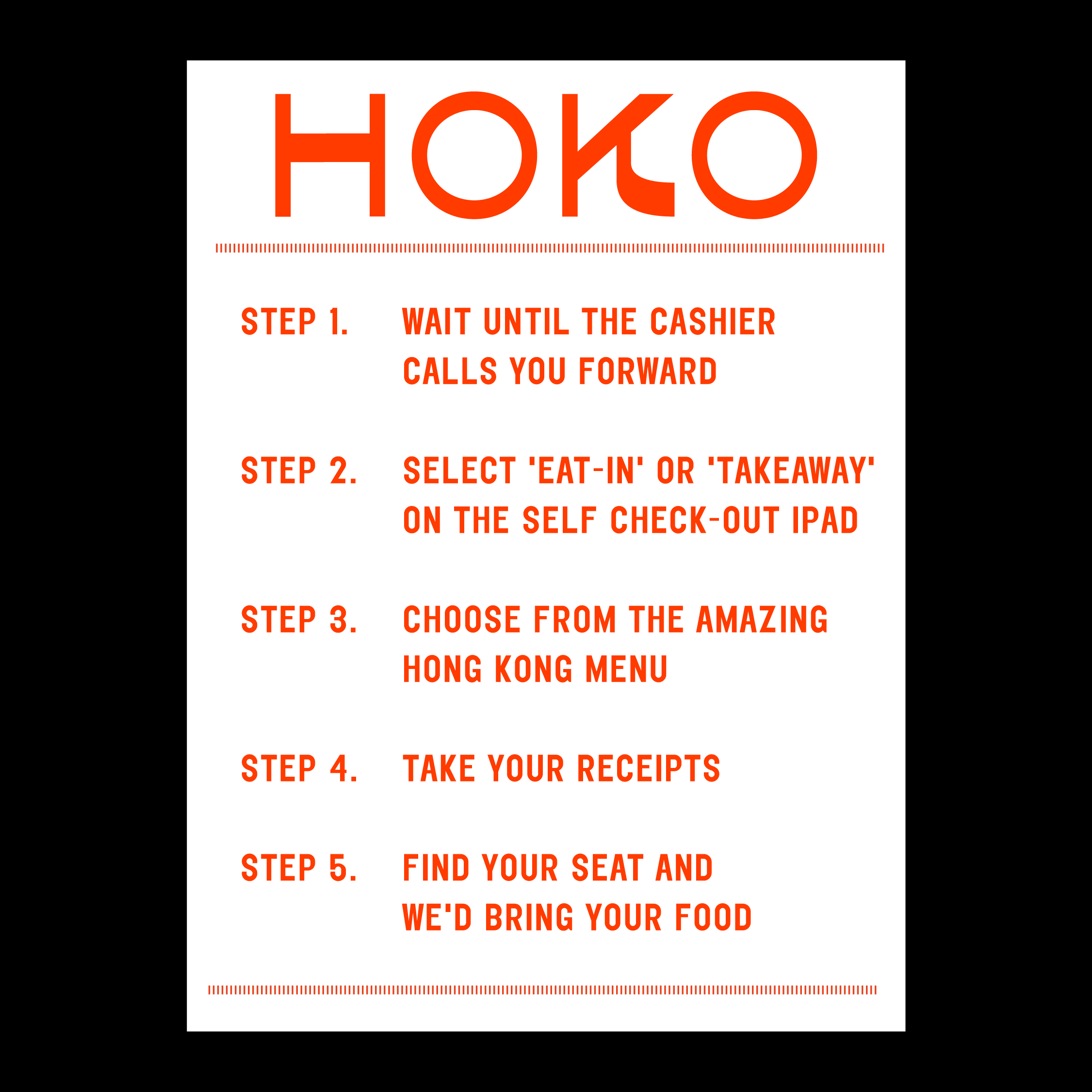


HOKO Cafe 2022
224 Brick Lane, E1 6SA, London
Bespoke display type design for HOKO Cafe. A high contrast, graphical condensed typeface inspired by old Chinese mei zhu zi (美術字) old ornamental letterings in food packaging.
Scope Type Design, Typeface
Photography courtesy of Yoav Picherski
224 Brick Lane, E1 6SA, London
Bespoke display type design for HOKO Cafe. A high contrast, graphical condensed typeface inspired by old Chinese mei zhu zi (美術字) old ornamental letterings in food packaging.
Scope Type Design, Typeface
Photography courtesy of Yoav Picherski
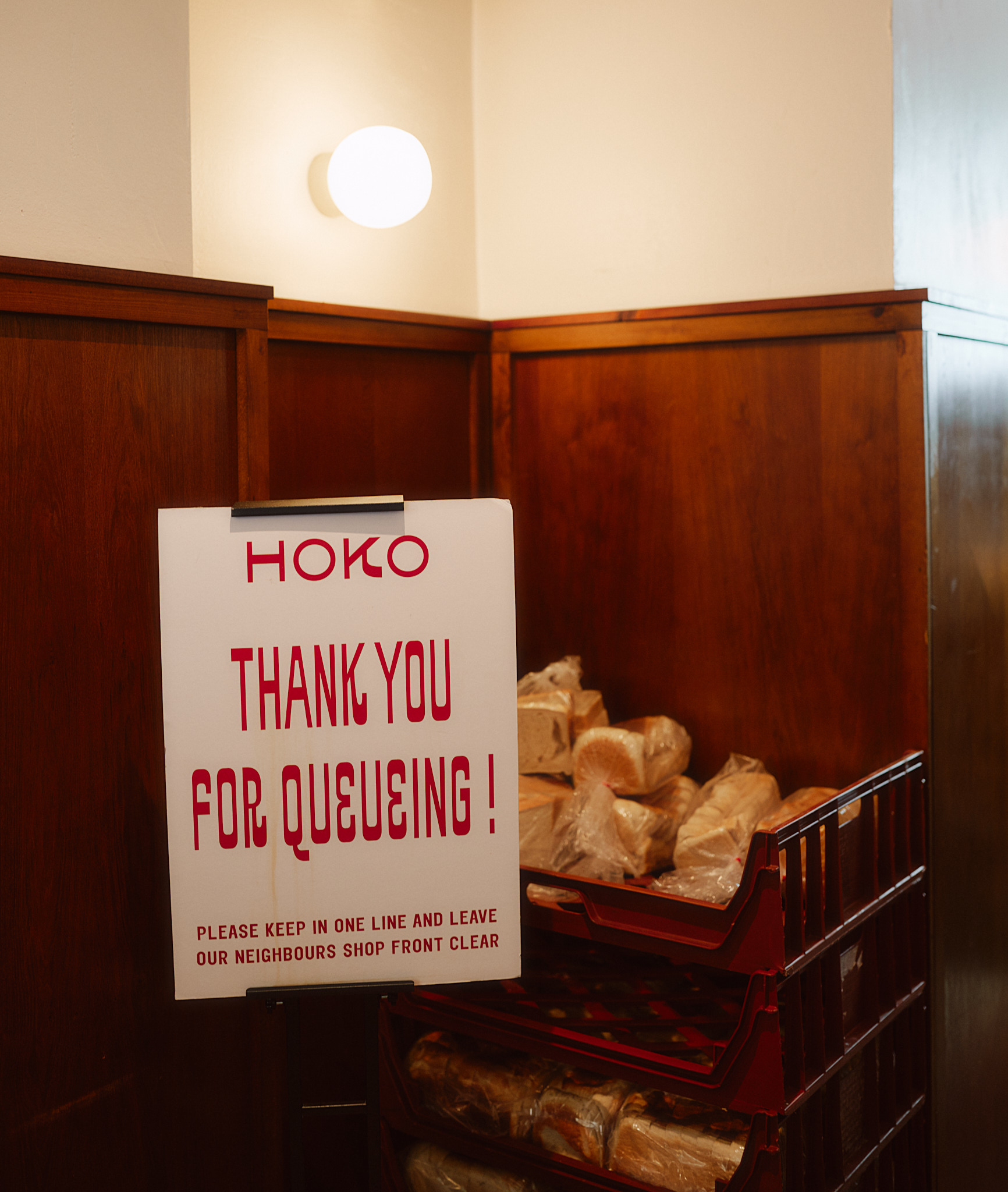


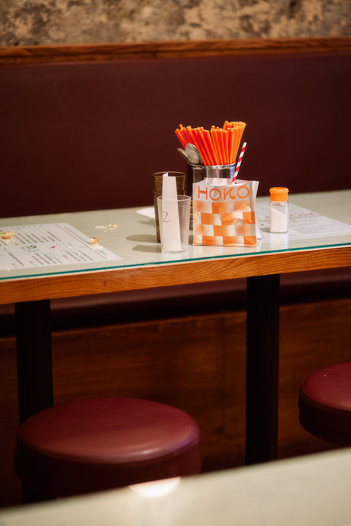
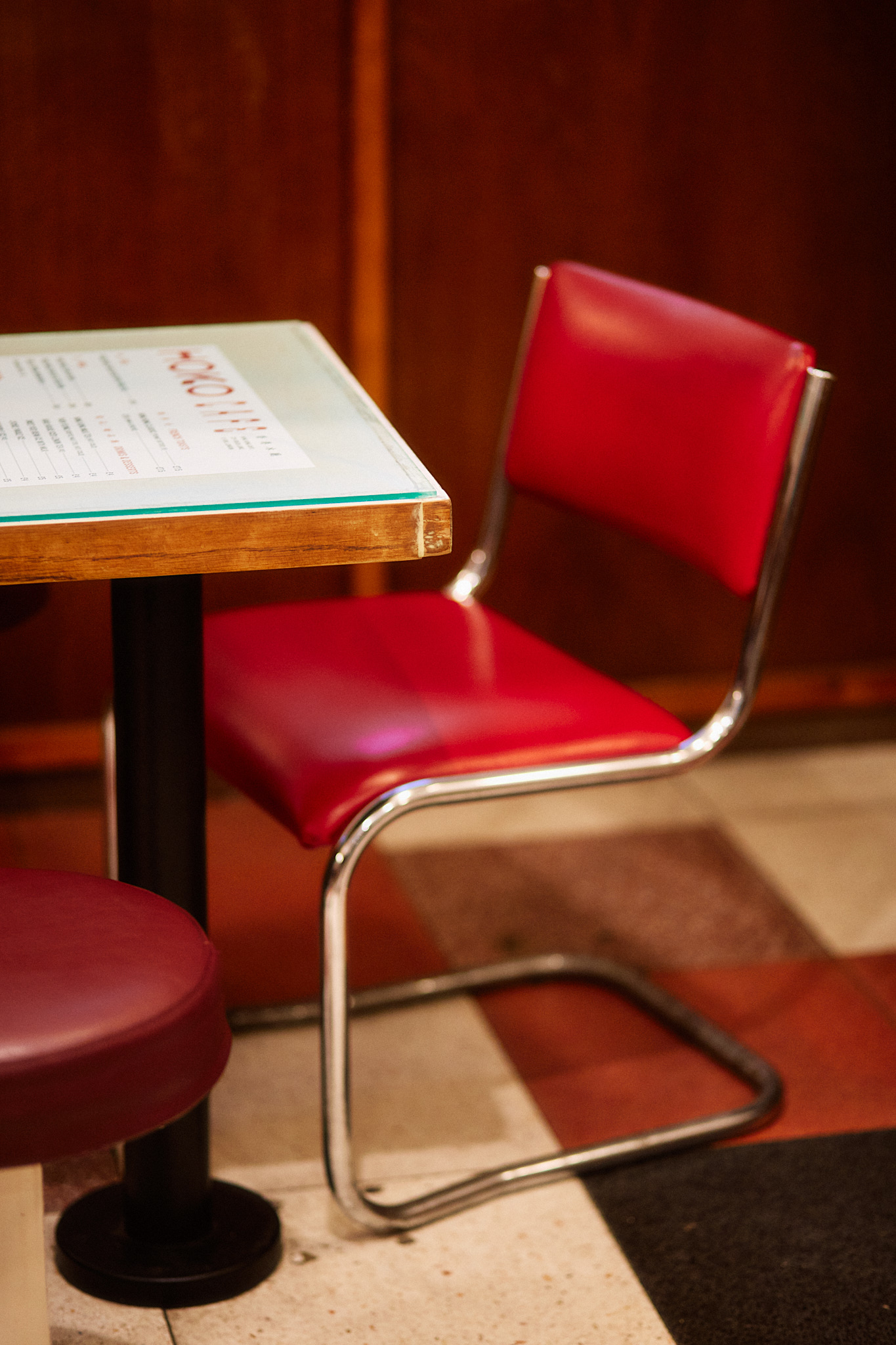
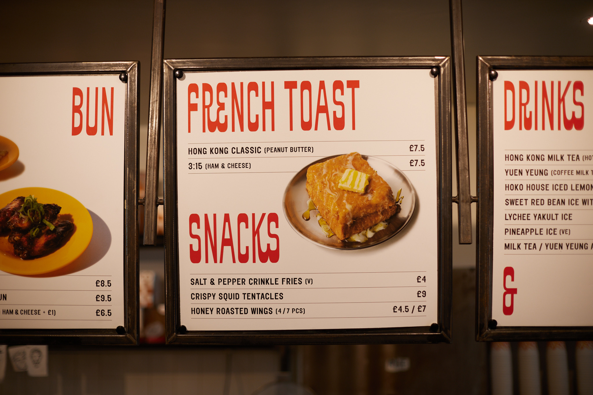


HOKO Cafe 2022
224 Brick Lane, E1 6SA, London
Brand identity and packaging design for HOKO Cafe. On a mission to preserve the food culture of Hong Kong, HOKO is a brand bringing a taste of home to London and wishes to share the blend of the Hong Kong spirit and history in the golden cups of hand-crafted Hong Kong-styled milk tea.
The design for HOKO’s packaging is strikingly simple, which features a swathe of bright red and a minimalist logotype inspired by Chinese calligraphy. It is simultaneously retro yet contemporary – a symbol of Hong Kong’s dichotomous nature and a beautifully designed product that stands out on shelves.
Scope Brand Identity, Packaging Design, Type Design,Typeface
Photography courtesy of Yoav Picherski


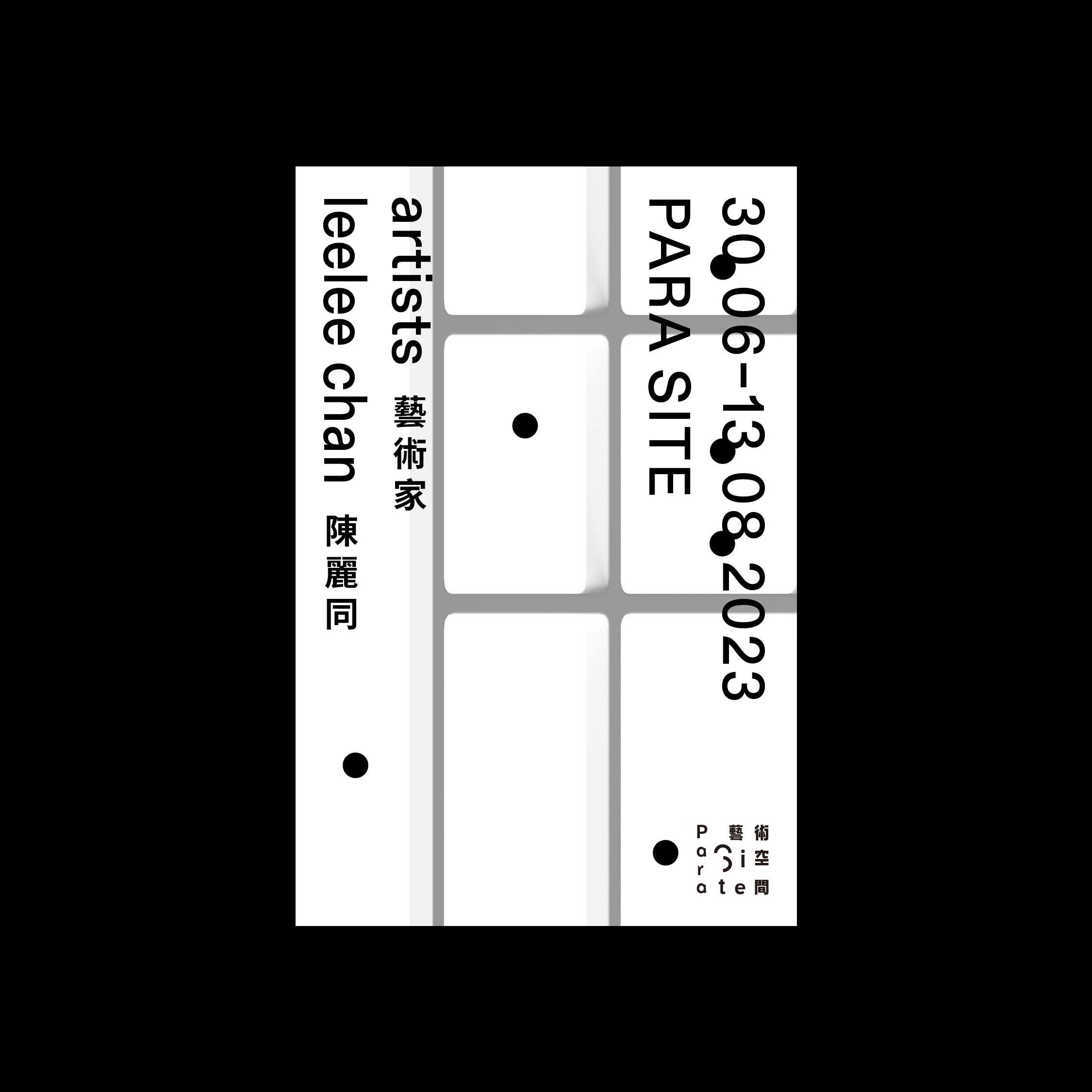

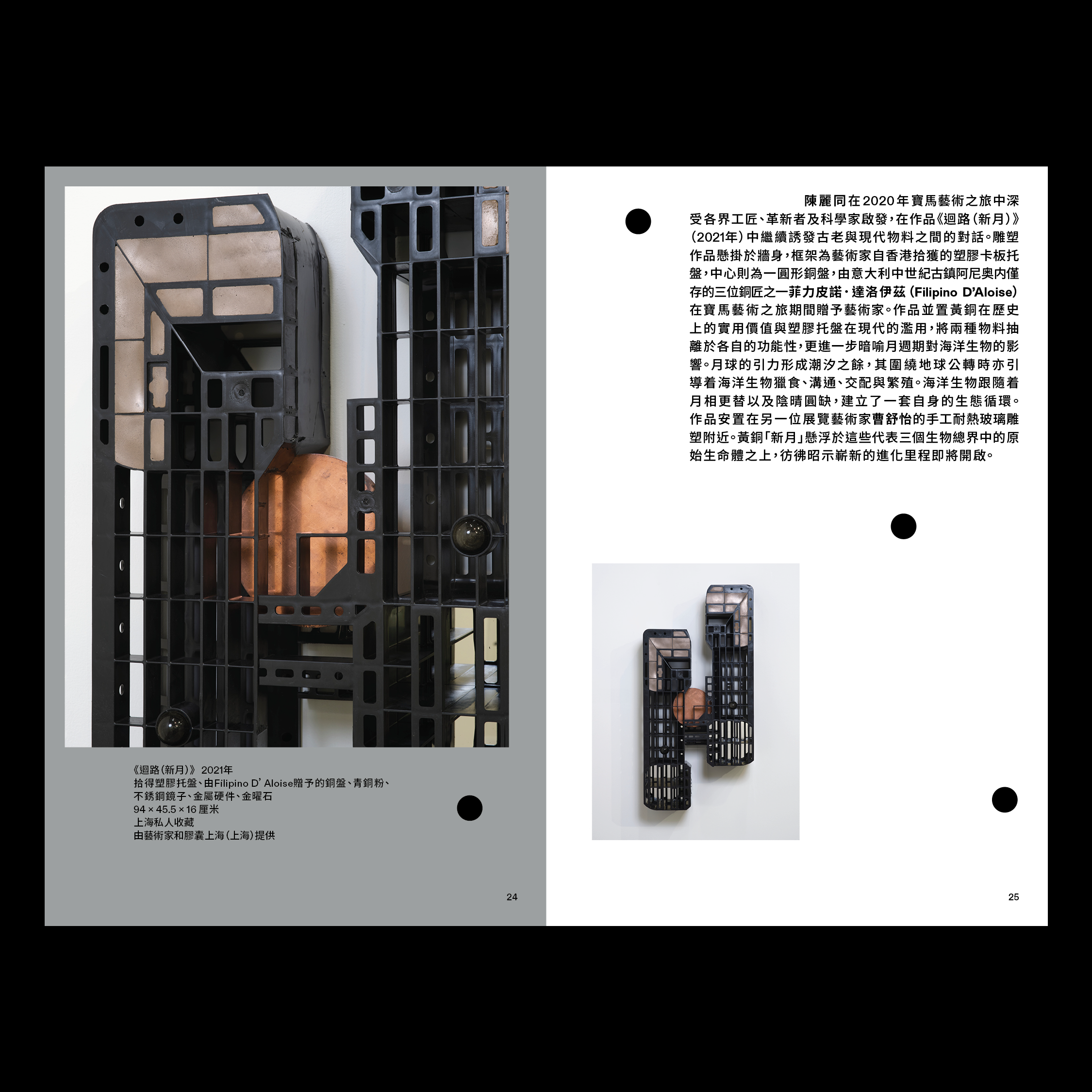
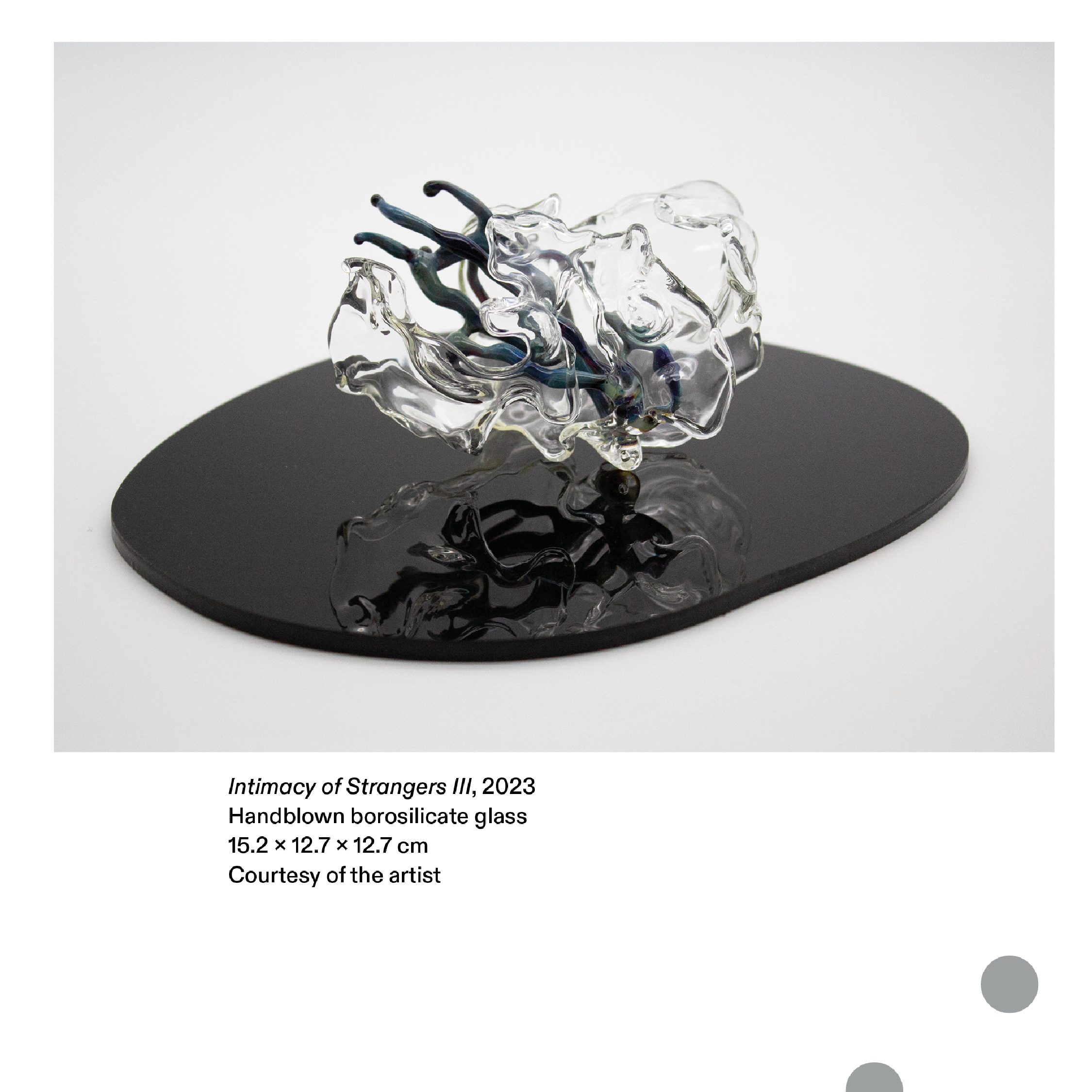


Strange Strangers 嬑形陌客 30 Jun—13 Aug, 2023
Para Site 677 King's Road, Quarry Bay, Hong Kong
Key visual identity for ‘Strange Strangers’ 嬑形陌客 by artist Shuyi Cao and Leelee Chan at Para Site curated by Cusson Cheng.
The visual identity captures a sense of ambiguity, developed upon the contrasting elements found in the sculptural works of the two artists. Cao's work emanates the essence of flowing organic shapes, while Chan's work distinctively built with a structural grid. This mix of a geometric grid with fluid organic forms is presented through 3D renderings that emulate the textural and material usage found in the sculptures – handblown transparent glass and silver metallic hardware, in a dynamic motion.
The detail in title's typography and the animated, cluttered dots draw inspiration from the forms and textures found in the sculpture works created by Ooliths (Yellow zinc), 2022 by Leelee Chan and As they folded in and breached out series, 2022-23 and pabulite (primordial bliss), 2023 by Shuyi Cao.
Catalogue Design 175 × 265 mm 64pp Double EN + TC catalogues on one cover with saddle stitching
4C + Pantone Silver Embossing on the black dots on the cover
Artists Shuyi Cao, Leelee Chan
Scope Exhibition Key Visual Identity, Exhibition Graphics, Book Design, Print Collaterals
Photography courtesy of Felix S.C. Wong
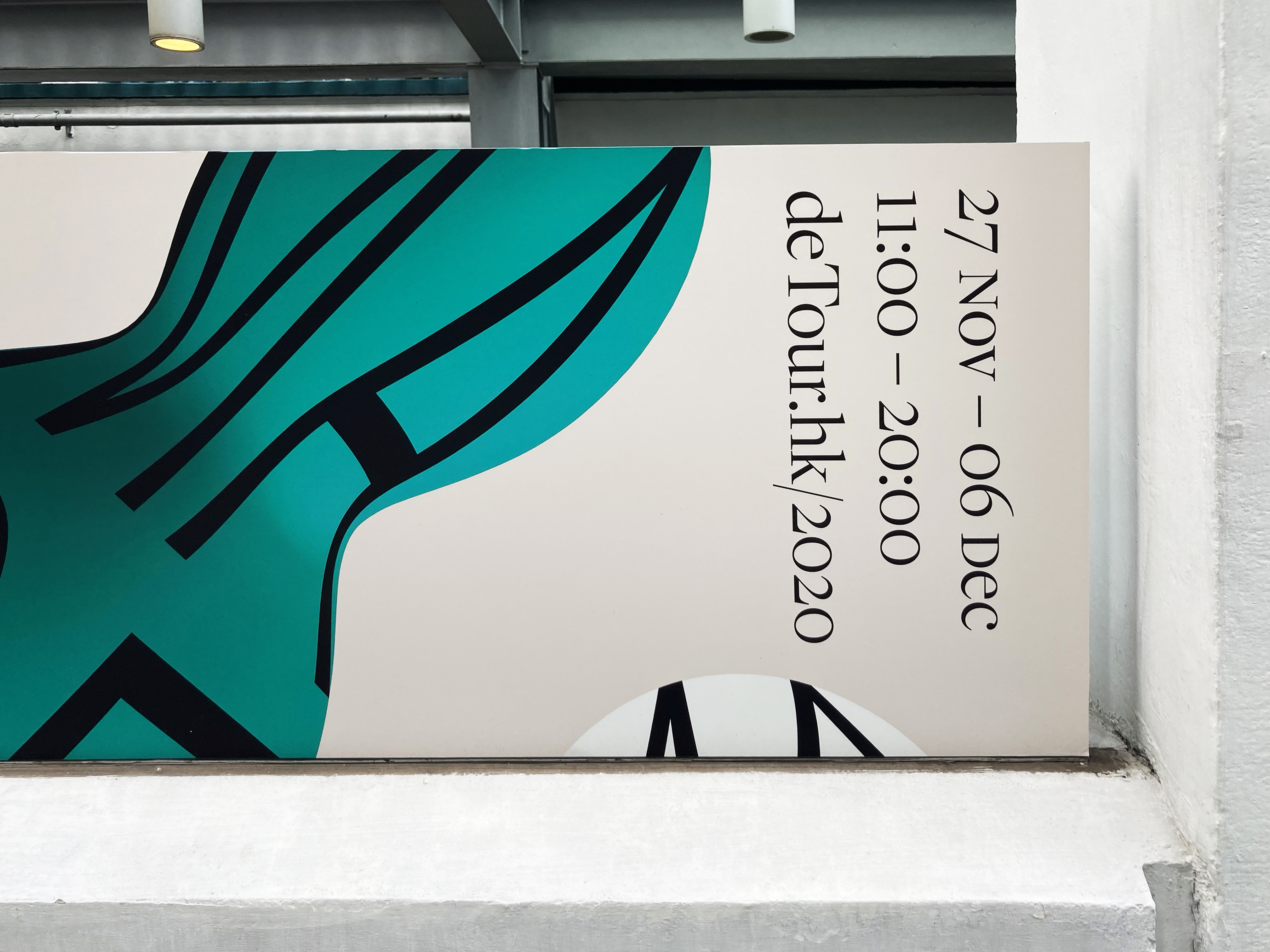
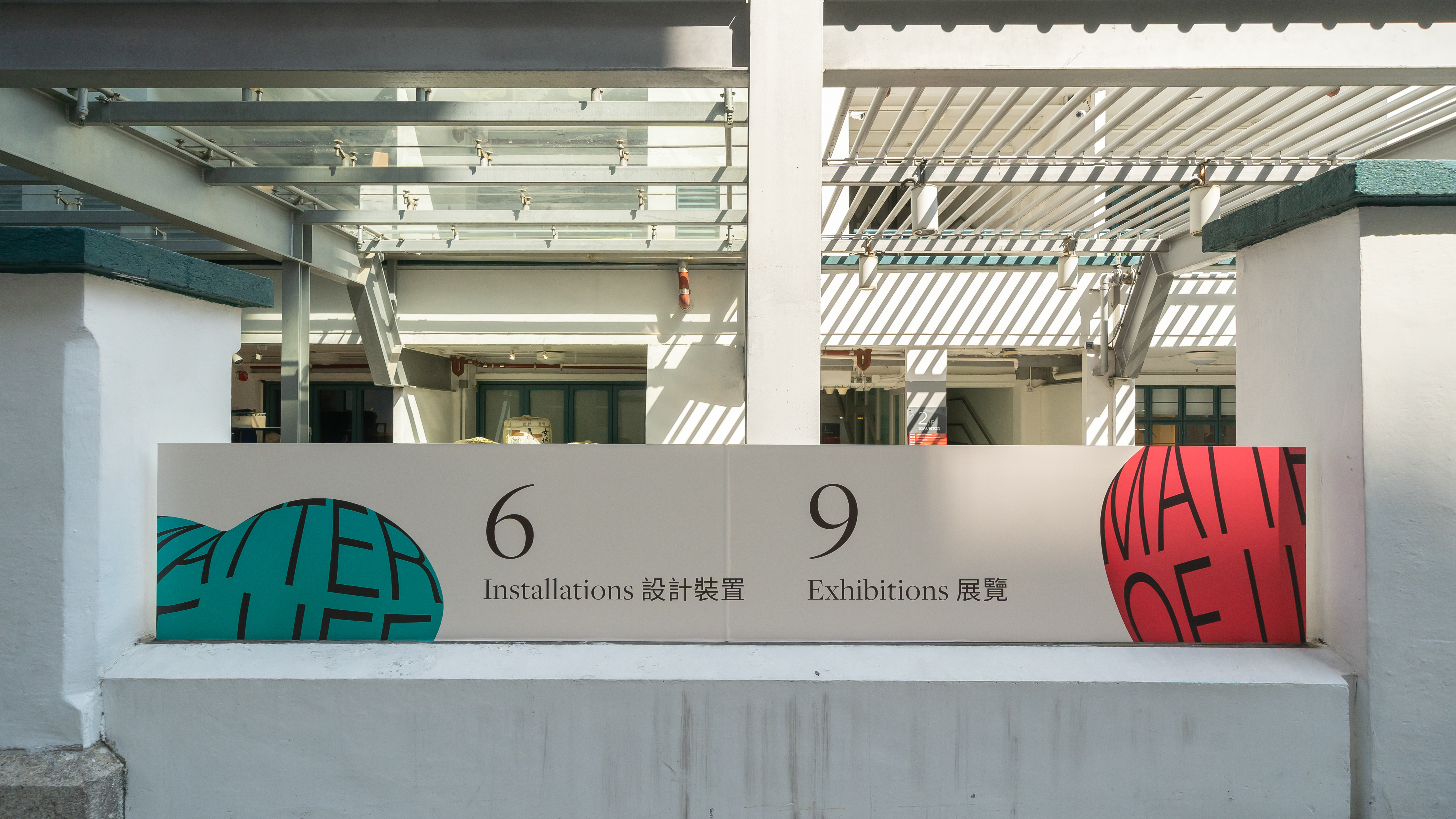
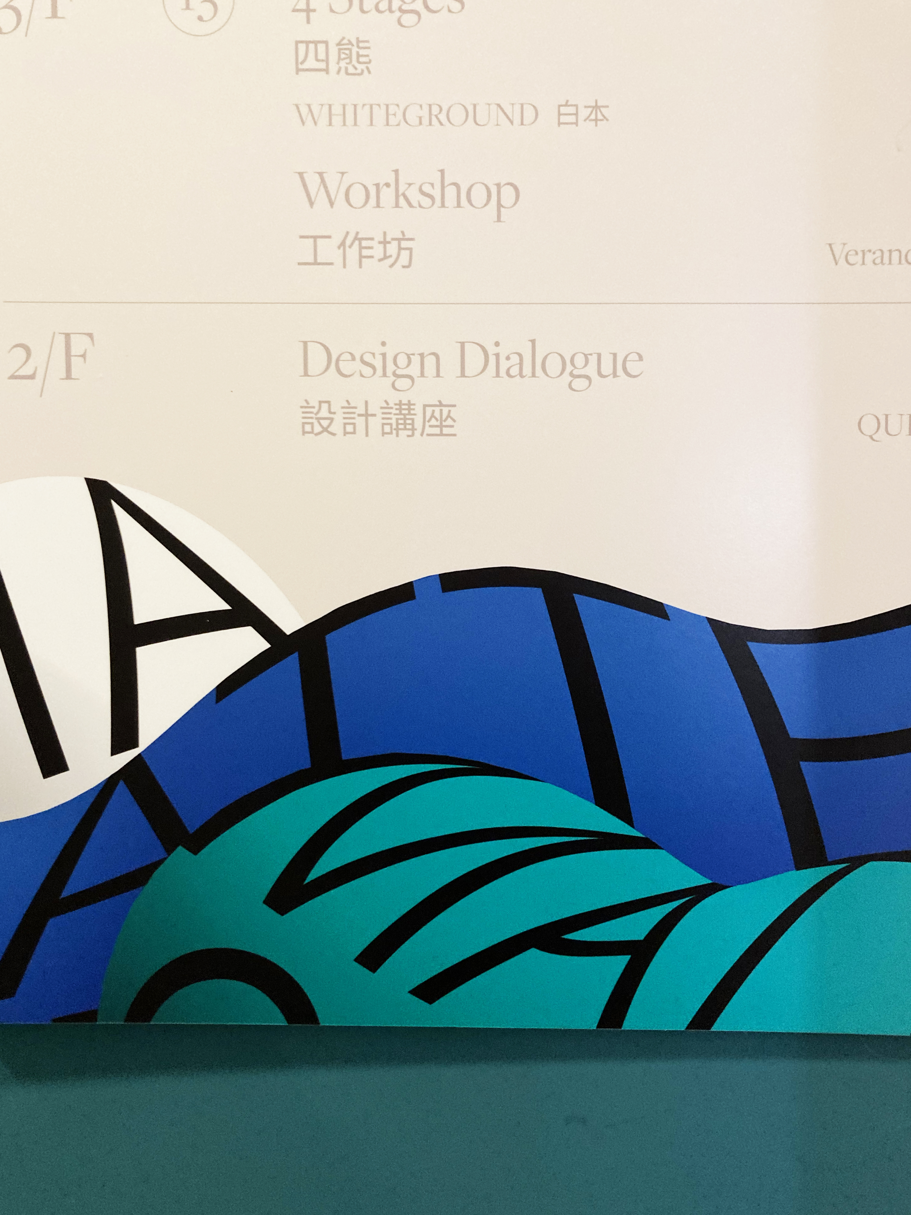
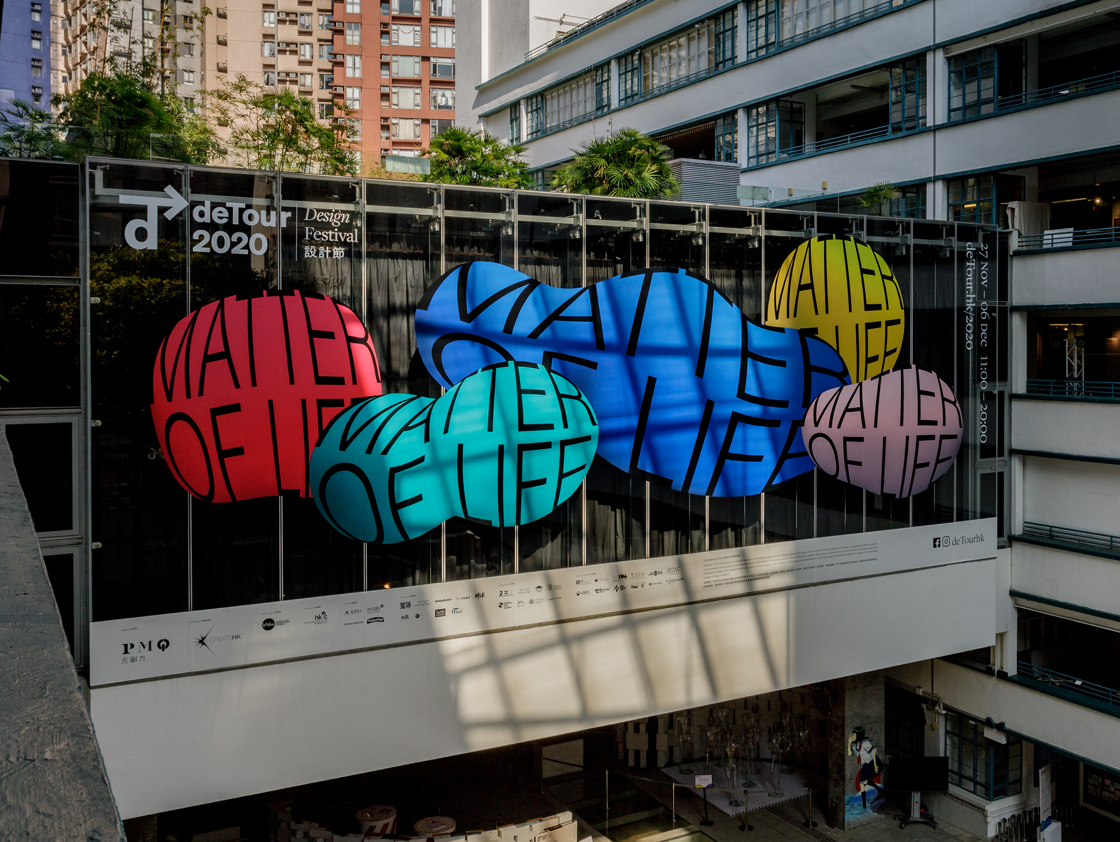
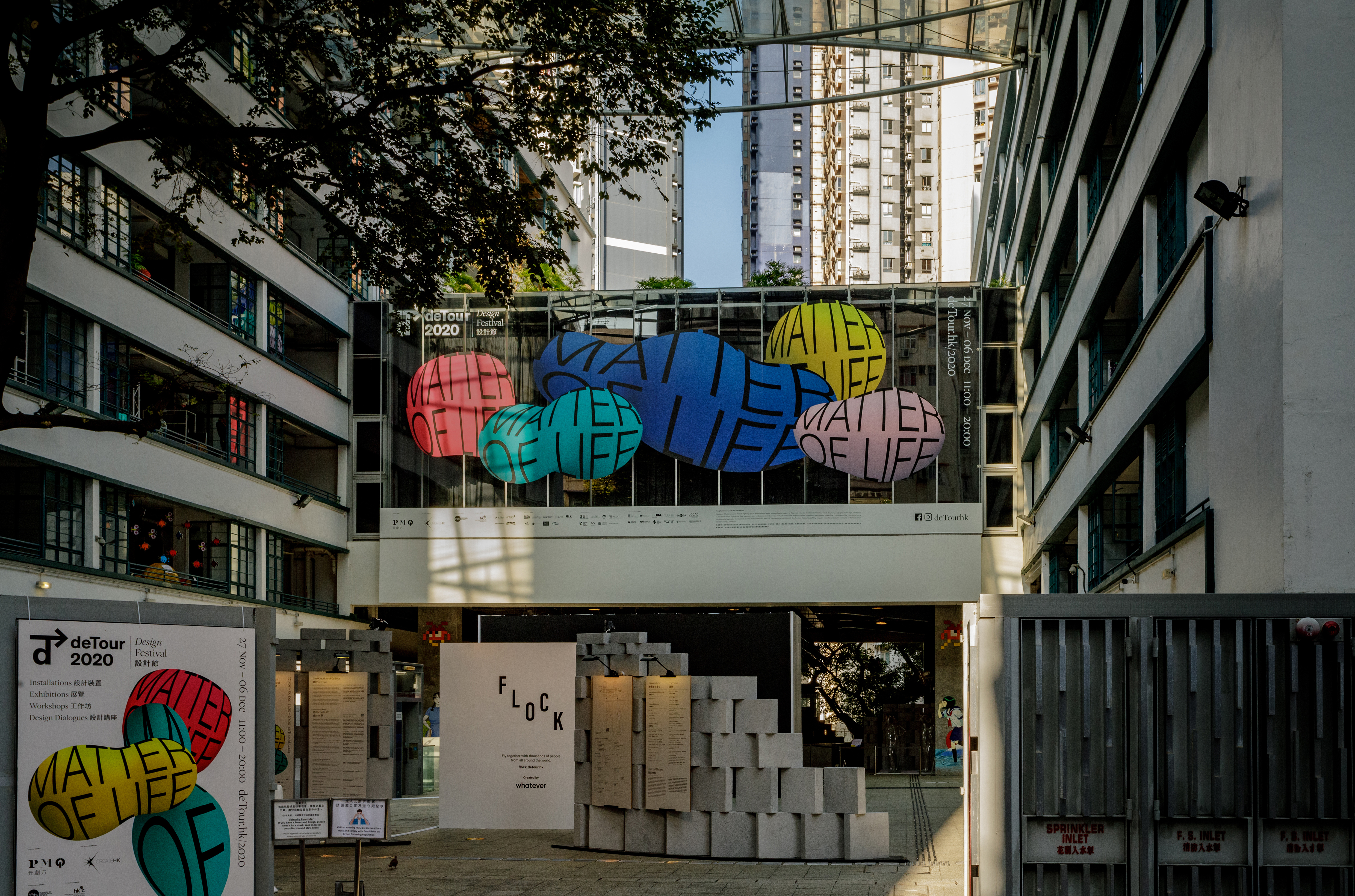
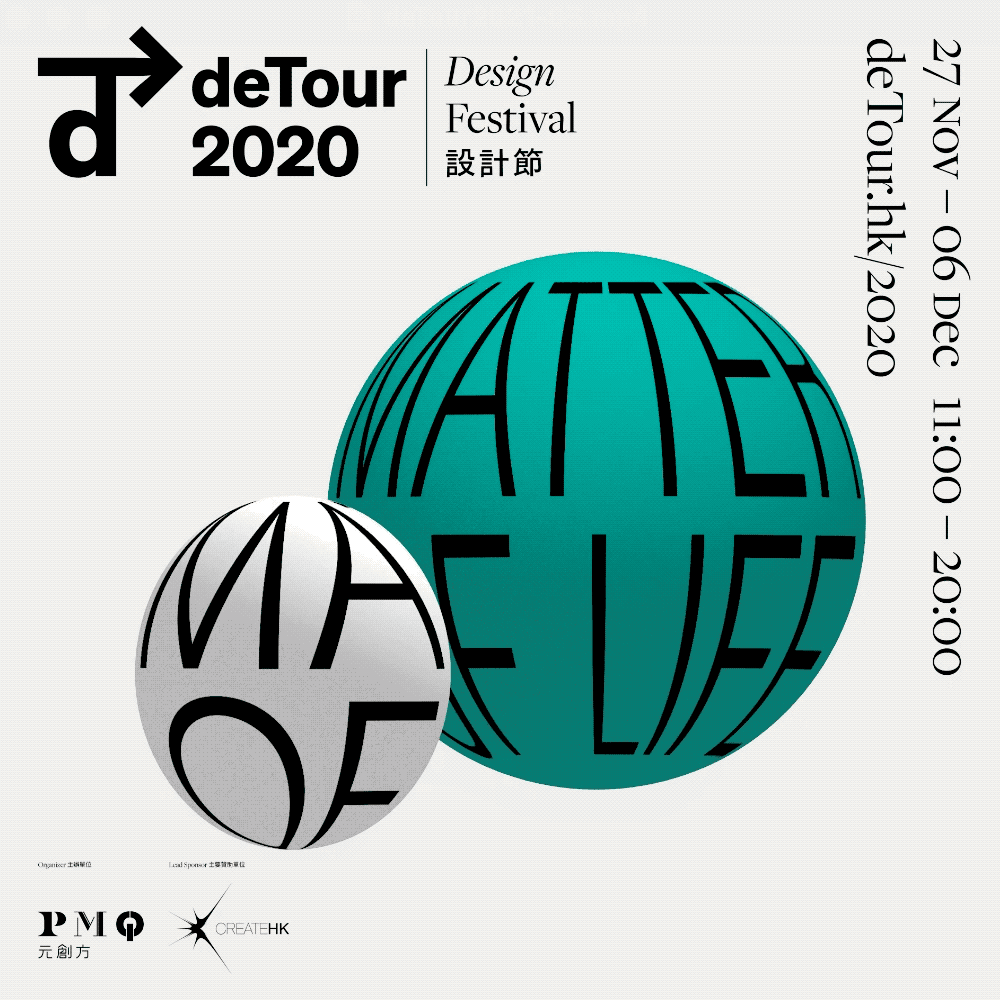
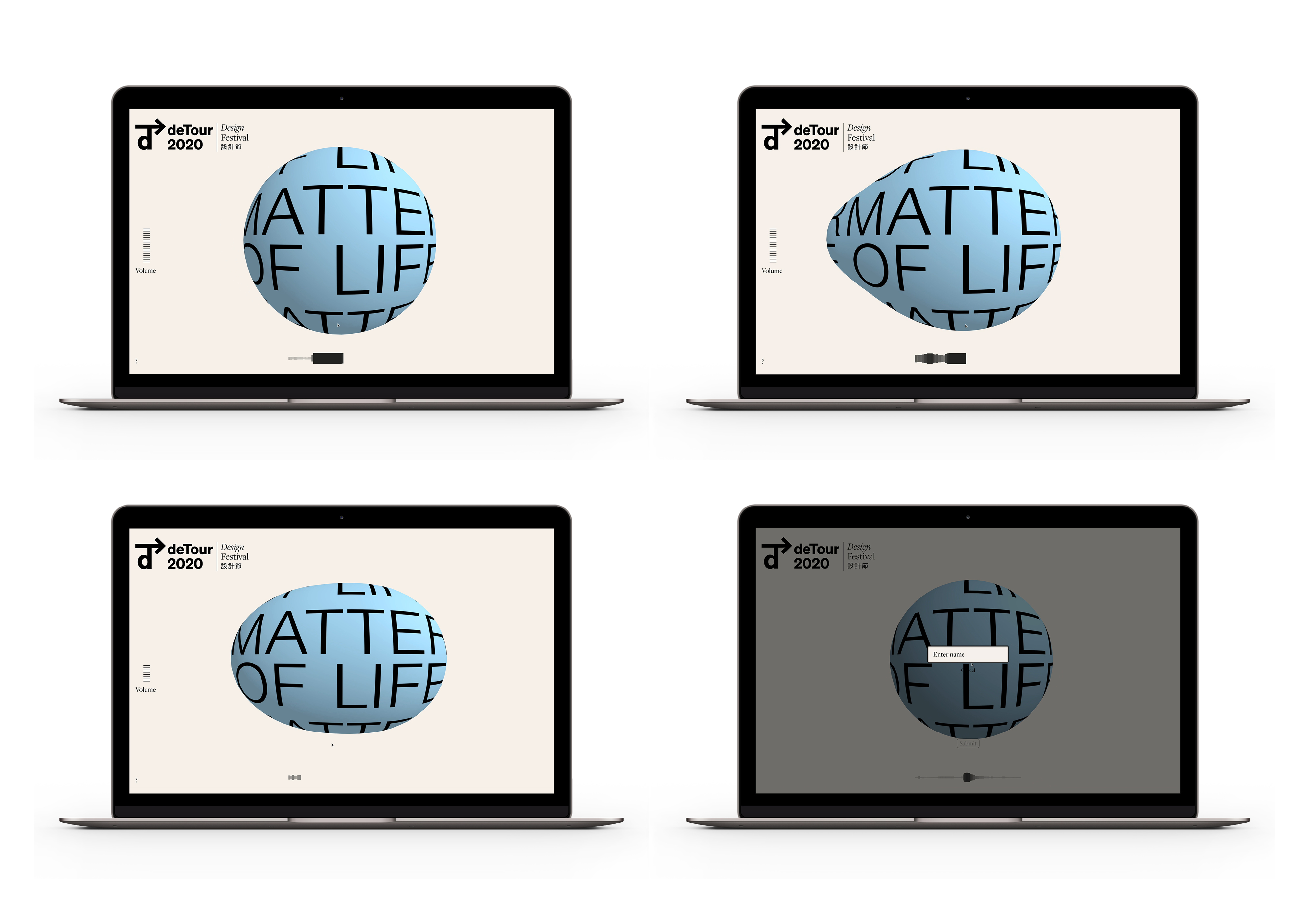
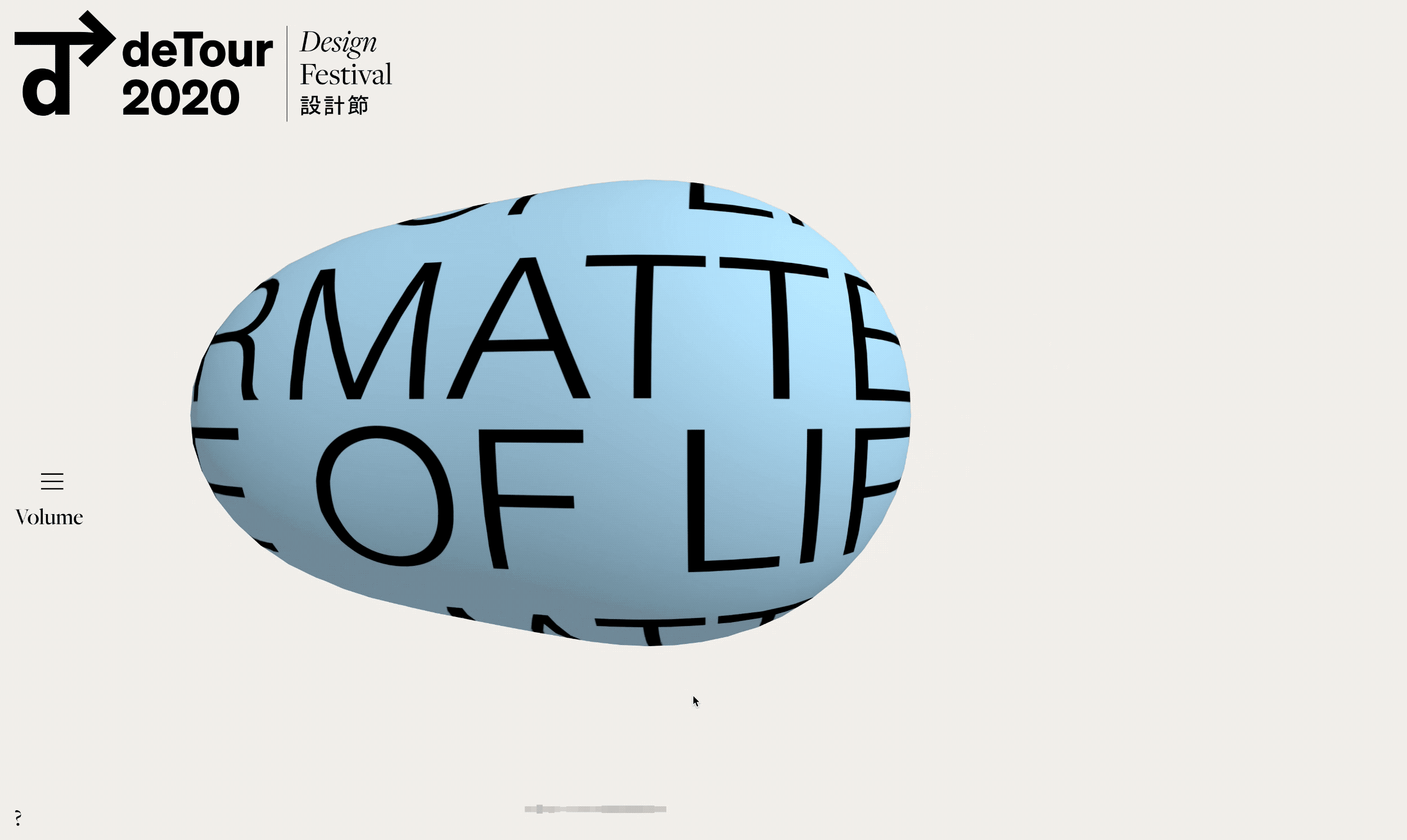
Detour 2020 Matter of Life 27 Nov—06 Dec, 2022
PMQ, 35 Aberdeen Street, Central, Hong Kong
deTour 2020 is an annual design festival in Hong Kong celebrating the works and ideas of local and overseas creative talents organised by PMQ, an art and cultural hub revitalised from Former Hollywood Road Police Married Quarters.
Festivals have always been about celebration and community, which are both illusive in 2020 with Covid. The concept of this year’s deTour visual identity stems from “gathering of qi” (集氣). This concept of solidarity and courage represents the values we see in Asian pop culture. The concept of ‘qi’ derives from the word “air” and figuratively as “the life force” so we found it a fitting reference for this festival theme “Matter of Life”, as the very air we breathe is what unites us all as human beings. It was an especially poignant reminder of our mask-wearing society today.
︎ detour2020.hato.co
Scope Exhibition Key Visual Identity, Exhibition Graphics, Print Collaterals
Project completed at HATO
Photography courtesy of PMQ & JIMI CHIU


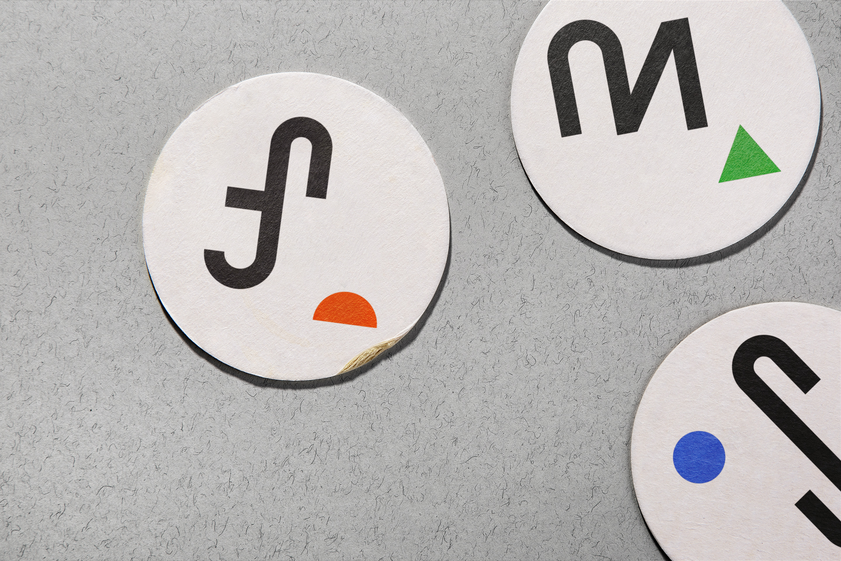
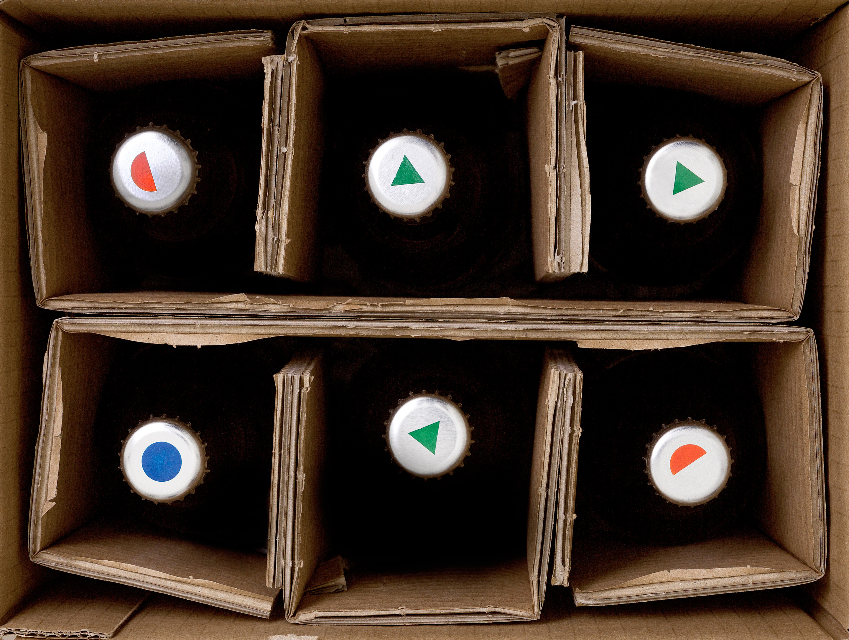

St.Erhard
2018
Bamberg, Germany
Packaging design for German craft brewery St. Erhard, Farmer, Mayflower and Saison. To differentiate with other German brewery which used traditional blackletter type and old-fashioned illustration in their packaging, a modern approach with simplicity is used in the design for St. Erhard.
The design references the typographic and geometric design from The Bauhaus School of Design legacy. Each brew is assigned with a colour and a geometric shape with custom type reduced to their most basic elemental forms. The result is characterised by a strong use of contrast and a graphic simplicity.
Scope Packaging Design
Project completed at Bedow
Photography courtesy of Bedow


Poetic Heritage 2 Sep—21 Nov, 2021
Tai Kwun Contemporary, Hong Kong
Key visual identity, motion and print collaterals for Poetic Heritage, Tai Kwun Contemporary. Poetic Heritage explores the critical and creative relationships between heritage and contemporary art through the works of six artists/artist groups from Hong Kong and beyond. Each of the artists offers insight on the many ways that “heritage” provides a productive lens to engage with contemporary issues, while expanding on the notion of “heritage” itself. In doing so, the exhibition also considers how much power and agency individuals have in determining what is retained and reimagined of our heritage.
Artists Alfredo & Isabel Aquilizan, Ursula Biemann & Paulo Tavares, Leelee Chan, Leung Mee-ping, Jorge Otero-Pailos, Wan Lai-kuen Annie
Scope Exhibition Key Visual Identity, Exhibition Graphics, Book Design, Print Collaterals
Project completed at HATO


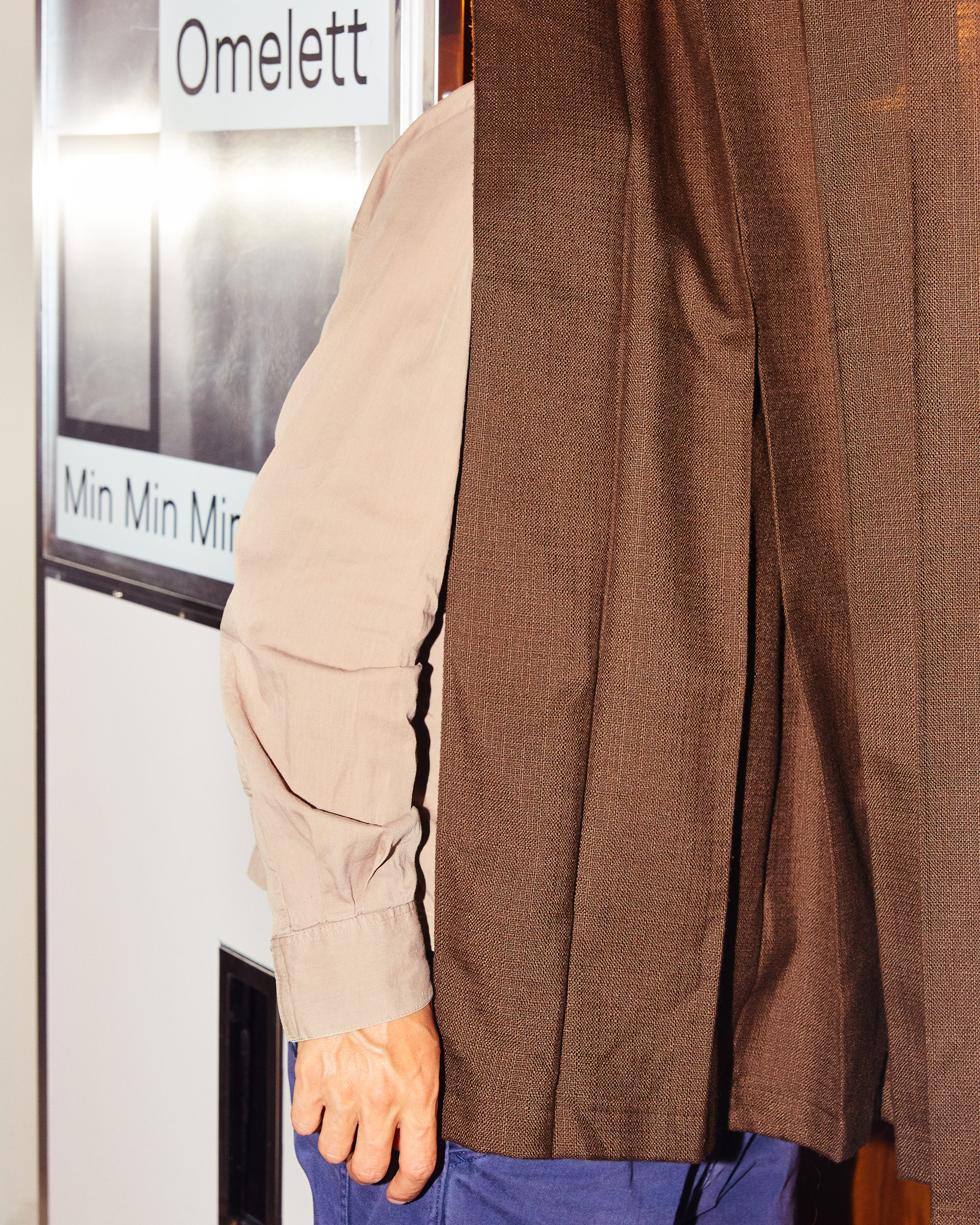

Omelett 2018
Stockholm, Sweden
Brand identity for Omelett, a hand-built digital photo booths supplier company in Stockholm, Sweden. The brand name, Omelett comes from a saying, ‘Säg omelett!’, which is the Swedish for ‘Say cheese!’. The identity is based on a posing typeface, Omelett Display. Each letter in this bespoke typeface family has a frame in it and have 4 different poses/alternatives. With motion graphic, a playful and quirky identity is created that is coherent with the brand value – photo booth is where we capture the fun and special moment.
Scope Brand Identity, Type Design
Project completed at Bedow
Photography courtesy of Bedow

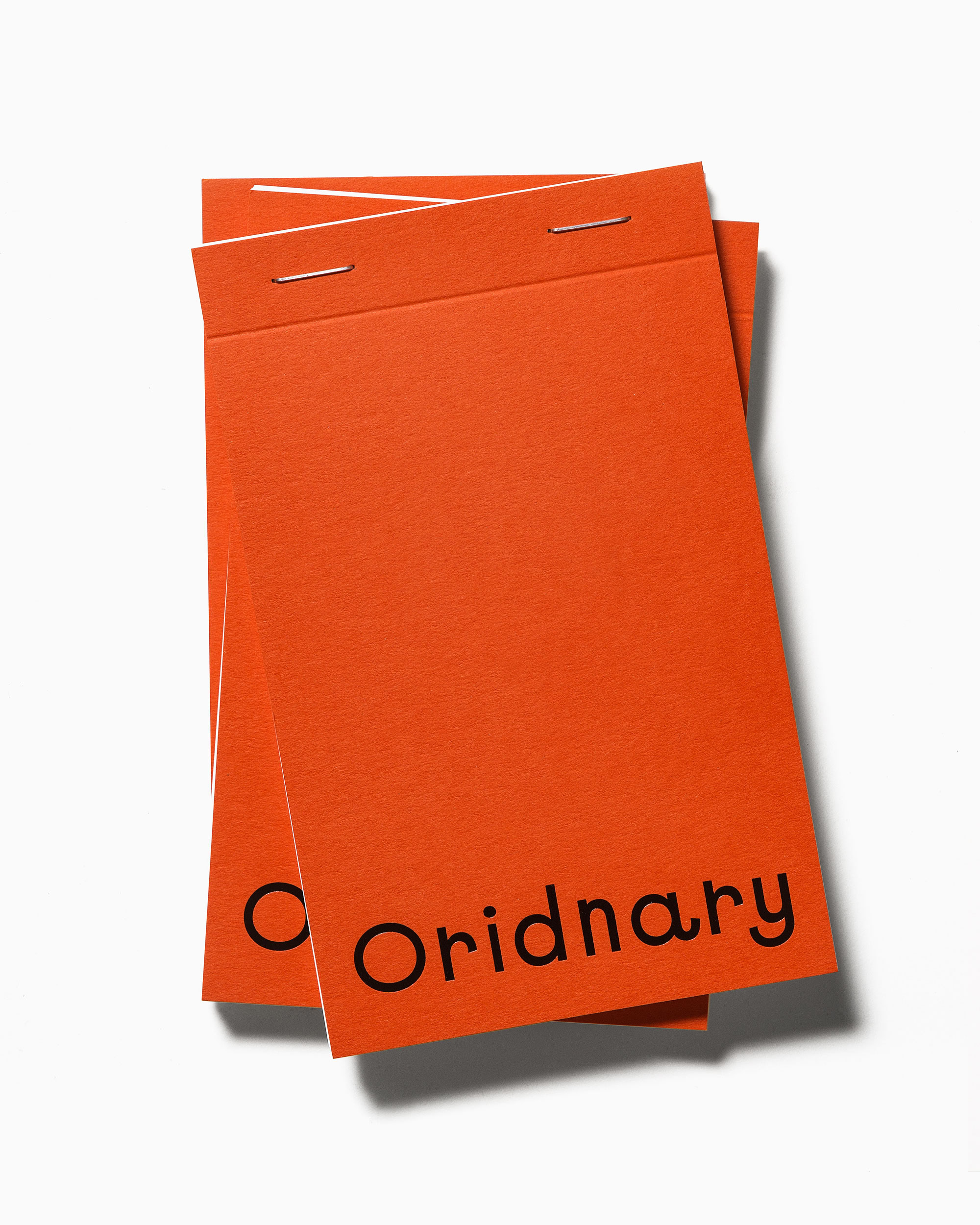


Oridnary 2018
Stockholm, Sweden
Brand Identity for Oridnary, a creative tech studio in Gothenburg, Sweden that loves to challenge. The solution is based on spelling mistakes, a communication concept we called Challenge Ordinary. We gave them the name Oridnary, a misspelled version of ordinary – and the spelling mistakes continue all the way to the website, which auto-corrects as you scroll.
Visit the website ︎ Oridnary
Scope Brand Identity, Web Design
Project completed at Bedow
Photography courtesy of Bedow


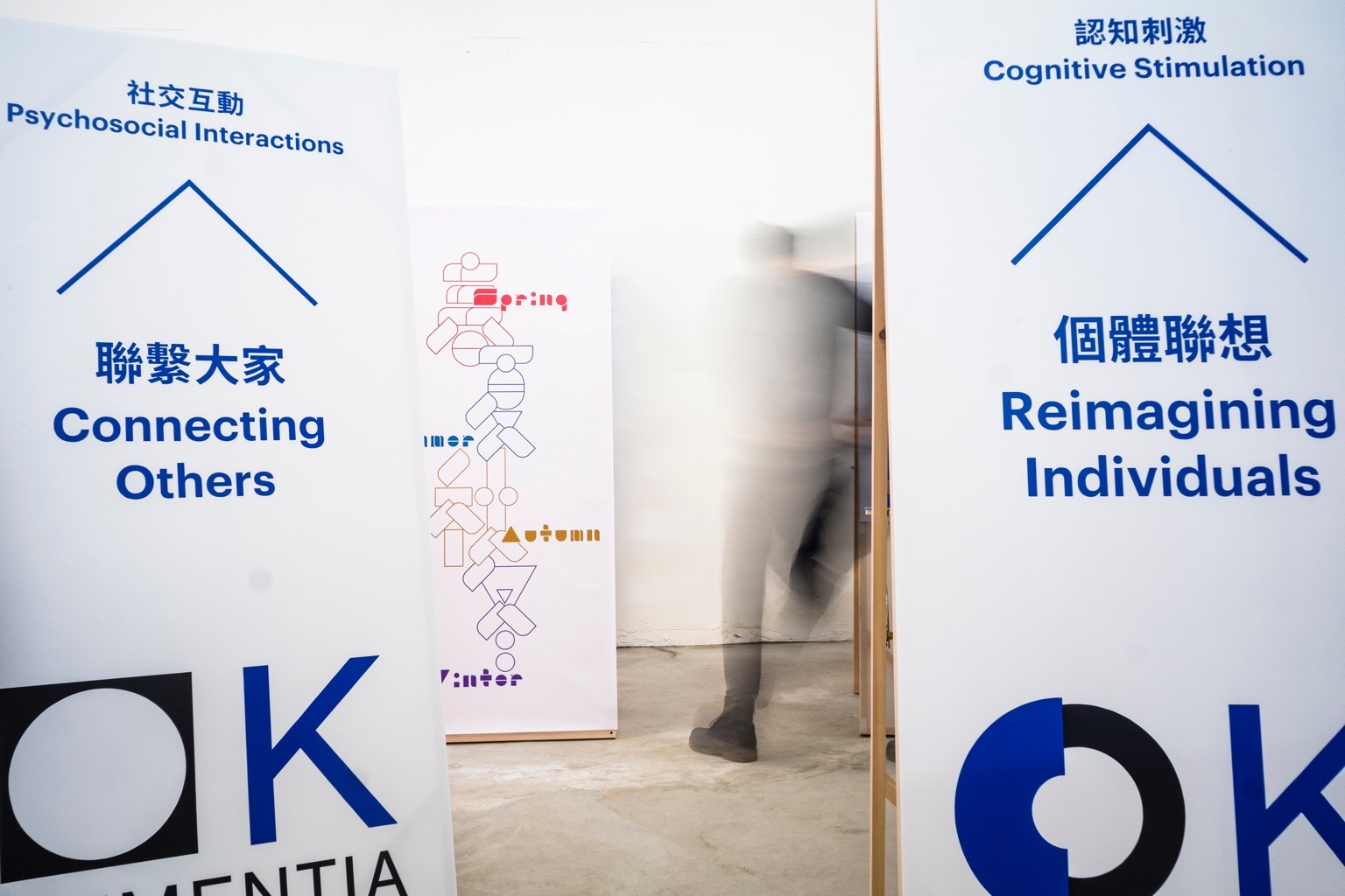
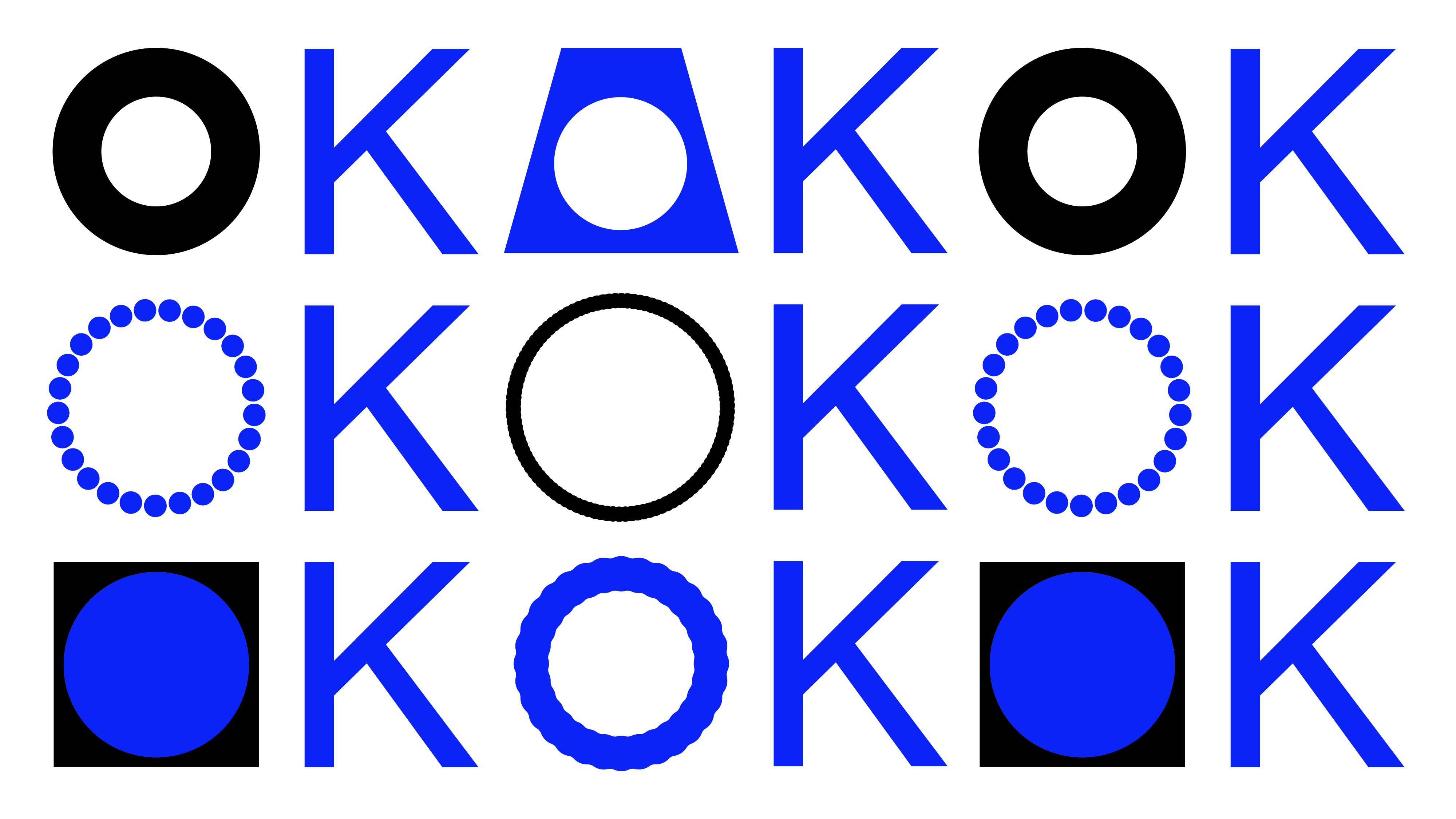

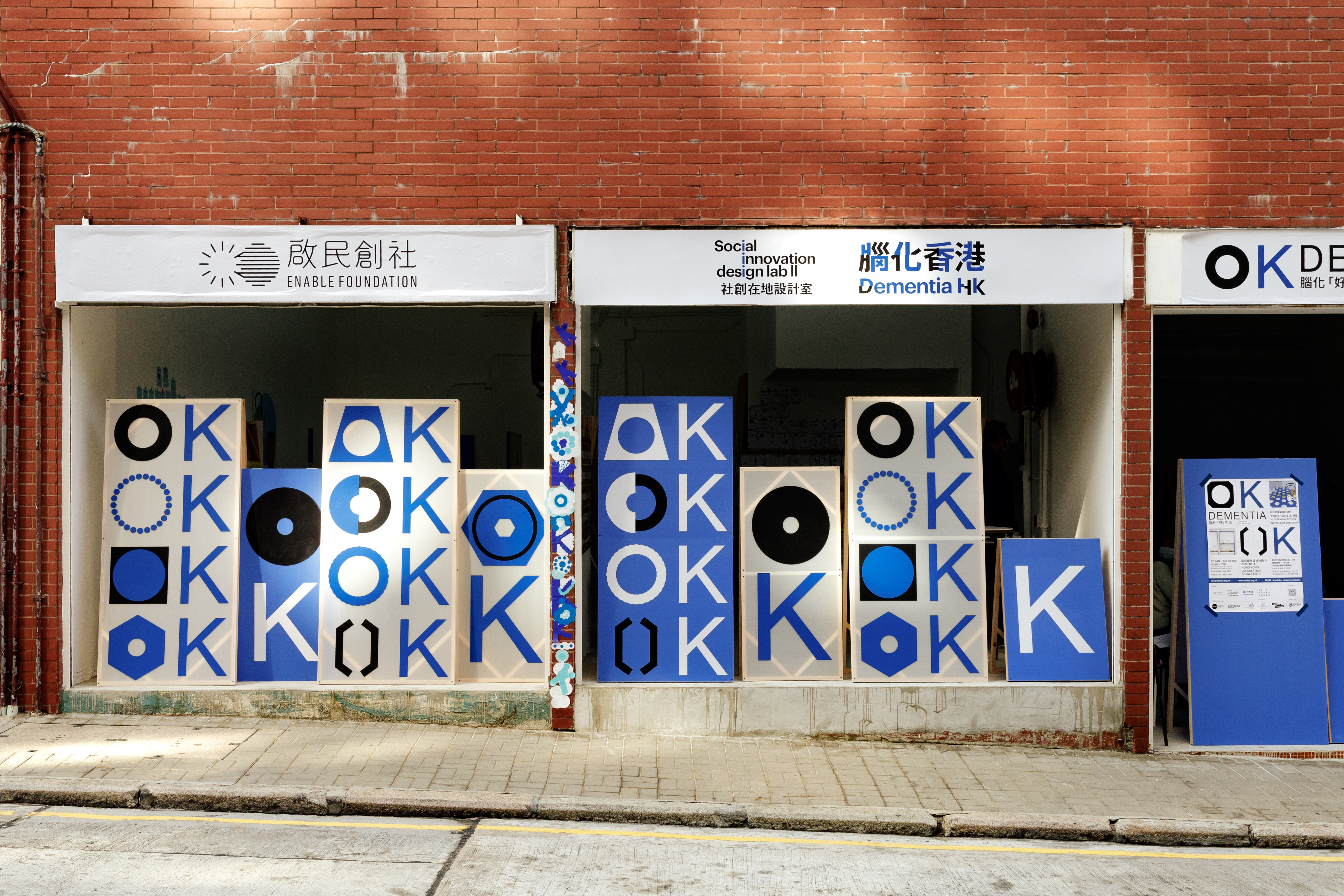

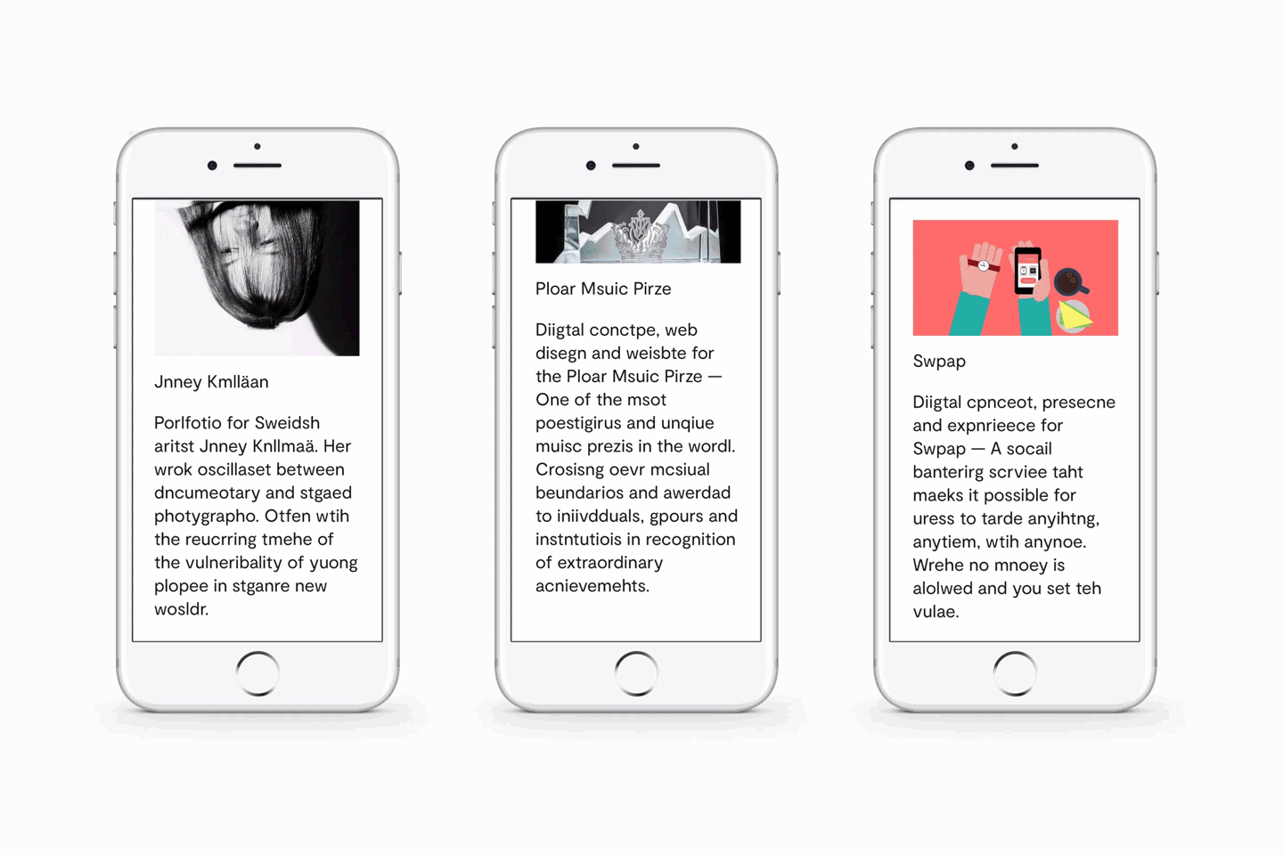
OK Dementia 5—15 Dec, 2022
No. 18 Bridges Street, Hong Kong
Dementia Hong Kong aims to engage cross-disciplinary teams to co-create a series of 'Dementia Things' to address everyday issues of dementia as well as sharing stories to raise public awareness.
As part of the launching events of Dementia Hong Kong, a series of co-creation 'OK Dementia' showcases will feature a range of 'Dementia Things' that Enable Foundation had researched, designed and produced.
As there will be more than 10 showcases in different locations, the visual identity was designed to react to the traveling showcases and the ever-evolving nature of the project. The stylised 'O' referencing the different tools and objects used by the Enable team can be added as the project progresses.
Scope Exhibition Key Visual Identity, Exhibition Graphics, Print Collaterals
Project completed at HATO
Photography courtesy of Jimi Chiu & Enable Foundation

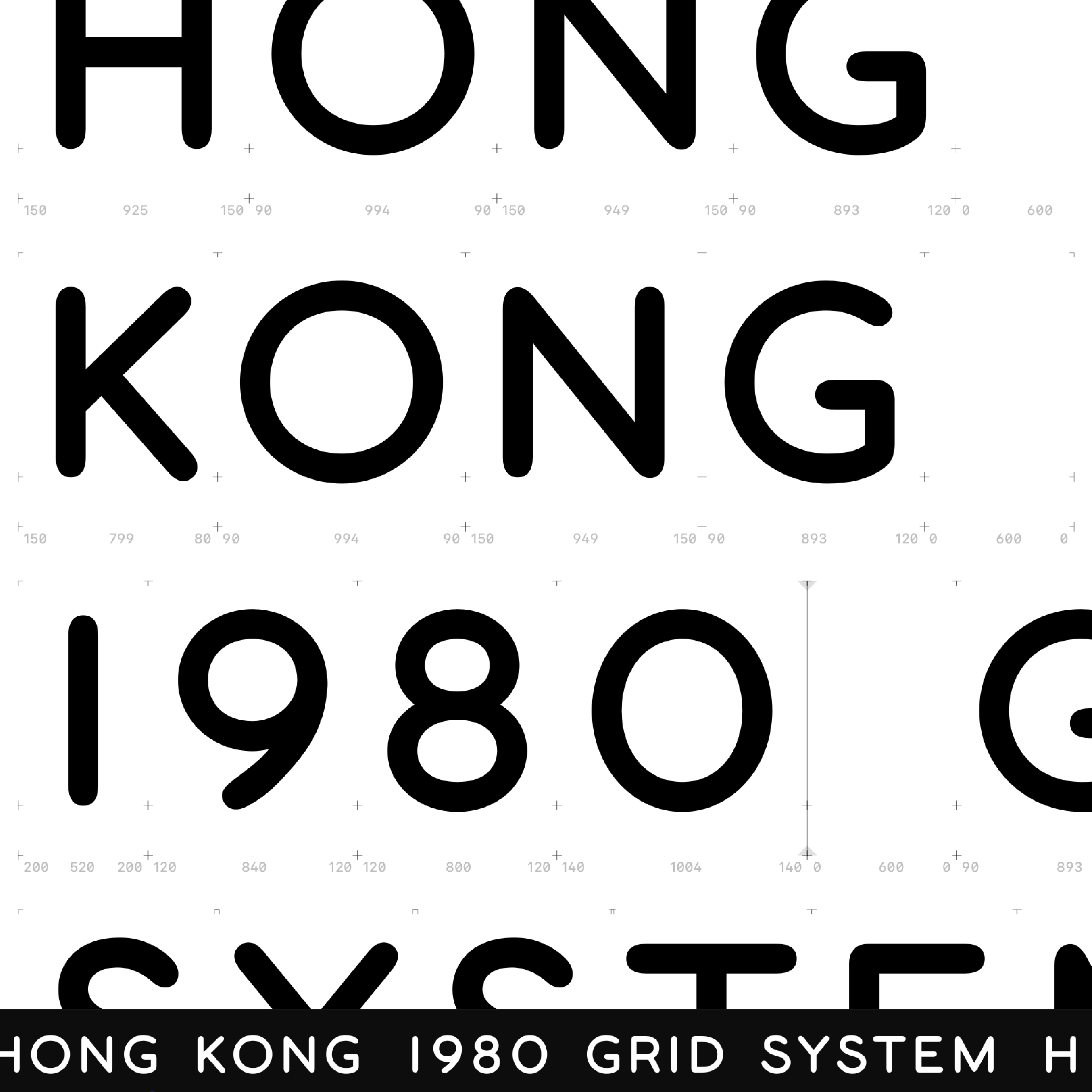
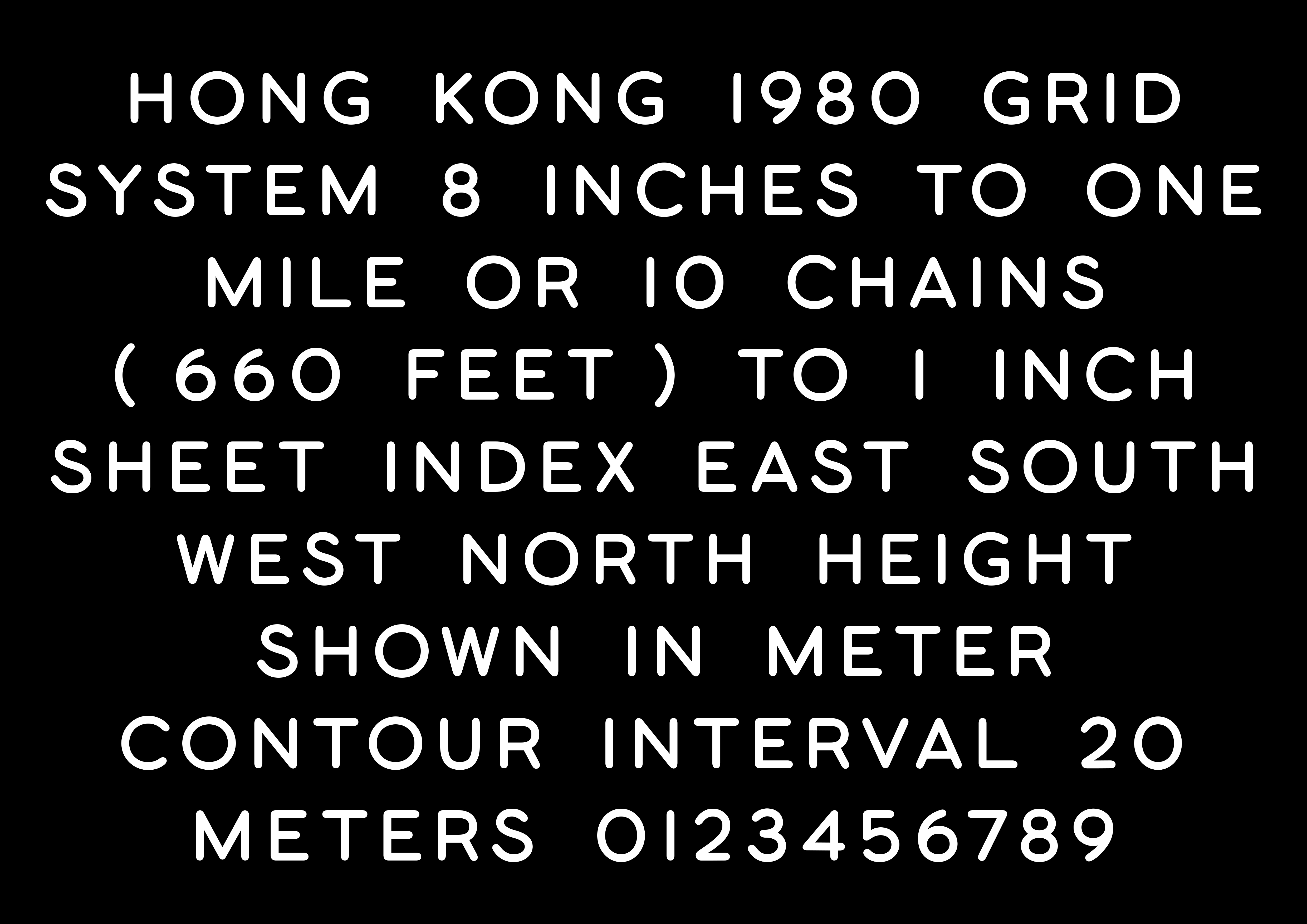
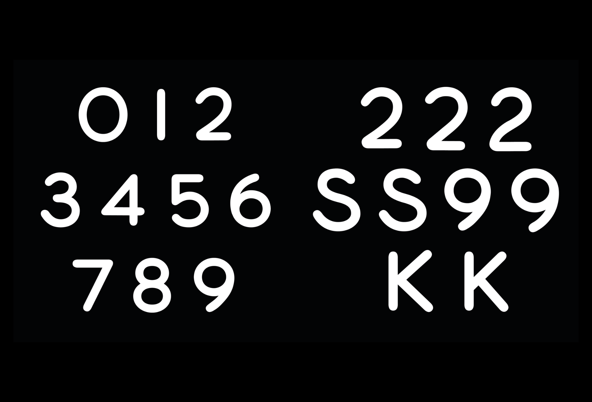


Hong Kong Map Type 2022
Hong Kong
Type design inspired by old paper maps of Hong Kong from the 60s discovered on a research trip at the local library in Hong Kong.
Scope Type Design, Typeface
A self-initiated project
Hong Kong
Type design inspired by old paper maps of Hong Kong from the 60s discovered on a research trip at the local library in Hong Kong.
Scope Type Design, Typeface
A self-initiated project


KölnSkulptur #10 ÜberNatur – Natural Takeover 1 Aug,2020—31 July, 2022
Skulpturenpark Köl, Riehler Strasse / Konrad-Adenauer-Ufer, 50668 Cologne, Germany
Visual identity for Kölnskulptur #10 in Skulpturenpark Köln (Cologne Sculpture Park). Every two years the Skulpturenpark Köln invites a curator to add new artworks to the impressive collection of around 40 works.
ÜberNatur — Natural Takeover is the theme of this year. Every sculpture is connected and affected by the surrounding natural environment. The visual idea for the exhibition comes from the sunlight variation reflecting on the sculptures. During the day, the variation of sunlight affects how the sculptures look to the audiences. Throughout the year, the variation of weather affects how the audiences feel about the sculptures. The key visual illustrates the map of the sculpture park itself, with sculpture almost integrated within.
Artists Mary Bauermeister, John Bock, Leelee Chan, Ayse Erkmen, Dane Mitchell, Katja Novitskova, Guan Xiao, Trevor Yeung
Scope Exhibition Key Visual Identity, Exhibition Graphics, Book Design, Print Collaterals
Project completed at HATO
Photography courtesy of Skulpturenpark Köln

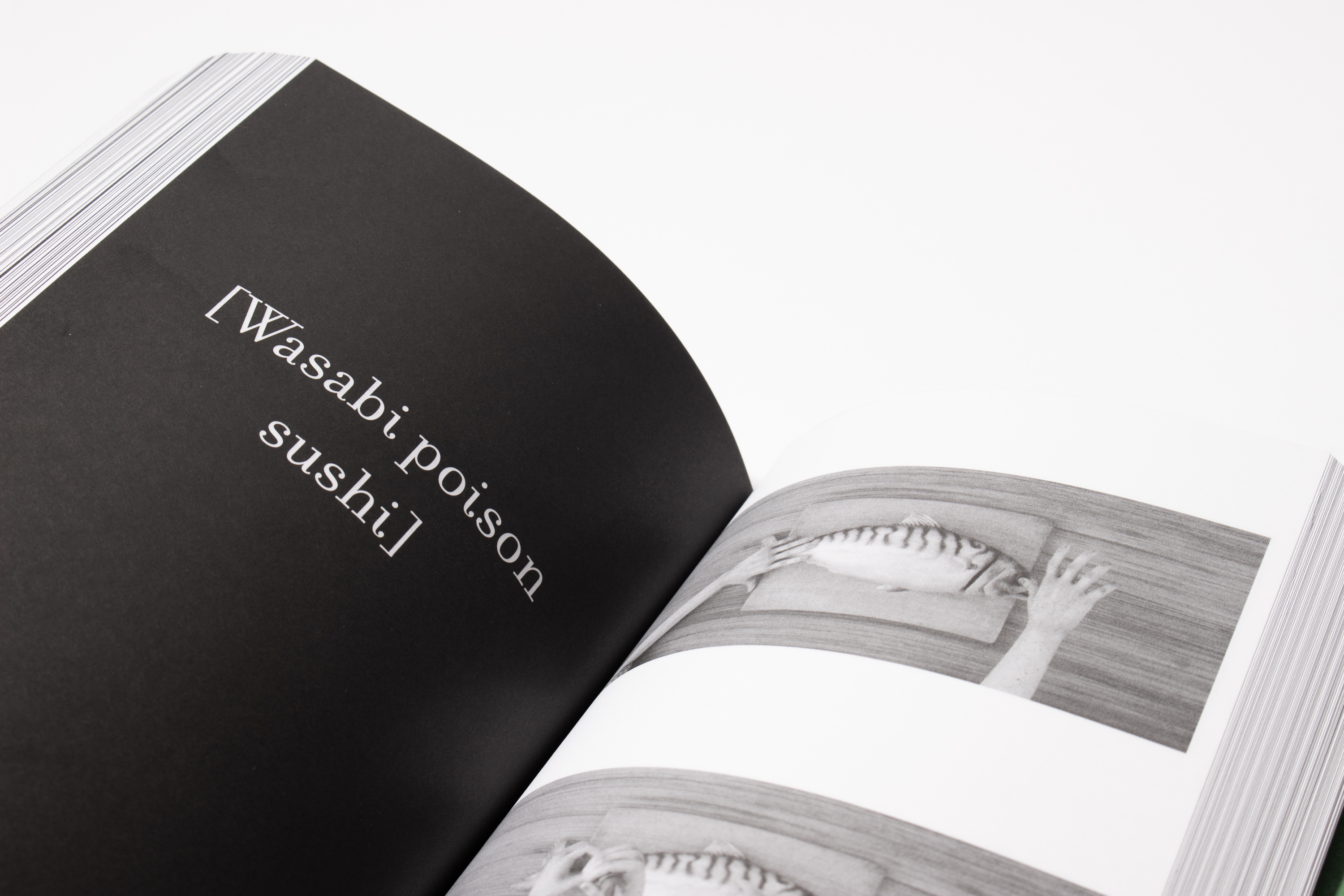


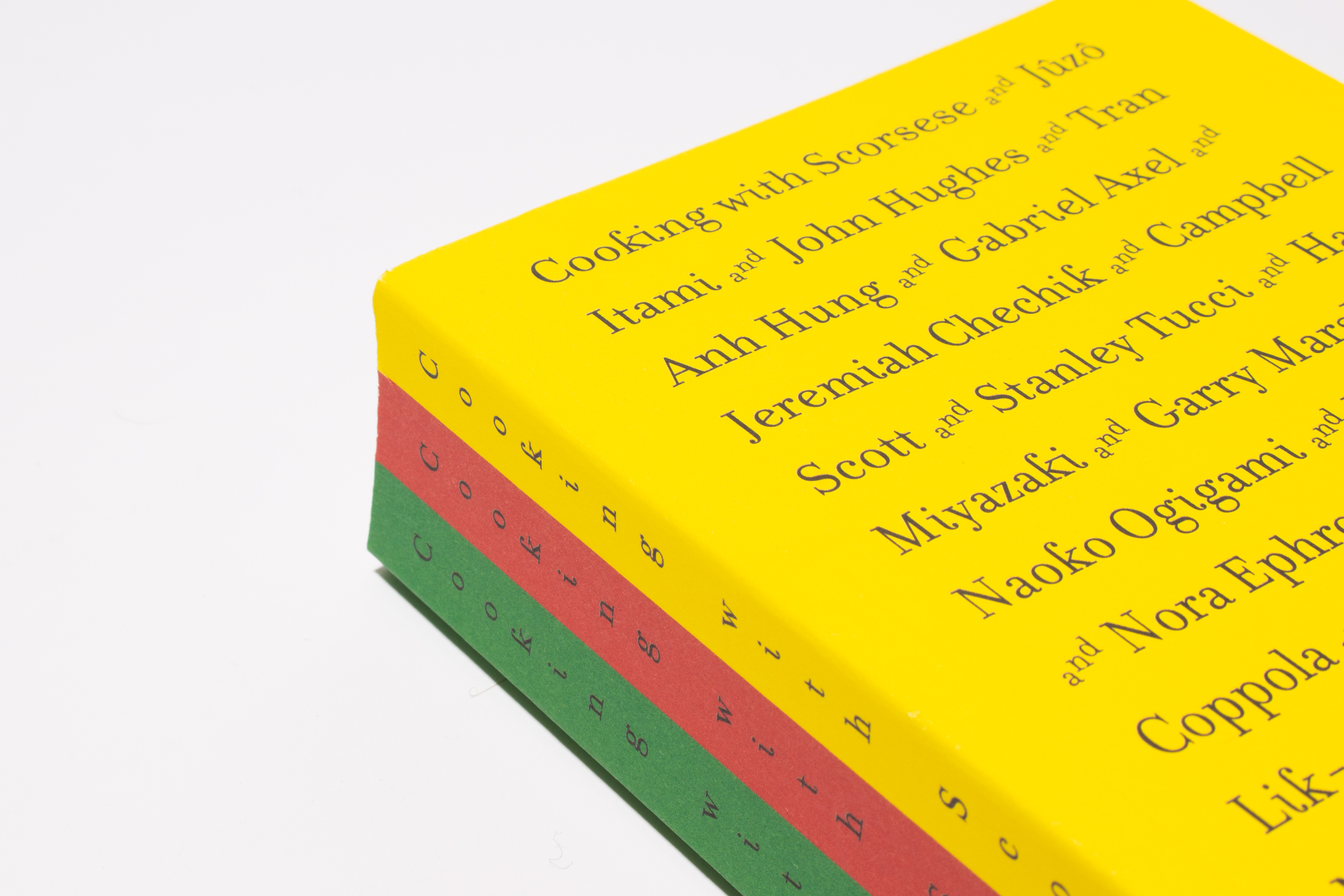


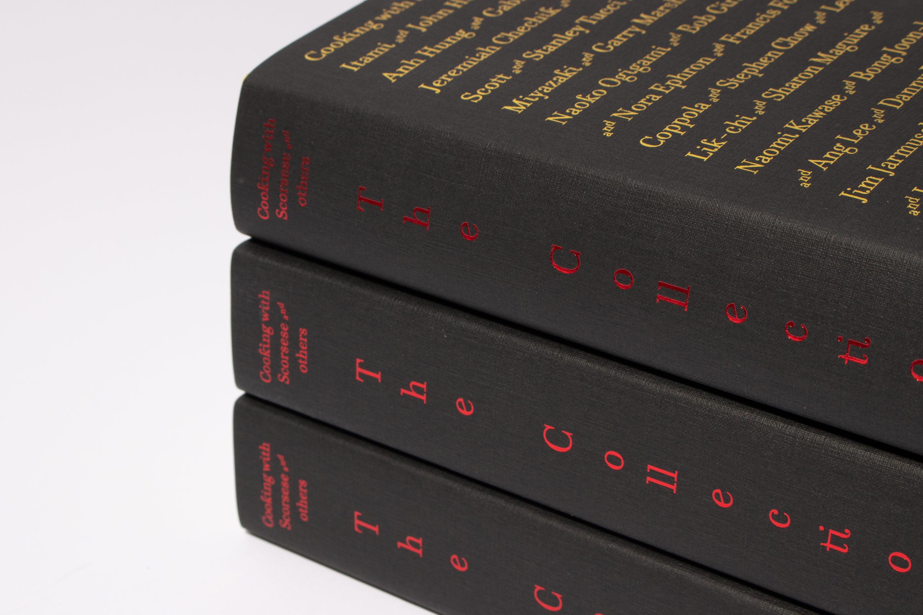
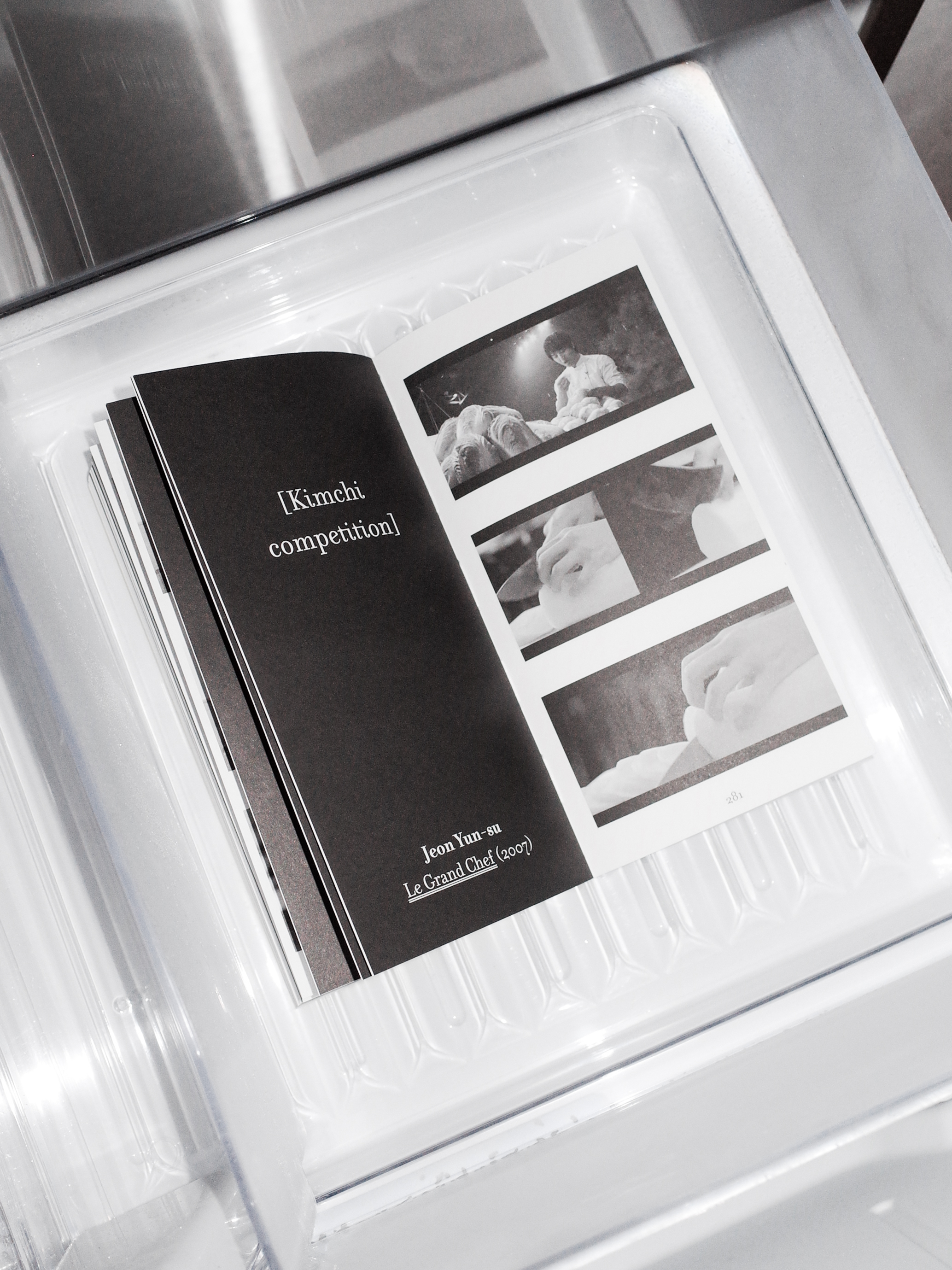
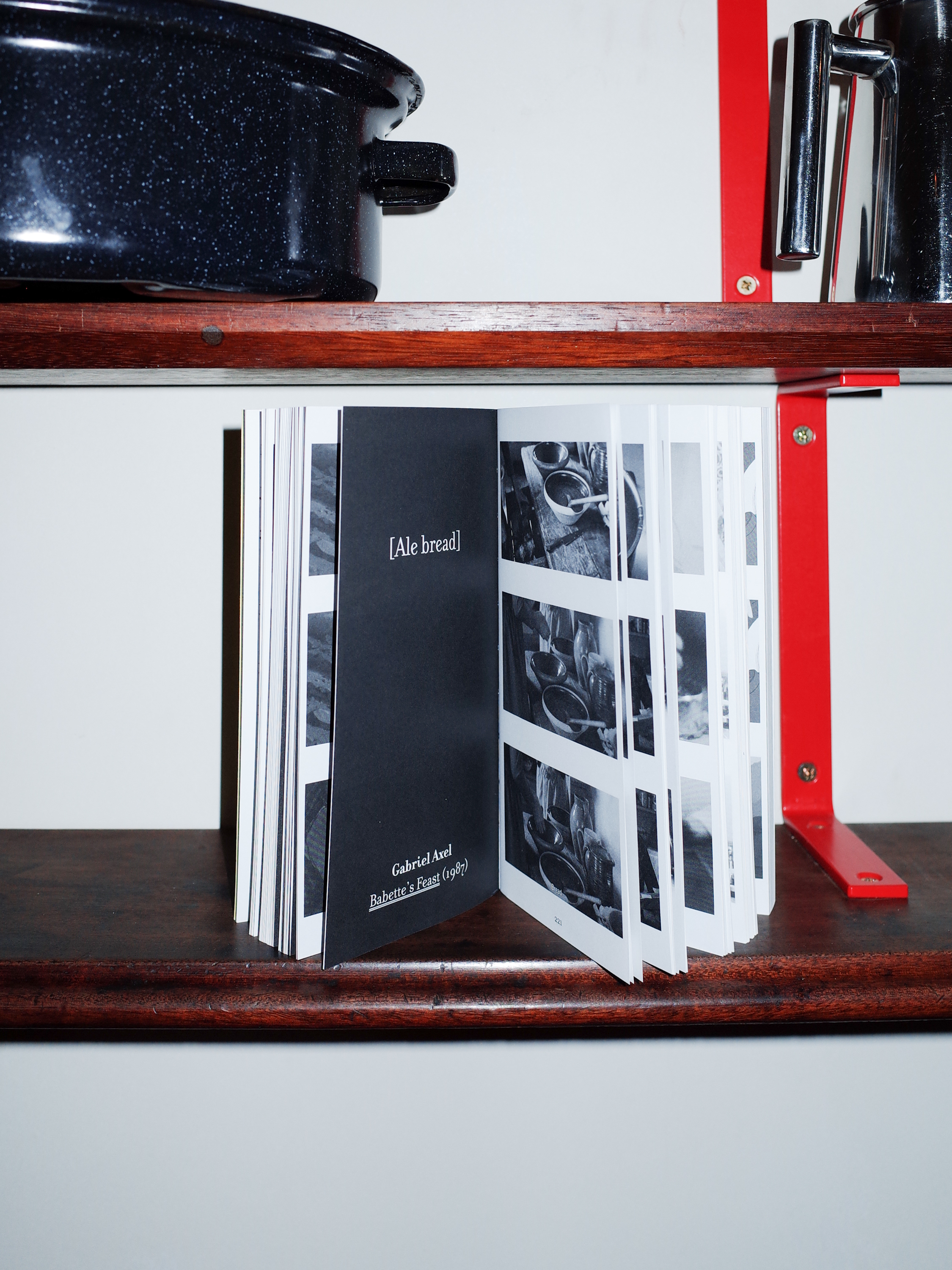

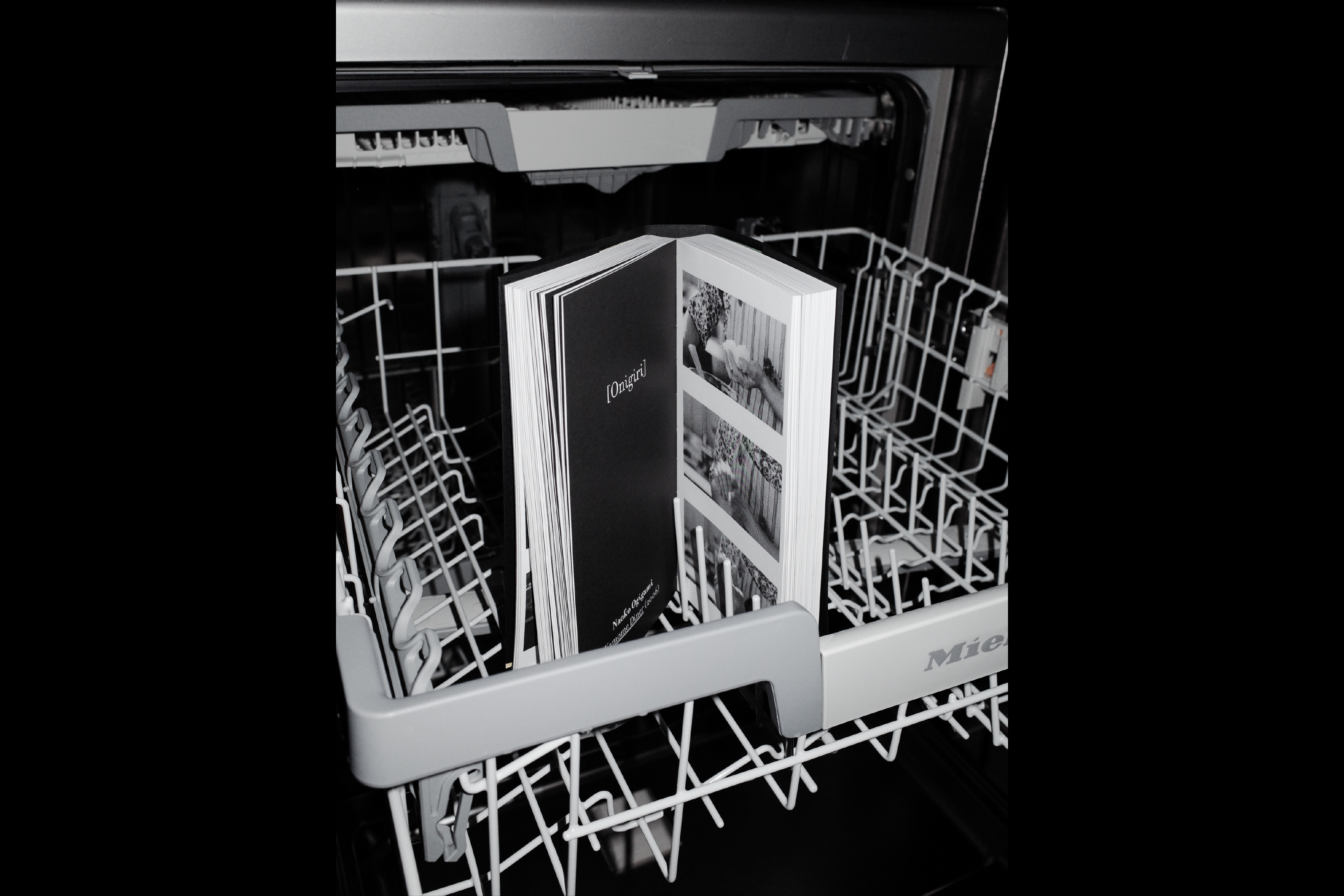
Cooking with Scorsese: The Collection 2022
Book Design for Cooking with Scorsese: The Collection publised by Hato Press.
Nearly ten years after the series first began, a new volume brings together all three instalments of Cooking with Scorsese, an ongoing homage to the experience of food on film. In this collection of screenshot sequences extracted from the history of cinema, food becomes a character, a plot point and a sensory experience – with dishes made to sadden, gladden, entertain and seduce.
The Collection features scenes from more than 50 iconic films, by directors from Wes Anderson and Hayao Miyazaki to Jûzô Itami and Nora Ephron.
Conceived and published by design studio HATO,Cooking with Scorsese: The Collection is the newest addition to the ongoing series, which began in 2014, and which encompasses books, a cookbook, a range of apparel and a series of events.
108.5 × 206 × 36 mm, 564pp ISBN: 978-1-910239-49-0
Scope Book Design
Project completed at HATO
Photography courtesy of Jack Batchelor & HATO

55 Square 2021
Tai Kwun Contemporary, Hong Kong
Key visual identity and motion for 55 Squared, Tai Kwun Contemporary.
Scope Key visual identity
Project completed at HATO
Tai Kwun Contemporary, Hong Kong
Key visual identity and motion for 55 Squared, Tai Kwun Contemporary.
Scope Key visual identity
Project completed at HATO
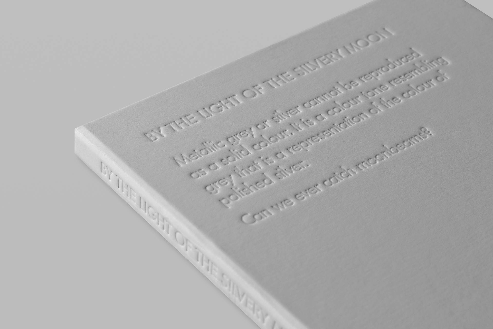
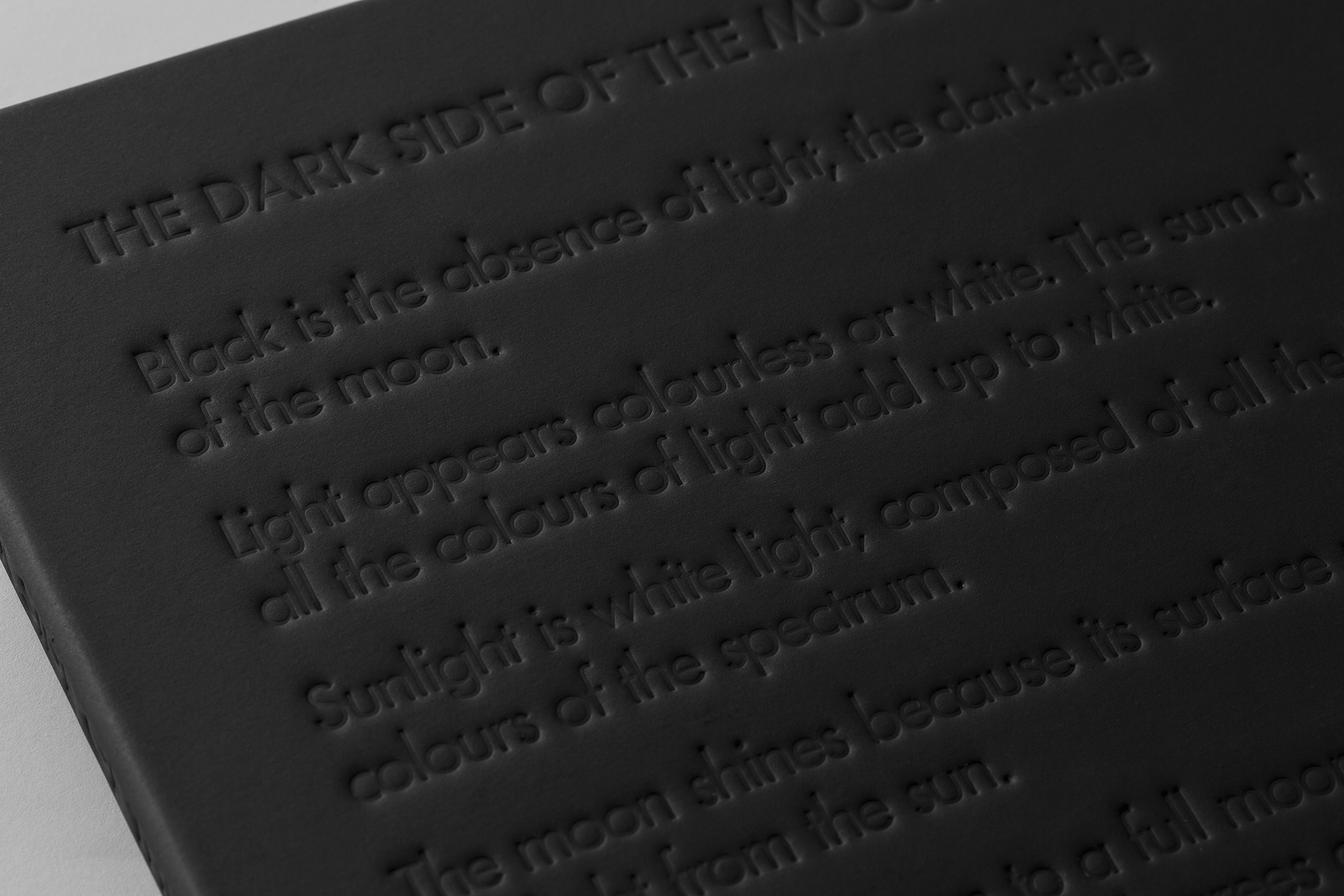
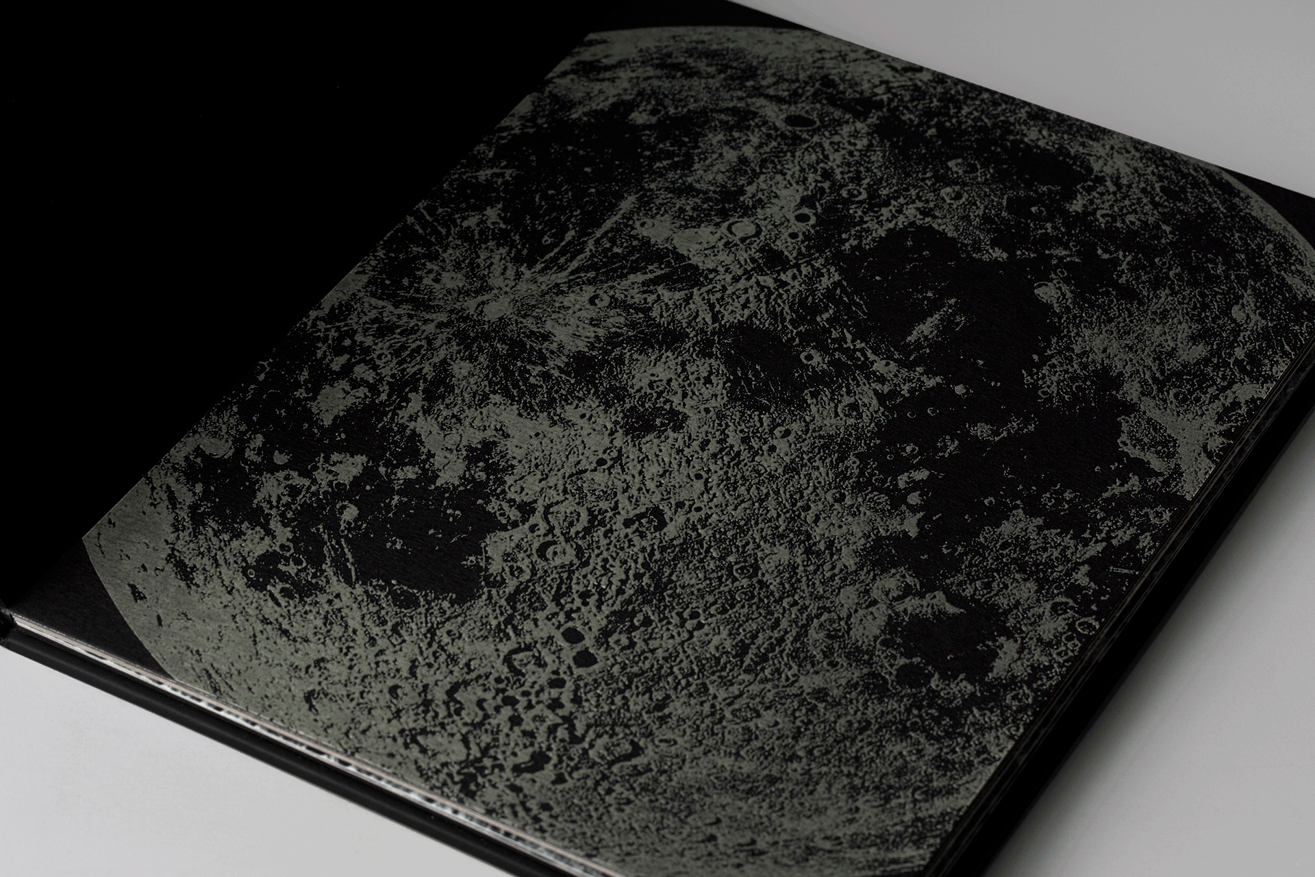
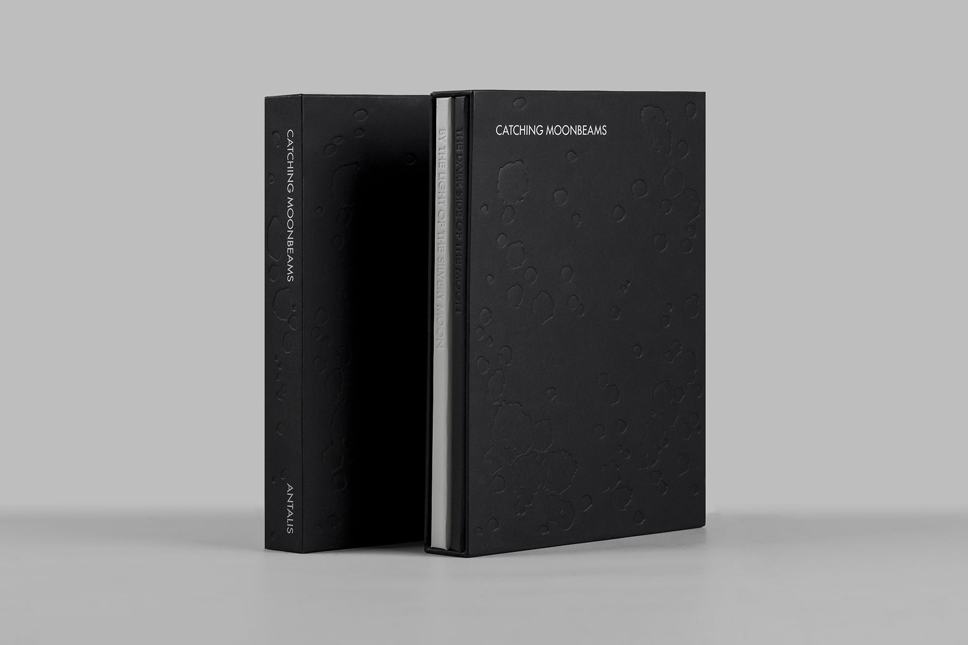
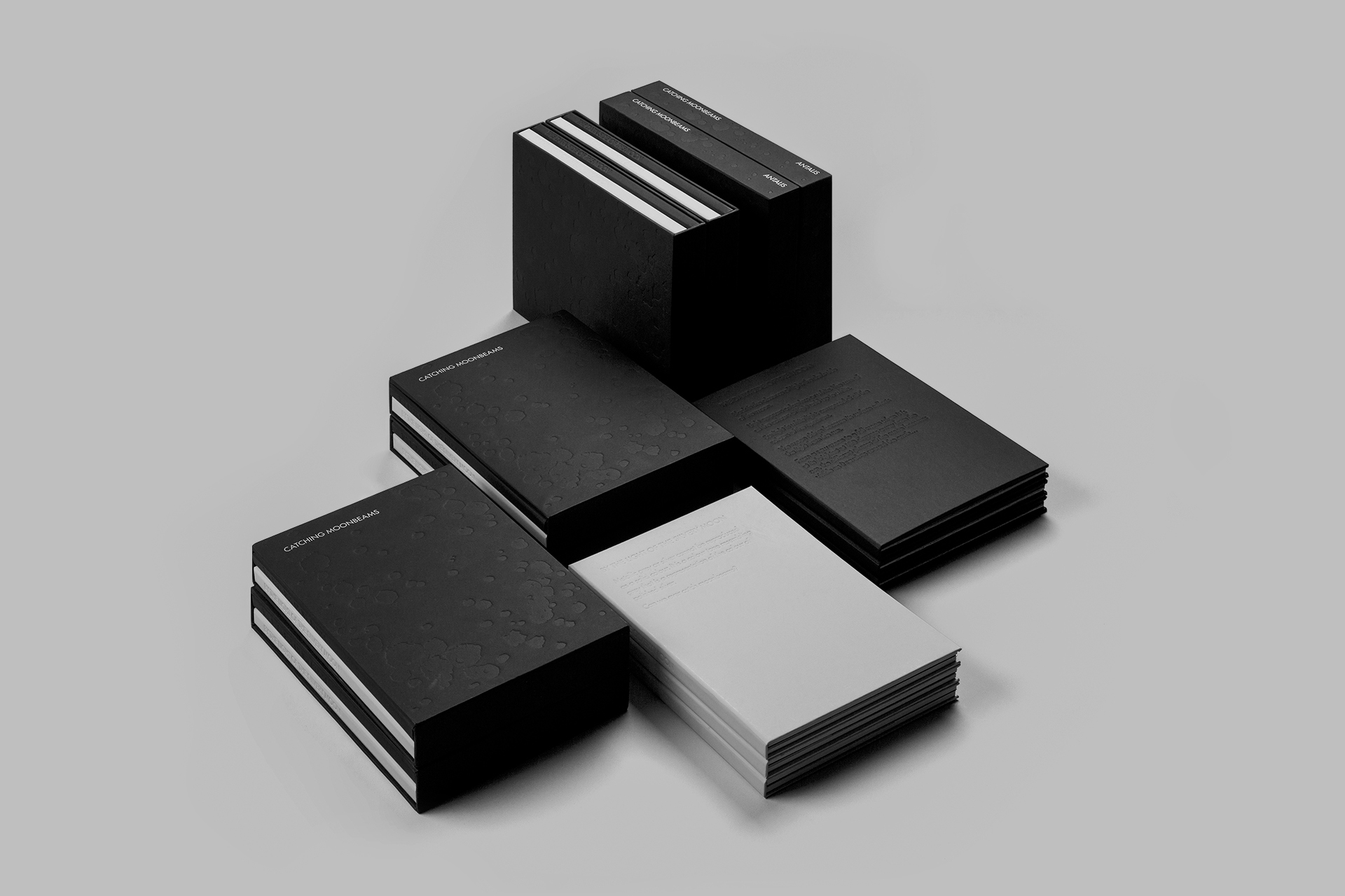
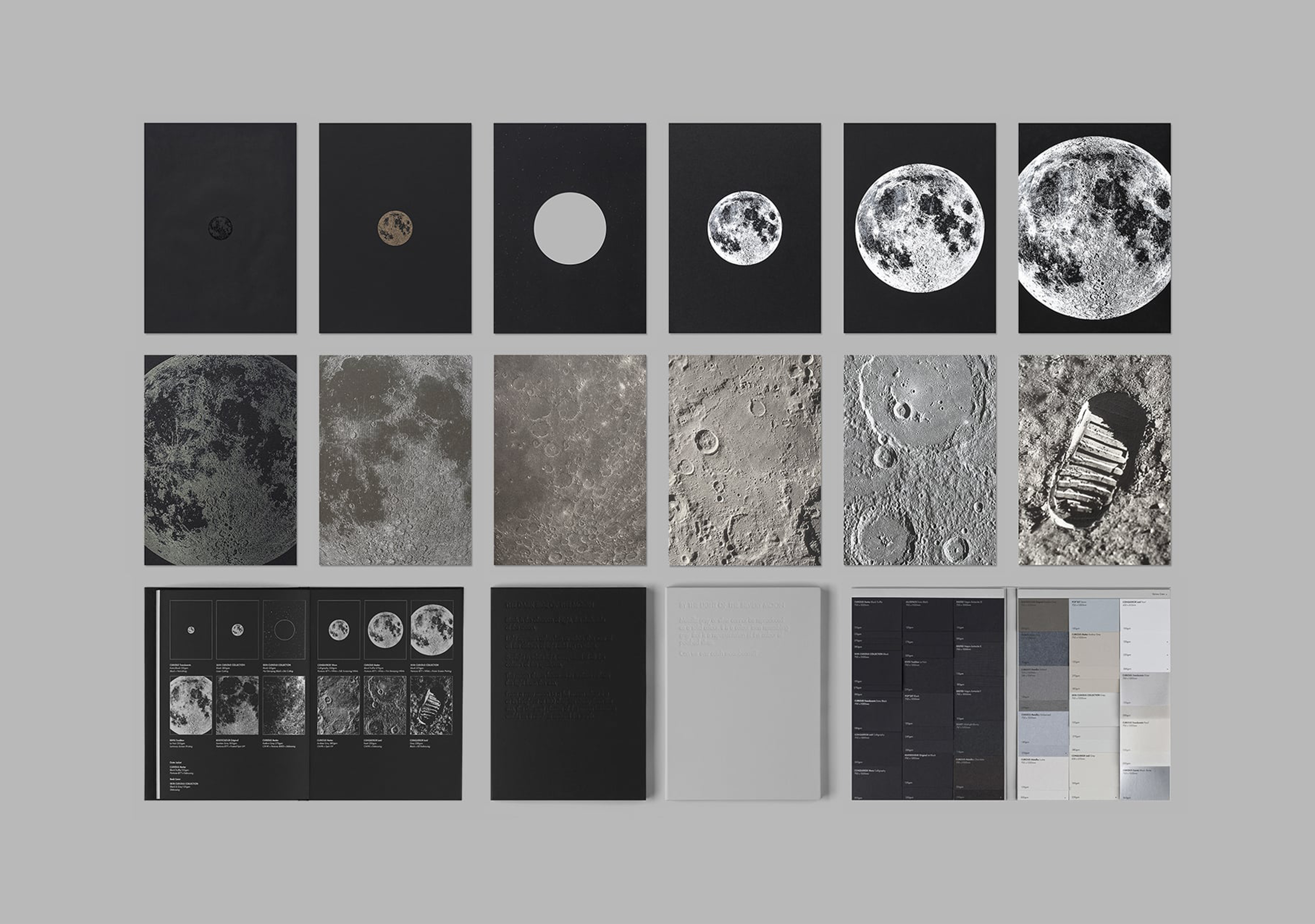


Catching Moonbeams 2015
Antalis Hong Kong
Publication design for Antalis Hong Kong for promoting their signature black, grey, and silver paper. The concept of ‘Catching Moonbeams’ is to highlight the ephemeral and illusory nature of light, darkness, and colours.
CATCHING MOONBEAMS
Volume 1, The Dark Side of the Moon, is a book printed with a number of specialised printing effects on each page, which enhance the reader’s experience. Readers are guided to an experimental journey to reach the moon by touching and feeling the texture of papers with these special effects.
Volume 2, By the Light of the Silvery Moon, is a functional paper sample booklet showcasing Antalis’ black to grey and silver papers. The whole set is presented in a special moon-textured case.
Scope Book Design
Project completed at Toby Ng Design
Photography courtesy of Toby Ng Design


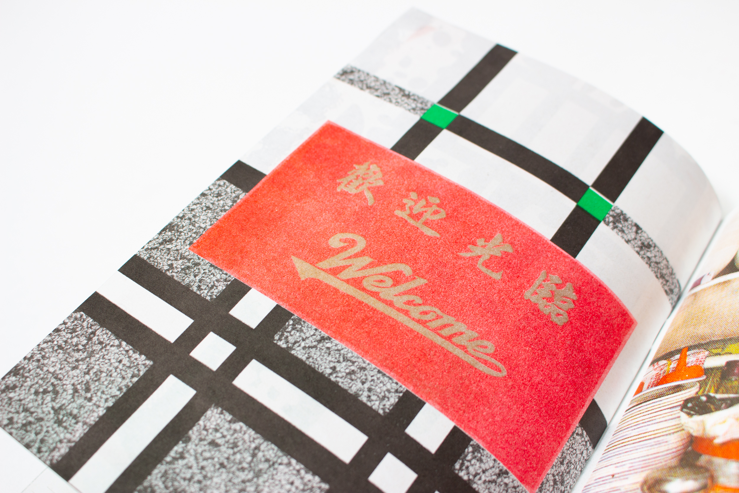

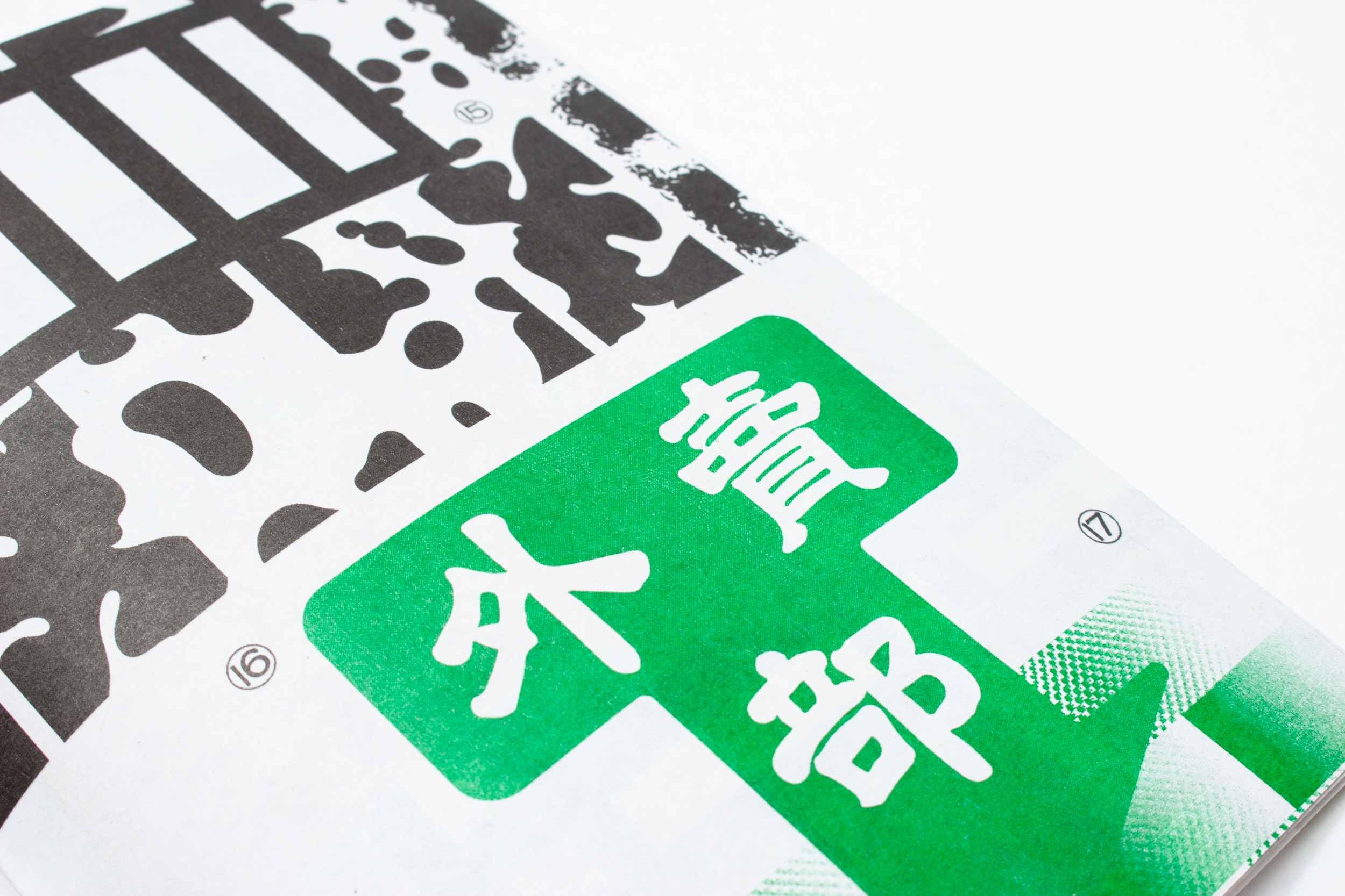

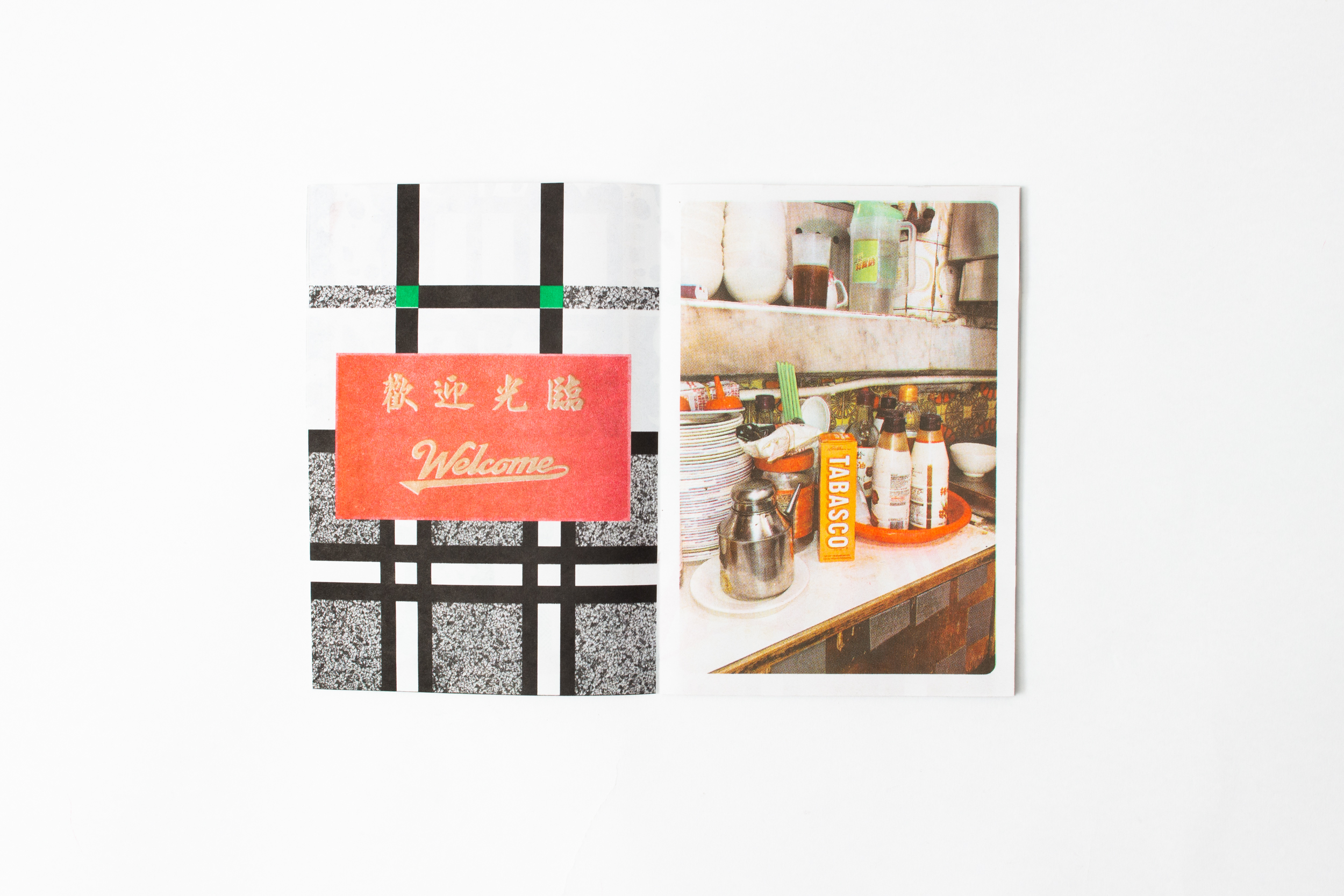

15:15 Cha Chaan Teng 2019
Cha Chaan Tengs, translated directly as ‘tea restaurants’, are Hong Kong-style cafés that are an essential part of the city’s culture.
Cha Chaan Tengs opened in the 1950s as an affordable alternative to high class western restaurants. 三點三 (15:15), meaning 3:15 in the afternoon, is a Cantonese slang for ‘Teatime at Cha Chaan Teng.’ Today their modestly decorated interiors are instantly recognisable.
The mosaic walls tiles, booth-style tables and highly efficient staff bring customers back to a simpler time. Orders are taken using unique jargons and shorthands to suit the city's fast-paced lifestyle, and customers often have to share tables with strangers during peak hours.
All these idiosyncrasies blend together to form a unique dining culture to Hong Kong and its people. Cha Chaan Tengs serve as a symbol of Hong Kong's unique history and heritage, and this zine is a celebration of that very spirit.
Published by Hato Press, London
Printed on 80gsm Evercopy , 140 × 200 mm, 16p, Softcover / Saddle stitch binding
Scope Publication
Project commisioned by Hato Press


15:15 Cha Chaan Teng—Minisite 2019
To mark the launch of the zine ‘ 15:15 Cha Chaan Teng’ a digital version as a minisite is created showcasing the illustrative and photographic content on your web browser that can be enjoyed by all.
Scope Web design
To mark the launch of the zine ‘ 15:15 Cha Chaan Teng’ a digital version as a minisite is created showcasing the illustrative and photographic content on your web browser that can be enjoyed by all.
Scope Web design
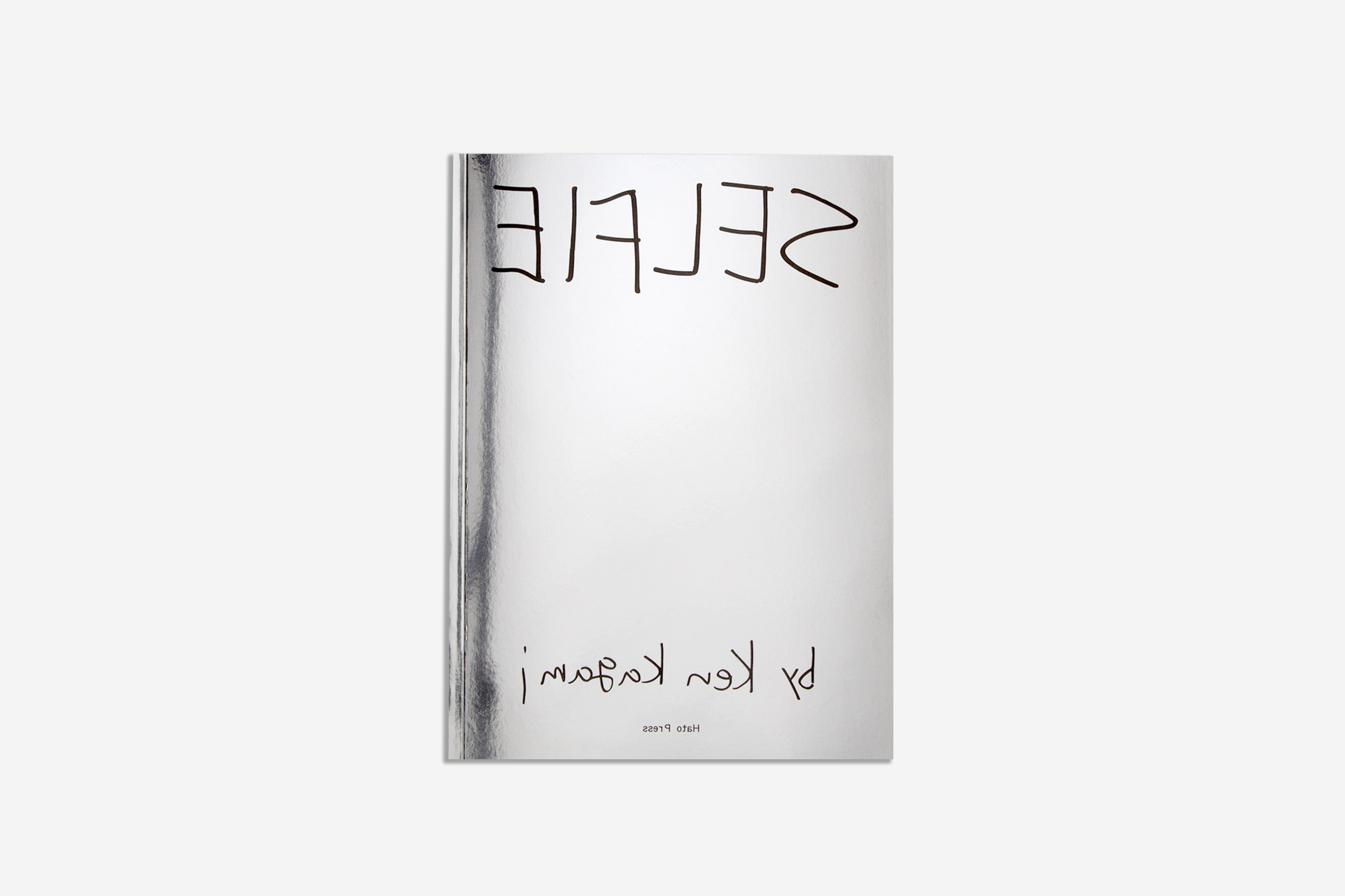


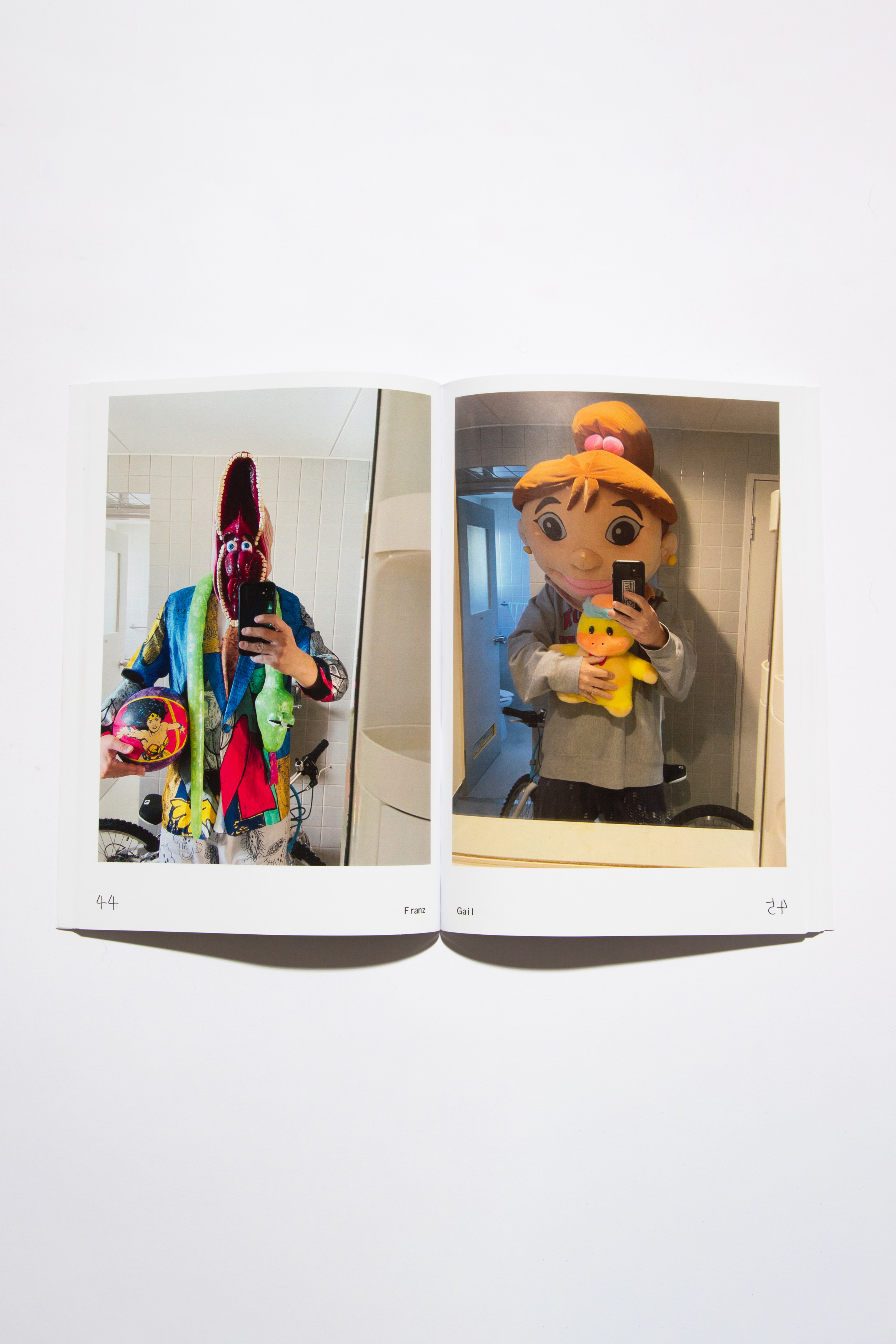

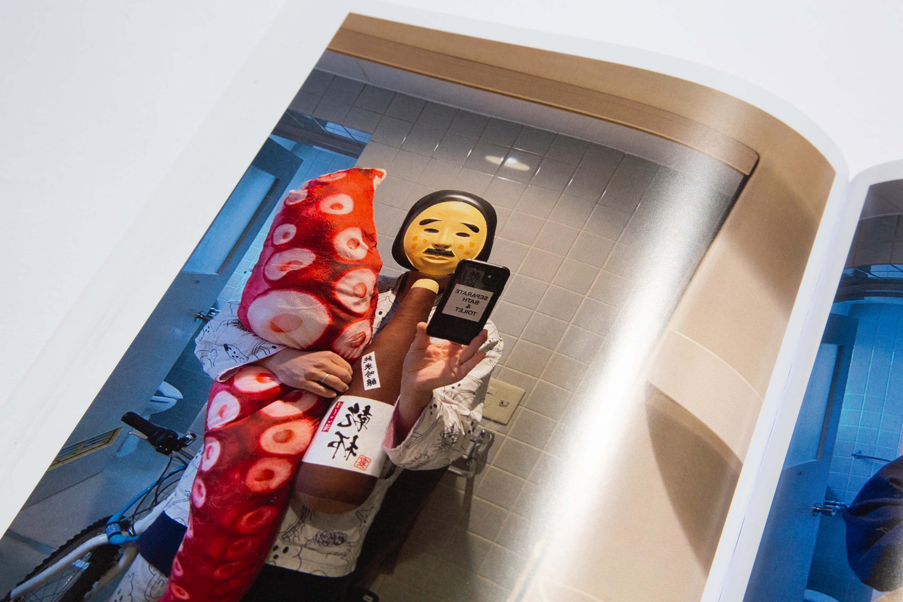
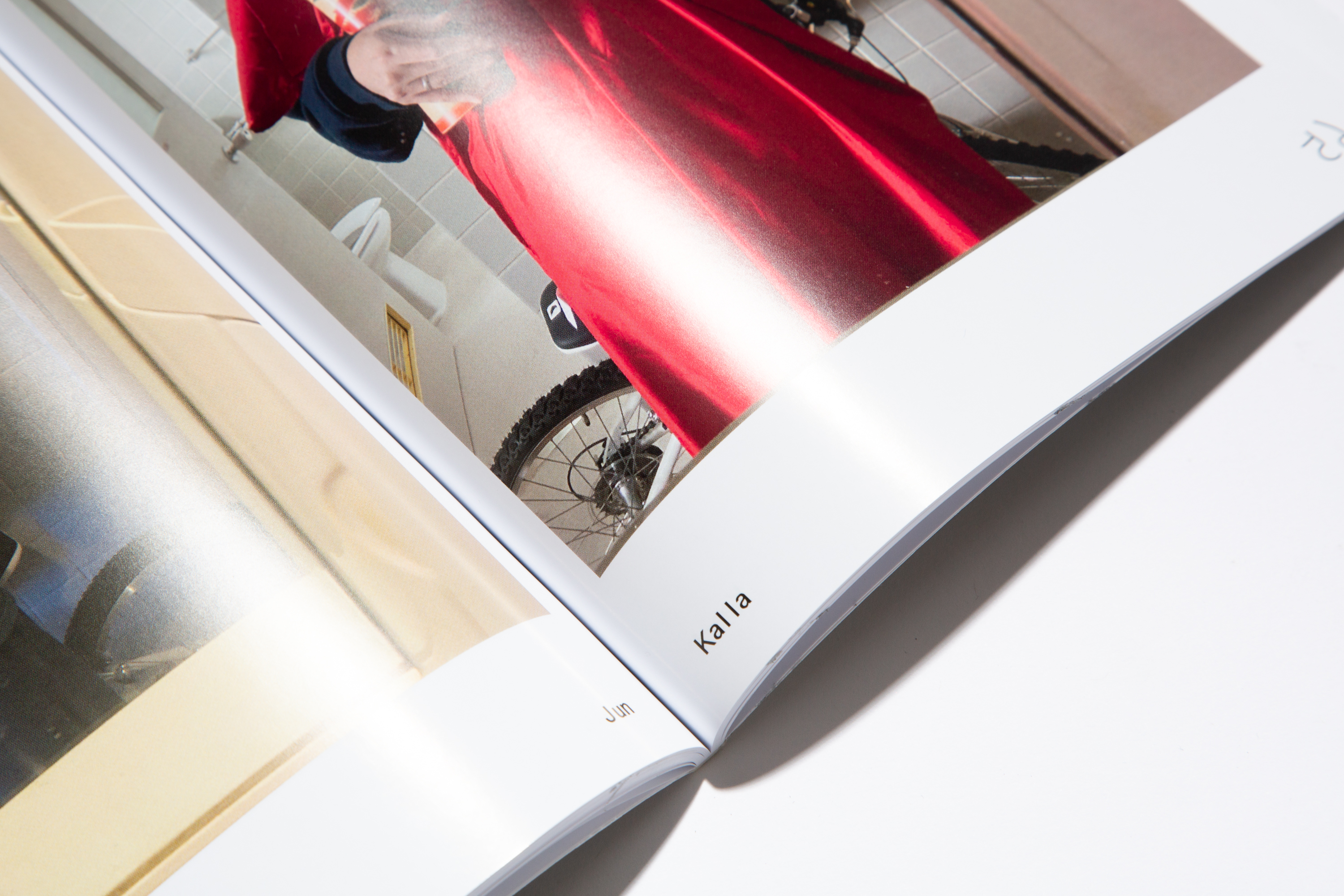
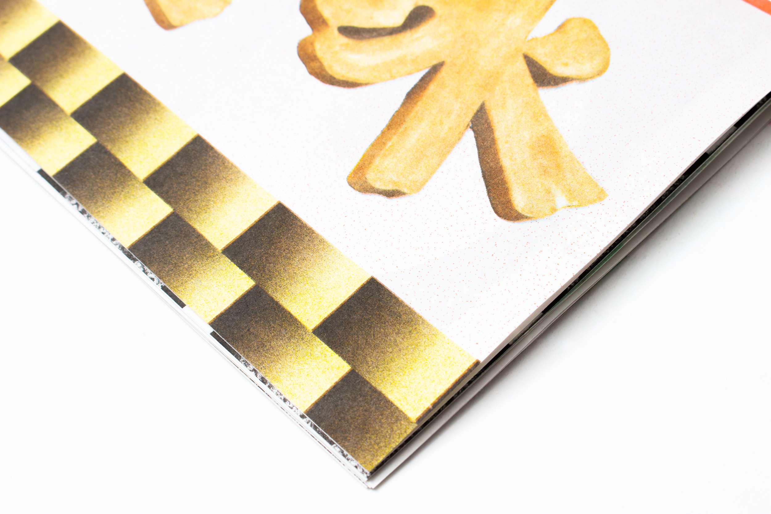
Selfie 2023
A reflective, metallic silver finish for the cover of Selfie, a book designed for Hato Press and Ken Kagami earlier this year. Masks, costumes and other props play a key role in Ken Kagami’s practice. Every morning when he arrives at the studio, the artist dresses up as a new character and snaps an image in his bathroom mirror before beginning his day’s work – the result by turns surreal, strange, hilarious and unnerving.
The theme of reflection runs throughout the publication we designed for Ken – from the mirror-shine cover to the title and page numbers, as well as the merchandise, which features the word ‘Selfie’ in reverse.
Published by Hato Press
Print run of 600
Printed on Mirri Eco Digital Silver 307gsm and Amadeus Gloss 130gsm
182 × 257 mm, 120pp
Soft Cover
Artist Ken Kagami
Scope Book Design
Project completed at HATO
Photography courtesy of HATO